- Prerequisites
- Key concepts
- Sample SVG file
- Step 1: Upload the SVG file
- Step 2: Explore the SCADA editor
- Step 3: Tags
- Step 4: Behavior items
- Step 5. Properties
- Step 6. Tag functions
- Step 7. Preview mode
- Step 8. Create widget
- Reference
| Available since TB Version 3.8.0 |
In ThingsBoard, SCADA symbols are crafted using SVG (Scalable Vector Graphics), which enables seamless scaling across different screen sizes due to their vector nature. Our engineers have enhanced the SVG format to support interactivity in these symbols. This guide will walk you through the steps to create your own interactive SCADA symbol using a sample SVG file.
Prerequisites
To effectively follow this guide, ensure you have:
- Completed the Getting Started guide;
- Reviewed the SCADA Dashboards documentation;
- Acquired a basic understanding of SVG.
Having experience with SVG.js will be beneficial for tackling advanced scenarios.
Key concepts
We will often use the following definitions:
- Developer - a person responsible for defining the SCADA symbol;
- End user - a person who integrates the SCADA symbol into the dashboard.
Creating a SCADA symbol in ThingsBoard involves an SVG file along with several concepts:
-
Tags: These are custom labels assigned to shapes within the SVG file. Tags are utilized to specify render functions and
onClickactions for SVG elements; -
Behavior: this concept outlines how a SCADA symbol receives data from the platform and what actions it triggers on devices or dashboards;
-
Properties: These are configuration elements designed for end users. These properties allow for customization of the widget’s appearance;
-
State Render Function: A JavaScript function responsible for rendering the SVG element.
-
On Click Action: A JavaScript function that defines the logic of the onClick handler.
-
ScadaSymbolContext: A specialized JavaScript object that contains references to tags, behavior items, properties, and helper API functions.
Sample SVG file
Assume we want to transform the SVG file shown below into an interactive SCADA symbol:
Figure: Static SVG image including a fan, text label, and two buttons.
This SVG image is static, containing a fan, text label, and two buttons. Our goal is to convert it into an interactive widget that reflects the state of our fan and updates in real time.
Task formalization:
- Buttons:
- These should issue commands to the target device, updating the state of the fan engine;
- Button labels and colors must be configurable by end users.
- Fan Appearance:
- The fan should rotate when the engine is ‘On’ and stop when the engine is “Off”;
- Colors for both “On” and “Off” states should be configurable separately.
- Text Label:
- Display the fan’s rotation speed. Hide this label when the engine is “Off”;
- The label should be customizable by end users, including options to show/hide, set font, color, and display units.
Next, we will outline the steps to achieve this functionality.
Step 1: Upload the SVG file
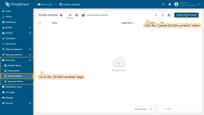
- Right-click on the SVG file shown below and select “Save image as” to save the file to your PC:
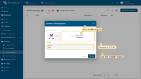
- Navigate to the “Resources” page of the “SCADA symbols” section and click the “Upload SCADA symbol” button;
- Drop the
fan.svgfile in the appropriate field, or upload it from a folder on your computer, rename it to “Fan”, and click “Upload”.
Step 2: Explore the SCADA editor
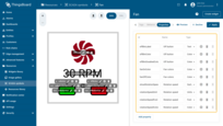
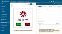
Once you upload your SCADA symbol, you’ll be directed to the SCADA symbol editor. The editor is split into two panels:
- Left panel displays your uploaded SVG file;
- Right panel contains multiple tabs such as “General”, “Tags”, “Behavior”, and “Properties”.
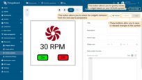
SCADA editor actions
-
Create Widget - this button allows you to quickly create a widget based on your SCADA symbol. Any major changes to the SCADA symbol will automatically reflect in the widget library, except for fields like title, description, and search tags, which are copied at the moment you create the widget.
-
Apply and Decline - these buttons allow you to save or discard changes to the symbol.
-
Preview - enables you to check the widget’s behavior from the end-user’s perspective. The left panel will render the SVG, while the right panel shows the configuration page of the widget. Use the Back button to exit preview mode.
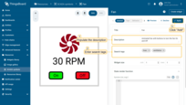
As a simple exercise, populate the description and search tags, then click “Apply”.
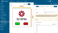
Widget size and aspect ratio
Notice the widget size in columns and rows, which hints at how the SCADA layout should place the widget. This setting impacts the aspect ratio of the widget and should ideally match the aspect ratio of your SVG. Complex aspect ratios like 17:43 are not recommended. Good examples include 1:1, 1:2, 2:1, etc.
Step 3: Tags
Tags are custom labels assigned to shapes within the SVG file.
They are used to specify render functions and onClick actions for SVG elements.
You can assign the same tag to multiple SVG elements to streamline interaction and functionality across similar components.
Tags definition via editor
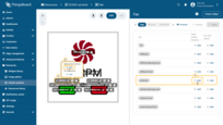
To define a tag, select the corresponding SVG element in the left panel of the editor and click the “+Add tag” button. Now, name the tag. It is recommended to name tags in camelCase to facilitate their reference in render functions.
For our use case, it’s necessary to tag almost every element within the SVG to ensure full interactivity. Below is a list of the tags to be defined:
- onButton - tag for the “group” element to define the
onClickaction for the “On” button; - onButtonBackground - tag for the “rect” element to control the background color of the “On” button;
- onButtonText - tag for the “text” element to define the text display of the “On” button;
- offButton - tag for the “group” element to define the
onClickaction for the “Off” button; - offButtonBackground - tag for the “rect” element to control the background color of the “Off” button;
- offButtonText - tag for the “text” element to define the text display of the “Off” button;
- rotationSpeedText - tag for the “text” element to display the rotation speed value;
- fan - tag for the “path” element to animate the fan rotation.
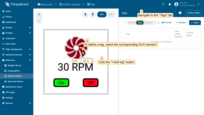

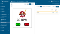

The table in “Tags” tab allows you to quickly access each tag and define both the state render function and the onClick action.
Tags definition via XML
While the UI editor suffices for simple SCADA symbols, complex SVG file structures might require a different approach.
For elements obscured by gradients or complex shapes, it’s useful to switch to XML editor mode.
You can find this option in the top-right corner of the left panel in the editor.
Here, you can define tags using the tb:tag syntax directly within the XML structure.
Let’s add tags to the “On” button elements:
- Navigate to the “XML” editor mode and replace this XML code:
1
2
3
4
5
6
<g transform="matrix(1.61104 0 0 1.60957 -72.338 -20.652)">
  <rect x="54.702" y="60.372" width="14.263" height="7.426" rx="1.5" fill="#12ed19" stroke="#000"/>
  <text x="61.856" y="64.491" dominant-baseline="middle" fill="#000000" font-family="Roboto" font-size="4.446" stroke-width=".741" text-anchor="middle" xml:space="preserve">
    <tspan stroke-width=".741">On</tspan>
  </text>
</g>
to this one:
1
2
3
4
5
6
<g tb:tag="onButton" transform="matrix(1.61104 0 0 1.60957 -72.338 -20.652)">
  <rect tb:tag="onButtonBackground" x="54.702" y="60.372" width="14.263" height="7.426" rx="1.5" fill="#12ed19" stroke="#000"/>
  <text tb:tag="onButtonText" x="61.856" y="64.491" dominant-baseline="middle" fill="#000000" font-family="Roboto" font-size="4.446" stroke-width=".741" text-anchor="middle" xml:space="preserve">
    <tspan stroke-width=".741">On</tspan>
  </text>
</g>
- Return to the “SVG” editor mode. You will see the tags added to the “On” button element.
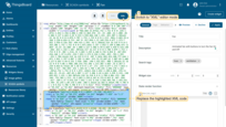
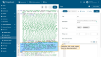
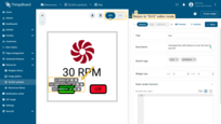
Below is the XML code that will add all the necessary tags for this example.
- Copy this XML code:
1
2
3
4
5
6
7
8
9
<svg xmlns="http://www.w3.org/2000/svg" xmlns:tb="https://thingsboard.io/svg" width="100" height="100" version="1.1" viewBox="0 0 100 100">
<rect width="100" height="100" rx="0" fill="none" stroke="#ccc" stroke-width="2"></rect><path tb:tag="fan" d="M66.868 25.074a1.752 1.752 0 0 0-.645-1.072c-2.852-2.356-6.806-2.198-11.864.476-.33-.33-.688-.61-1.088-.85 3.486-3.127 6.663-4.44 9.533-3.939.846.148 1.431-.821.907-1.502a16.52 16.52 0 0 0-4.079-3.787 1.753 1.753 0 0 0-1.213-.302c-3.683.35-6.368 3.258-8.054 8.725-.467 0-.917.056-1.37.169.254-4.677 1.573-7.852 3.956-9.526.703-.494.431-1.593-.42-1.704a16.519 16.519 0 0 0-5.563.206 1.752 1.752 0 0 0-1.071.645c-2.357 2.852-2.199 6.806.475 11.864-.33.33-.61.688-.85 1.088-3.127-3.486-4.44-6.664-3.939-9.533.148-.846-.821-1.432-1.501-.907a16.517 16.517 0 0 0-3.788 4.079 1.753 1.753 0 0 0-.302 1.213c.35 3.683 3.259 6.368 8.726 8.054 0 .467.055.916.168 1.37-4.676-.254-7.851-1.573-9.526-3.956-.493-.703-1.593-.431-1.704.42a16.519 16.519 0 0 0 .207 5.563c.093.453.288.777.644 1.071 2.852 2.357 6.807 2.199 11.865-.475.33.33.687.61 1.087.85-3.486 3.127-6.663 4.44-9.532 3.939-.846-.148-1.432.821-.908 1.501a16.52 16.52 0 0 0 4.08 3.788c.386.255.752.346 1.213.302 3.683-.35 6.367-3.259 8.053-8.725a5.58 5.58 0 0 0 1.37-.17c-.254 4.677-1.572 7.853-3.956 9.527-.702.494-.431 1.593.42 1.704 1.89.245 3.696.178 5.563-.207a1.752 1.752 0 0 0 1.072-.644c2.356-2.852 2.198-6.806-.476-11.865.33-.33.61-.687.85-1.087 3.127 3.486 4.44 6.663 3.939 9.533-.148.845.821 1.431 1.501.907a16.518 16.518 0 0 0 3.788-4.08c.255-.386.346-.752.302-1.213-.35-3.683-3.259-6.367-8.725-8.053 0-.467-.056-.917-.169-1.37 4.676.254 7.852 1.572 9.526 3.956.494.702 1.593.431 1.704-.42.245-1.89.178-3.696-.206-5.563zm-16.503 8.103a4.706 4.706 0 1 1 0-9.412 4.706 4.706 0 0 1 0 9.412z" fill="#7d081e"></path><text tb:tag="rotationSpeedText" x="49.434" y="59.465" dominant-baseline="middle" fill="#000000" text-anchor="middle" xml:space="preserve"><tspan>30 RPM</tspan></text><g tb:tag="onButton" transform="matrix(1.61104 0 0 1.60957 -72.338 -20.652)">
    <rect tb:tag="onButtonBackground" x="54.702" y="60.372" width="14.263" height="7.426" rx="1.5" fill="#12ed19" stroke="#000"></rect>
    <text tb:tag="onButtonText" x="61.856" y="64.491" dominant-baseline="middle" fill="#000000" font-family="Roboto" font-size="4.446" stroke-width=".741" text-anchor="middle" xml:space="preserve"><tspan stroke-width=".741">On</tspan></text>
  </g><g tb:tag="offButton" transform="matrix(1.61253 0 0 1.61566 -58.441 -20.942)">
    <rect tb:tag="offButtonBackground" x="74.367" y="60.311" width="14.263" height="7.426" rx="1.5" fill="#ed121f" stroke="#000"></rect>
    <text tb:tag="offButtonText" x="81.366" y="64.518" dominant-baseline="middle" fill="#000000" font-family="Roboto" font-size="4.446" stroke-width=".741" text-anchor="middle" xml:space="preserve"><tspan stroke-width=".741">Off</tspan></text>
  </g>
</svg>
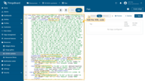
- Navigate to the “XML” editor mode;
- Paste the copied code in the corresponding window;
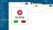
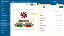
- Return to the “SVG” editor mode. You can see the defined tags. Afterward, apply the changes.
Operations with tags
You can update the tag, add a state rendering function, and assign an on click action, or delete the tag using the appropriate tag icon.
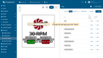
Update tag
- Hover over the tag and click the "Update tag" icon;
- Change the tag name and click "Apply".
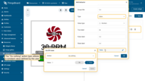
Tag settings
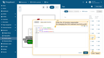
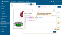
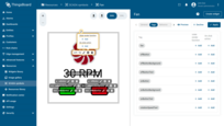
- Hover over the tag and click the “Tag settings” icon;
- In the pop-up menu, there are two types of functions you may assign to each tag: “State render function” and “On click action”. We will discuss these in more detail in the “Tag configurations” section.

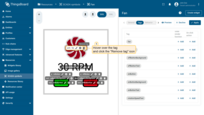
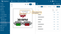
Remove tag
- Hover over the tag and click the "Remove tag" icon;
- Confirm deleting the tag in the dialog box.
Step 4: Behavior items
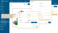
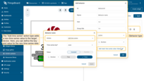
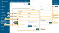
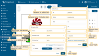
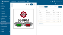
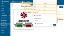
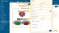
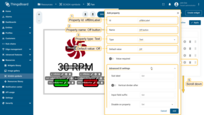
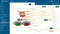
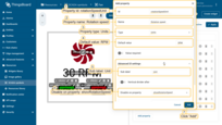
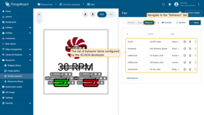
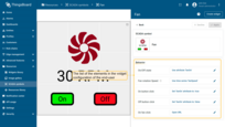
Behavior items enable the end-user to configure interactions between the widget and the platform. Once defined, these items are available in the widget’s end-user configuration settings as a Behavior panel. For instance, you can set up the source that determines the fan’s state (“On”/”Off”) and specify the actions that occur when the “On” and “Off” buttons are clicked.
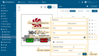
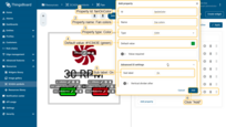
Below is a gallery containing two images: one showing the list of behavior items configured by the SCADA developer, and the other displaying the corresponding elements in the widget configuration of the end-user.
Add behavior
Now let’s learn how to configure behavior items. Each item includes the following common fields:
- Id - an identifier used to reference an item in the ScadaSymbolContext;
- Name - a label that generates an element for end-user configuration;
- Hint - a hint provided within the end-user configuration element to assist with usage;
- Group title - a method to organize configuration elements within the ‘Behavior’ configuration panel;
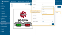
- Type - the field can be of “Value”, “Action”, or “Widget action” type. We will explore each type in detail below;
- Default settings - the preset configurations available to the end-user.
To add new behavior item for the SCADA symbol, do the following:
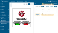
- Navigate to the "Behavior" tab and click the "Add behavior" button;
- Fill in the required fields and click "Add".
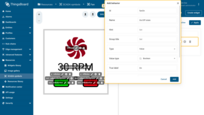
Fields like “Name”, “Hint”, and “Group title” support internationalization using the ‘i18n’ tag. For instance: {i18n:scada.fan.turn-on}. For more details on setting up custom translations, see Localization.
Behavior types
The list of behavior parameters is specific to the chosen SCADA symbol and is entirely controlled by the symbol’s author. There are three types of behavior parameters: “Value”, “Action”, and “Widget action”.
- “Value” parameters usually control the visual representation of the symbol and may change over time based on the received value;
- “Action” parameters define the actions performed against the target entity when a specific event occurs;
- “Widget action” parameters define the actions triggered when the user clicks on the component of the SCADA symbol.
Value
Value behavior items fetch data from the platform into the ScadaSymbolContext, acting like variables. These variables typically change based on target device attributes or time series data and are used in defining the ‘State render function’ for your tags.
There are six types of actions to retrieve value:
- Do nothing action type utilizes a constant value defined by the user.
- Execute RPC action type sends a command to the target device to retrieve the value. The value is resolved once at the widget’s creation.
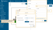
- Get attribute action type subscribes to a target entity’s attribute value, updating the widget when this attribute changes.
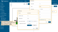
- Get time series action type subscribes to a target entity’s time series field, updating the widget with new data arrivals.
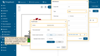
- Get alarm status action type subscribes to the alarm state field of the target entity, updating the widget status according to the alarm type.
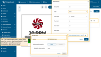
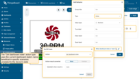
- Get dashboard state action type uses the current dashboard state’s name, beneficial in specific scenarios unrelated to the device’s state.
Action
Action behavior items specify the actions taken against the target device when specific events occur, typically triggered using the ScadaSymbolContext when defining the ‘On click action’ for your tags.
The platform supports three types of actions for interacting with the target entity:
- Execute RPC sends a command to the target device. You can specify the method and parameters for the command.
- Set attribute action type issues a command to set an attribute on the target device, allowing you to define the scope, key, and value.
- Add time series action type adds a new time series value to the target device. Here, you can define the key and value for the new time series data.
Widget action
Widget action behavior items function similarly to Action behavior items but are designed to trigger actions related to the current dashboard widget rather than the target device. Possible widget actions are detailed in the Widget Actions documentation.
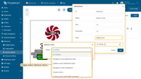
Value types
“Value” and “Action” behavior items come in various types including “String”, “Integer”, “Double”, “Boolean”, and “JSON”. Each type has its own specific configuration parameters.
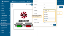
Adding new value behavior items for our SCADA symbol
Let’s create new value behavior items for our SCADA symbol:
1.Use the “fanOn” shared attribute:
- Id: fanOn
- Name: On/Off state
- Type: Value
- Value type: Boolean (‘true’ means the fan is on, ‘false’ means it is off)
- True label: On
- False label: Off
- State label: On
- Default settings:
- Action: Get attribute
- Attribute scope: Shared
- Attribute key: fanOn
2.Subscribe to the time series key “fanSpeed” of the target device:
- Id: fanSpeed
- Name: Fan rotation Speed
- Hint: Value in RPM
- Type: Value
- Value type: Double (value in RPMs)
- Default settings:
- Action: Get time series
- Time series key: fanSpeed
Let’s set up new action behavior items for the user interactions with the “On” and “Off” buttons:
1.Configure action when the “On” button is clicked: set shared scope attribute “fanOn” to “True”:
- Id: onBtnClick
- Name: On button click
- Type: Action
- Value type: Boolean
- Default settings:
- Action: Set attribute
- Attribute scope: Shared
- Attribute key: fanOn
- Value: True
2.Configure action when the “Off” button is clicked. Set shared scope attribute “fanOn” to “False”:
- Id: offBtnClick
- Name: Off button click
- Type: Action
- Value type: Boolean
- Default settings:
- Action: Set attribute
- Attribute scope: Shared
- Attribute key: fanOn
- Value: False
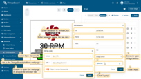
Configure the “onFanClick” click action to open the ThingsBoard platform's webpage in a separate browser tab:
- Id: onFanClick
- Name: On fan click
- Type: Widget action
- Default settings:
- Action: Open URL
- URL: https://thingsboard.io/
- Attribute key: fanOn
- Enable to open the webpage in a separate browser tab
Step 5. Properties
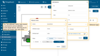
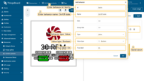
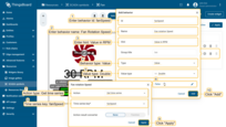
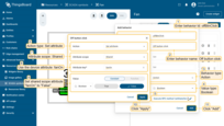
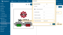
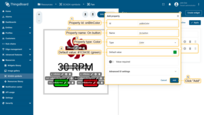
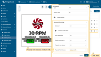
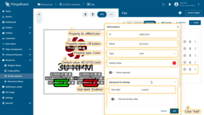
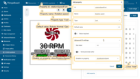
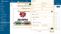
Properties are configuration parameters that allow end-users to customize the appearance of widgets. These include settings for labels, fonts, colors, and units. Once defined, these properties are accessible in the widget’s end-user configuration under the “Appearance” tab.
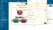
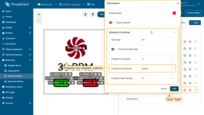
Below is a gallery containing two images: one displaying the list of properties configured by the SCADA developer, and the other showing the corresponding elements in the end-user configuration of the widget.
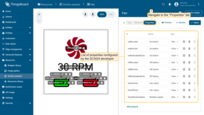
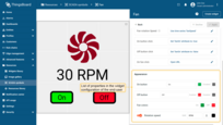
Let’s learn how to configure properties. Each property includes the following common fields:
- Id - an identifier used to reference the property in the ScadaSymbolContext;
- Name - a label used to generate an element for end-user configuration. Use the same name to group multiple configuration properties into the same row;
- Type - properties can be of
Text,Number,Switch,Color,Color settings,Font, andUnitstype. They will be explored in detail below; - Default value - the preset configuration available to the end-user;
- Value required - a switcher that mandates user input for the property value;
- Advanced UI settings - these include multiple configuration items that help developers fine-tune the parameter configuration form.
To add new property for the SCADA symbol, do the following:
- Navigate to the "Property" tab and click the "Add property" button;
- Fill in the required fields and click "Add".
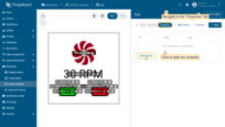
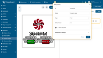
This structure outlines the process of defining and managing properties, ensuring clarity and accessibility for end-users and developers alike.
Adding new property for our SCADA symbol
Let’s set up configuration properties for the “On” button:
1.Label of the “On” button:
- Id: onBtnLabel
- Name: On button (Used to group all properties related to the “On” button in one row)
- Type: Text
- Default value: On
- Advanced UI settings:
- Property field classes: medium-width
2.Color of the ‘On’ button in enabled state:
- Id: onBtnColor
- Name: On button
- Type: Color
- Default value: #1C943E (green)
3.Color of the ‘On’ button in disabled state:
- Id: onBtnDisabledColor
- Name: On button
- Type: Color
- Default value: #696969 (gray)
- Advanced UI settings:
- Sub label: Disabled
Let’s set up configuration properties for the ‘Off’ button:
1.Label of the ‘Off’ button:
- Id: offBtnLabel
- Name: Off button
- Type: Text
- Default value: Off
- Advanced UI settings:
- Property field classes: medium-width
2.Color of the “Off” button in enabled state:
- Id: offBtnColor
- Name: Off button
- Type: Color
- Default value: #D12730 (red)
- Advanced UI settings:
- Sub label: Enabled
3.Color of the “On” button in disabled state:
- Id: offBtnDisabledColor
- Name: Off button
- Type: Color
- Default value: #696969 (gray)
- Advanced UI settings:
- Sub label: Disabled
Let’s set up configuration properties for the Fan appearance:
1.Color of the Fan in “On” state:
- Id: fanOnColor
- Name: Fan colors (Used to group all properties related to the Fan in one row)
- Type: Color
- Default value: #1C943E (green)
- Advanced UI settings:
- Sub label: On
2.Color of the Fan in “Off” state:
- Id: fanOffColor
- Name: Fan colors (Used to group all properties related to the Fan in one row)
- Type: Color
- Default value: #D12730 (red)
- Advanced UI settings:
- Sub label: Off
- Property row classes: column
Let’s set up configuration properties for the rotation speed value appearance:
1.Switcher to show/hide the value:
- Id: showRotationSpeed
- Name: Rotation speed
- Type: Switch
- Default value: True
2.Units selector:
- Id: rotationSpeedUnit
- Name: Rotation speed
- Type: Units
- Default value: RPM
- Advanced UI settings:
- Sub label: Unit
- Disable on property: showRotationSpeed
3.Font selector:
- Id: rotationSpeedFont
- Name: Rotation speed
- Type: Font
- Default value: Roboto Normal 12px
- Advanced UI settings:
- Disable on property: showRotationSpeed
4.Label color:
- Id: rotationSpeedColor
- Name: Rotation speed
- Type: Color
- Default value: #000000 (black)
- Advanced UI settings:
- Disable on property: showRotationSpeed
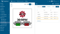
List of configured properties should look like this:
Step 6. Tag functions
There are two types of functions you may assign to each tag: state render function and on click action. Let’s review the signature of each function and define the tag functions for each tag. We will move from more simple functions and progress to more complex ones.
State render function
This JS function is responsible for changing the SVG element via SVG.js API and accepts two parameters:
- ctx is an instance of ScadaSymbolContext;
- element is an SVG.js element;
You may also notice the global state render function that is available in the general tab. This function is optional and is useful when you would like to define logic of the rendering for all tags in one place.
On click action
This JS function defines a logic for on click handler, and accepts three parameters:
- ctx is an instance of ScadaSymbolContext;
- element is an SVG.js element;
- event is an on click event that may be extended to other events in the future releases;
Tag configuration
onButtonText tag
Let’s start with defining the simple state render function for our “On” button text.
The only thing we need to do is to replace the hard-coded text from original SVG with the text configured by end-user via the onBtnLabel property:
- Go to the “Tag settings” of the “
onButtonText” tag and click “+ Add” button of a “State rendering function”; - Copy the function:
1
ctx.api.text(element, ctx.properties.onBtnLabel);
- Paste copied function into the appropriate window. Click “Apply”.
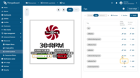
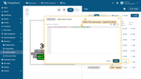
Key points:
- ctx.api is used to access the ‘text’ function and update the text of the element;
- ctx.properties is used to access the value of the onBtnLabel property.
Now you may click “Preview” button and change the corresponding property. Click “Apply” to see that the label of the “On” button has changed.
offButtonText tag
Similar to onButtonText:
- Go to the “Tag settings” of the “
offButtonText” tag and click “+ Add” button of a “State rendering function”; - Copy the function;
1
ctx.api.text(element, ctx.properties.offBtnLabel);
- Paste copied function into the appropriate window. Click “Apply”.
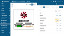
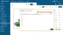
Key points:
- ctx.api is used to access the ‘text’ function and update the text of the element;
- ctx.properties is used to access the value of the onBtnLabel property.
onButtonBackground tag
Let’s change the background of the “On” button based on the value of the “fanOn” behavior item:
- Go to the “Tag settings” of the “
onButtonBackground” tag and click “+ Add” button of a “State rendering function”; - Copy the function:
1
2
3
4
5
if(ctx.values.fanOn){
  element.attr({fill: ctx.properties.onBtnDisabledColor});
} else {
  element.attr({fill: ctx.properties.onBtnColor});
}
- Paste copied function into the appropriate window. Click “Apply”.

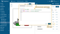
Key points:
- ctx.values is used to access the value of the fanOn behavior item;
- element.attr({fill: color}) is used to update “fill” attribute of the element;
- ctx.properties is used to access the value of the onBtnColor and onBtnDisabledColor color properties.
Now you may click “Preview” button and change the corresponding color properties. Click “Apply” to see that the background of the “On” button has changed.
offButtonBackground tag
Similar to offButtonBackground:
- Go to the “Tag settings” of the “
offButtonBackground” tag and click “+ Add” button of a “State rendering function”; - Copy the function:
1
2
3
4
5
if(ctx.values.fanOn){
  element.attr({fill: ctx.properties.offBtnColor});
} else {
  element.attr({fill: ctx.properties.offBtnDisabledColor});
}
- Paste copied function into the appropriate window. Click “Apply”.
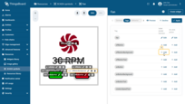
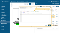
Key points:
- ctx.values is used to access the value of the fanOn behavior item;
- element.attr({fill: color}) is used to update “fill” attribute of the element;
- ctx.properties is used to access the value of the onBtnColor and onBtnDisabledColor color properties.
onButton tag
Let’s enable and disable the “On” button based on the state of the fan using the following state render function:
- Go to the “Tag settings” of the “
onButton” tag and click “+ Add” button of a “State rendering function”; - Copy the function:
1
2
3
4
5
if(!ctx.values.fanOn){
    ctx.api.enable(element);
} else {
    ctx.api.disable(element);
}
- Paste copied function into the appropriate window. Click “Apply”.

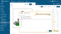
Key points:
- ctx.values accesses the value of the fanOn behavior item;
- ctx.api.disable disables user interaction, including the onClick handler if the fan is already on.
- ctx.api.enable enables user interaction, including the onClick handler if the fan is off.
Now let’s define the on click action for the button:
- Go to the “Tag settings” of the “
onButton” tag and click “+ Add” button of a “On click action”; - Copy the function:
1
2
3
4
5
6
7
8
9
ctx.api.disable(element);
ctx.api.callAction(event, 'onBtnClick', undefined, {
  next: () => {
     ctx.api.setValue('fanOn', true);
  },
  error: () => {
     ctx.api.enable(element);
  }
});
- Paste copied function into the appropriate window. Click “Apply”.

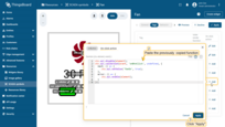
Key points:
- ctx.api.disable is used to disable the button immediately after receiving the onClick event to prevent spamming;
- ctx.api.callAction triggers the action defined by the onBtnClick behavior item;
- callAction accepts an event, actionId, optional parameters, and an Observer instance to handle the result;
- On successful action execution, the next function sets the fanOn value to true;
- If the action encounters an error, ctx.api.enable re-enables the button.
offButton tag
Similar to offButton, the state render function:
- Go to the “Tag settings” of the “
offButton” tag and click “+ Add” button of a “State rendering function”; - Copy the function:
1
2
3
4
5
if(ctx.values.fanOn){
  ctx.api.enable(element);
} else {
  ctx.api.disable(element);
}
- Paste copied function into the appropriate window. Click “Apply”.
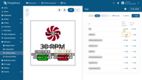
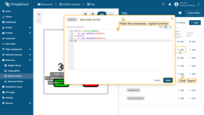
Key points:
- ctx.values accesses the value of the fanOn behavior item;
- ctx.api.disable disables user interaction, including the onClick handler if the fan is already on.
- ctx.api.enable enables user interaction, including the onClick handler if the fan is off.
Now let’s define the on click action for the button:
- Go to the “Tag settings” of the “
offButton” tag and click “+ Add” button of “On click action”; - Copy the function:
1
2
3
4
5
6
7
8
9
ctx.api.disable(element);
ctx.api.callAction(event, 'offBtnClick', undefined, {
  next: () => {
     ctx.api.setValue('fanOn', false);
  },
  error: () => {
     ctx.api.enable(element);
  }
});
- Paste copied function into the appropriate window. Click “Apply”.

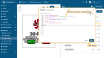
Key points:
- ctx.api.disable is used to disable the button immediately after receiving the onClick event to prevent spamming;
- ctx.api.callAction triggers the action defined by the onBtnClick behavior item;
- callAction accepts an event, actionId, optional parameters, and an Observer instance to handle the result;
- On successful action execution, the next function sets the fanOn value to true;
- If the action encounters an error, ctx.api.enable re-enables the button.
rotationSpeedText tag
Let’s use the showRotationSpeed, rotationSpeedFont, rotationSpeedColor, and rotationSpeedUnit properties to prettify our text label:
- Go to the “Tag settings” of the “
rotationSpeedText” tag and click “+ Add” button of a “State rendering function”; - Copy the function:
1
2
3
4
5
6
7
8
9
10
11
12
var show = ctx.properties.showRotationSpeed && ctx.values.fanOn;
if (show) {
  var speed = ctx.values.fanSpeed ? ctx.values.fanSpeed : 60;
  var font = ctx.properties.rotationSpeedFont;
  var color = ctx.properties.rotationSpeedColor;
  var text = ctx.api.formatValue(speed, 0, ctx.properties.rotationSpeedUnit);
  ctx.api.text(element, text);
  ctx.api.font(element, font, color);
  element.show();
} else {
  element.hide();
}
- Paste copied function into the appropriate window. Click “Apply”.
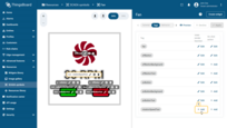
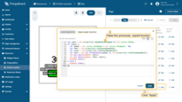
Key points:
- Line 1: The show variable is determined by both the showRotationSpeed property and the fanOn behavior item;
- Line 3: The speed variable either uses the fanSpeed behavior item or defaults to 60, primarily for the preview mode;
- Line 6: The text value is formatted using the speed variable and specified rotationSpeedUnit property;
- Line 7,8: Text content and its styling (font and color) are set;
- Line 9,11: Conditional display of the text element based on the show variable.
fan tag
Now let’s proceed with a bit more complex function to rotate a “fan” tag:
1
2
3
4
5
6
7
8
9
10
11
12
13
14
15
16
17
18
19
var on = ctx.values.fanOn;
var speed = ctx.values.fanSpeed ? ctx.values.fanSpeed /60 : 1;
var hasAnimation = element.remember('hasAnimation');

if (on) {
    element.attr({fill: ctx.properties.fanOnColor});
    if (!hasAnimation) {
        element.remember('hasAnimation', true);
        element.animate(1000).ease('-').rotate(360).loop();
    } else {
        element.timeline().play();
    }
    element.timeline().speed(speed);
} else {
    element.attr({fill: ctx.properties.fanOffColor});
    if (hasAnimation) {
        element.timeline().pause();
    }
}
Although the function is quite simple, it requires basic knowledge of SVG.js. Key points:
- Line 3: we use element.remember getter from SVG.js to get the state of the animation;
- Line 9: we use element.remember setter from SVG.js to set the state of the animation. It is important to avoid initialization of the animation on each call of the render function;
- Line 11: we use element.timeline.speed from SVG.js to define the speed of our animation that we convert from RPM to RPS;
- Line 14: we use element.timeline.pause from SVG.js to stop the animation if the fan is turned off;
The SVG.js animation is feature rich but has some performance impact on the main browser thread. We propose an alternative approach that utilizes CSS animation:
- Go to the “Tag settings” of the “
fan” tag and click “+ Add” button of a “State rendering function”; - Copy the function:
1
2
3
4
5
6
7
8
9
10
11
12
13
14
15
16
17
18
var on = ctx.values.fanOn;
var speed = ctx.values.fanSpeed ? ctx.values.fanSpeed / 60 : 1;
var animation = ctx.api.cssAnimation(element);

if (on) {
    element.attr({fill: ctx.properties.fanOnColor});
    if (!animation) {
        animation = ctx.api.cssAnimate(element, 2000)
                                      .rotate(360).loop().speed(speed);
    } else {
        animation.speed(speed).play();
    }
} else {
    element.attr({fill: ctx.properties.fanOffColor});
    if (animation) {
        animation.pause();
    }
}
- Paste copied function into the appropriate window. Click “Apply”.
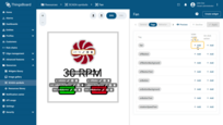
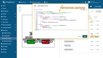
Key points:
- CSS animation is smoother and less resource consuming in most of the use cases;
- Line 3: we use
ctx.api.cssAnimationto get the current instance of the ScadaSymbolAnimation object; - Line 8: we use
ctx.api.cssAnimateto create a new instance of ScadaSymbolAnimation object that providing controls similar to SVG.js’s Runner; - Line 11: we use
animation.speed(speed).play()to define the speed of the animation and start it; - Line 16: we use
animation.pause()to stop the animation;
Now let’s define the on click action for the button:
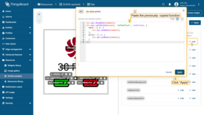
- Go to the “Tag settings” of the “
fan” tag and click “+ Add” button of “On click action”; - Copy the function:
1
2
3
4
5
6
7
8
9
ctx.api.disable(element);
ctx.api.callAction(event, 'onFanClick', undefined, {
  next: () => {
     ctx.api.enable(element);
  },
  error: () => {
     ctx.api.enable(element);
  }
});
- Paste copied function into the appropriate window. Click “Apply”.
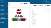
Best practices
Avoid manually setting behavior values, as shown in the ctx.api.setValue('fanOn', true) example. This is included to simplify debugging in preview mode but may not reflect the actual device status due to potential issues with command delivery or handling.
Recommended Pattern for Device Interaction:
- RPC to Device: Utilize Remote Procedure Calls (RPC) like
setFanStatefor short-lived commands when immediate application is expected and the device is known to be online. - Shared Attribute: Set a shared attribute, such as
targetFanState, to define the desired state of devices that may be offline. This ensures that the device eventually receives and applies updates once it is online. - Client Attributes or Time-Series Data: Use data delivered from the device, such as
fanState, as values in behavior items. This strategy ensures that the SCADA symbol’s behavior reflects actual device responses rather than merely the issuance of commands.
General state render function
As an alternative to configuring each tag rendering functions, we might configure everything in one place.
However, in case of global function you are working with the svg instead of a single tag element.
Use ctx.tags.[tagId], e.g. ctx.tags.rotationSpeedText to get the array of SVG elements for each tag.
Usually this array contains only one element, but in general case, your SVG file may have multiple elements that share the same tag id.
Step 7. Preview mode
In preview mode, you can check the behavior and the correctness of the settings of your future widget.
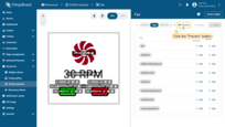
To enter preview mode, click the “Preview” button on the right side of the window. The left panel will display the SVG, and the right panel will show the widget configuration.
Let’s test the behavior of our widget:
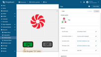
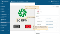
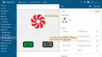
- Press the green “On” button. The button will become unclickable, its color should change to gray, the fan will change color from red to green and start spinning. The fan’s RPM value will display beneath it. Meanwhile, the “Off” button will become active and change its color from gray to red. Press it;
- The fan should stop, the “Off” button will become unclickable, and its color will turn gray again.
Step 8. Create widget
Now that we have finished configuring the widget, we need to create it. To do this:
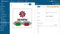
- Click the “Create widget” button in the upper right corner;
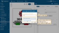
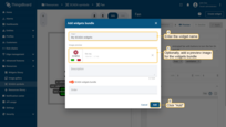
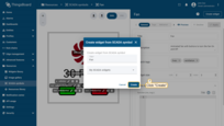
- In the new window, enter the name of the future widget and specify an existing widget bundle or create a new one. We will create a new one. Enter the desired name for it and click “Create new widget bundle”.
- Optionally, add a preview image for the widget bundle and click “Add”;
- Confirm the widget creation by clicking the “Create” button.
Download SCADA symbol
You can download the SCADA symbol with all settings. To do this, click the “Download SCADA symbol” button on the left panel of the SCADA symbol editor. The SVG file will be saved to your PC.
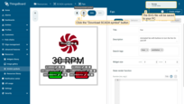
Here is an example of a configured SCADA symbol:
Widget’s test
Now let’s test our widget on the dashboard:
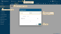
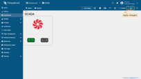
- Create a new dashboard or open existing one. Navigate to the “Layouts” settings, and change the layout from “Default” to “SCADA”. Click “Save”;
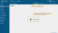
- Now, click the “Add widget” button at the top of the screen or click the large “Add new widget” icon in the center of the screen;
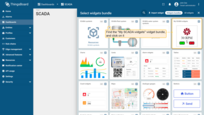
- Find the “My SCADA widgets” widget bundle and click on it;
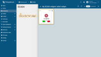
- Click on the “Fan” widget to add it to the dashboard;
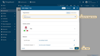
- Specify the target device (use any device), and click “Add”;
- Widget added. Click “Save” to save the changes to the dashboard;
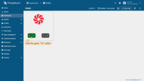
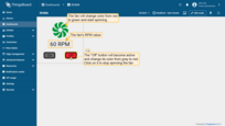
- Click the green “On” button. The button will become unclickable, its color should change to gray, the fan will change color from red to green and start spinning. The fan’s RPM value will display beneath it;
- Meanwhile, the “Off” button will become active and change its color from gray to red. Press it. The fan should stop, the “Off” button will become unclickable, and its color will turn gray again.
Reference
ScadaSymbolContext
The ScadaSymbolContext (represented as ctx in functions code) is a JavaScript object integral to interacting with SCADA symbols in ThingsBoard. It contains the following fields:
-
ctx.svg: This field accesses the root SVG node, acting as the primary entry point to the SVG’s DOM structure. -
ctx.tags: An object that categorizes all tagged SVG elements. These are grouped by their respective tag IDs (the object keys), such asctx.tags.myTagId. Each tag ID points to an array containing one or more SVG elements. -
ctx.values: Holds all values derived from behavior items of the type ‘value’. This field is crucial for dynamically updating the symbol according to data from the device or other sources. -
ctx.properties: Contains all properties defined for the SCADA symbol, allowing customization and configuration adjustments based on end-user requirements. -
ctx.api: Provides a reference to the SCADA symbol API, which includes methods for interacting with, modifying, and managing SVG elements and their associated actions.
This object is essential for developers to effectively create and manage interactive elements within SCADA symbols. See the definition of the interface below:
1
2
3
4
5
6
7
export interface ScadaSymbolContext {
    api: ScadaSymbolApi;
    tags: {[id: string]: Element[]};
    values: {[id: string]: any};
    properties: {[id: string]: any};
    svg: Svg;
}
ScadaSymbolApi
The ScadaSymbolApi (referred to as api when accessed via ScadaSymbolContext) is a comprehensive JavaScript interface designed for manipulating SCADA symbol elements in ThingsBoard. It encapsulates a variety of methods for creating, modifying, and managing interactions with SVG elements. Here are the primary functionalities provided by this API:
- generateElementId: Generates a unique identifier for an element. Useful if you want to create new elements.
1
 generateElementId: () => string
Returns: Newly generated element ID as a string.
- formatValue: Formats numeric values according to specified precision and unit conversions.
1
 formatValue: (value: any, dec?: number, units?: string | TbUnit, showZeroDecimals?: boolean) => string | undefined
Parameters:
- value: Numeric value to be formatted.
- dec (optional): Number of decimal digits. Typically obtained from
ctx.properties. - units (optional): Units to append to the formatted value. Typically obtained from
ctx.properties. - showZeroDecimals (optional): Specifies whether to keep zero decimal digits. Typically obtained from
ctx.properties.
Returns: Formatted value as a string or undefined if formatting fails.
- formatValue: Formats numeric values according to specified precision and unit conversions.
1
 formatValue: (value: any, settings: ValueFormatSettings) => string | undefined
Parameters:
- value: Numeric value to be formatted.
- settings: ValueFormatSettings object defining formatting options (decimals, units, ignoreUnitSymbol, showZeroDecimals).
Returns: Formatted value as a string or undefined if formatting fails.
- text: Sets or updates the text content of one or more SVG elements. Only applicable for elements of type SVG.Text and SVG.Tspan.
1
 text: (element: Element | Element[], text: string) => void
Parameters:
- element: SVG element or an array of SVG elements.
- text: Text to be set.
- font: Applies font styling and color to text elements. Only applicable for elements of type SVG.Text and SVG.Tspan.
1
 font: (element: Element | Element[], font: Font, color: string) => void
Parameters:
- element: SVG element or an array of SVG elements.
- font: Font settings object used to apply text element font. Typically obtained from
ctx.properties. - color: Color string used to apply text color of the element. Typically obtained from
ctx.properties.
- icon: Embeds an icon within SVG elements, with optional parameters for size, color, and center alignment. Only applicable for elements of type SVG.G
1
 icon: (element: Element | Element[], icon: string, size?: number, color?: string, center?: boolean) => void
Parameters:
- element: SVG element or an array of SVG elements.
- icon: Icon to draw. MDI icons supported. Typically obtained from
ctx.properties. - size (optional): Icon size in pixels. Typically obtained from
ctx.properties. - color (optional): Icon color. Typically obtained from
ctx.properties. - center (optional): Specifies whether to center the icon inside the group element.
- cssAnimate: Starts a CSS-based animation, providing controls similar to those available in SVG.js’s Runner. Finishes any previous CSS animation.
1
 cssAnimate: (element: Element, duration: number) => ScadaSymbolAnimation
Parameters:
- element: SVG element.
- duration: Animation duration in milliseconds.
Returns: Instance of ScadaSymbolAnimation to control the animation.
- cssAnimation: Retrieves the current CSS animation applied to an element.
1
  cssAnimation: (element: Element) => ScadaSymbolAnimation | undefined
Parameters:
- element: SVG element.
Returns: Current CSS animation instance or undefined if no animation is applied.
- resetCssAnimation: Stops and clears any CSS animations on an element, resetting it to its original state. Removes CSS animation instance.
1
  resetCssAnimation: (element: Element) => void
Parameters:
- element: SVG element.
- element: SVG element.
- finishCssAnimation: Immediately concludes any CSS animations, applying the final animation states to the element. Removes CSS animation instance.
1
  finishCssAnimation: (element: Element) => void
Parameters:
- element: SVG element.
- element: SVG element.
- disable: Disables interaction with one or more elements. E.g. no click action will be performed on user click.
1
  disable: (element: Element | Element[]) => void
Parameters:
- element: SVG element or an array of SVG elements.
- element: SVG element or an array of SVG elements.
- enable: Re-enables interaction with elements previously disabled. E.g. click action will be performed on user click.
1
  enable: (element: Element | Element[]) => void
Parameters:
- element: SVG element or an array of SVG elements.
- element: SVG element or an array of SVG elements.
- callAction: Triggers a specific behavior action by its ID, optionally passing values and observer callbacks.
1
  callAction: (event: Event, behaviorId: string, value?: any, observer?: Partial<Observer<void>>) => void
Parameters:
- event: SVG element.
- behaviorId: ID of the behavior item with type ‘Action’.
- value (optional): argument passed to the action.
- observer (optional): the result callback.
- setValue: Updates a value within the
ctx.valuesobject and triggers all rendering functions.1
setValue: (valueId: string, value: any) => void
Parameters:
- valueId: ID of the behavior item with type ‘Value’.
- value: New value to set.
- unitSymbol: Retrieves the target unit symbol based on the current unit system or the provided unit.
1
 unitSymbol: (unit: TbUnit) => string
Parameters:
- unit: Unit specification, either a string or a TbUnitMapping object defining unit mappings for different systems (e.g., METRIC, IMPERIAL, HYBRID).
Returns: The target unit symbol as a string, derived from the current unit system or the provided unit.
- convertUnitValue: Converts a numeric value from one unit to another using the provided unit specification.
1
 convertUnitValue: (value: number, unit: TbUnit) => number
Parameters:
- value: Numeric value to be converted.
- unit: Unit specification, either a string representing the source unit or a TbUnitMapping object for system-based conversion.
Returns: The converted numeric value. Returns the original value if conversion fails or no conversion is needed.
ScadaSymbolAnimation
The ScadaSymbolAnimation interface in ThingsBoard is designed to facilitate complex animations within SCADA symbols using CSS animation.
This interface allows developers to control animation aspects dynamically, offering a variety of methods to manipulate the animation’s behavior and properties.
Below are the key methods provided by the ScadaSymbolAnimation interface:
- running: Checks if the animation is currently running.
1
 running: () => boolean
Returns:
trueif the animation is running, otherwisefalse. - play: Starts or resumes the animation.
1
 play: () => void
- pause: Pauses the animation.
1
 pause: () => void
- stop: Stops the animation and resets its progress.
1
 stop: () => void
- finish: Completes the animation and jumps to the end state.
1
 finish: () => void
- speed: Sets the speed of the animation.
1
 speed: (speed: number) => ScadaSymbolAnimation
Parameters:
- speed: The speed factor (e.g., 2 for twice as fast).
Returns: Itself - an updated instance of
ScadaSymbolAnimation, allowing for chained method calls. - ease: Sets the easing function for the animation.
1
 ease: (easing: string) => ScadaSymbolAnimation
Parameters:
- easing: The easing type (e.g., ‘linear’, ‘ease-in’, ‘ease-out’).
Returns: Itself - an updated instance of
ScadaSymbolAnimation, allowing for chained method calls. - loop: Causes the animation to repeat a specified number of times.
1
 loop: (times?: number, swing?: boolean) => ScadaSymbolAnimation
Parameters:
- times (optional): The number of times to repeat the animation.
- swing (optional): If
true, the animation direction alternates.
Returns: Itself - an updated instance of
ScadaSymbolAnimation, allowing for chained method calls. - transform: Applies a matrix transform to the animated element.
1
 transform: (transform: MatrixTransformParam, relative?: boolean) => ScadaSymbolAnimation
Parameters:
- transform: The transformation object similar to SVG.js but with the following supported properties:
1
2
3
4
5
6
7
8
9
rotate?: number
scaleX?: number
scaleY?: number
ox?: number
originX?: number
oy?: number
originY?: number
translateX?: number
translateY?: number
- relative (optional): If
true, the transformation is relative to the current state.
- transform: The transformation object similar to SVG.js but with the following supported properties:
Returns: Itself - an updated instance of ScadaSymbolAnimation, allowing for chained method calls.
- rotate: Rotates the element around a point.
1
  rotate: (r: number, cx?: number, cy?: number) => ScadaSymbolAnimation
Parameters:
- r: Rotation angle in degrees.
- cx, cy (optional): The center of rotation.
Returns: Itself - an updated instance of
ScadaSymbolAnimation, allowing for chained method calls. - x: Moves the element along the x-axis.
1
  x: (x: number) => ScadaSymbolAnimation
Parameters:
- x: New x position.
Returns: Itself - an updated instance of
ScadaSymbolAnimation, allowing for chained method calls. - y: Moves the element along the y-axis.
1
  y: (y: number) => ScadaSymbolAnimation
Parameters:
- y: New y position.
Returns: Itself - an updated instance of
ScadaSymbolAnimation, allowing for chained method calls. - size: Sets the size of the element.
1
  size: (width: number, height: number) => ScadaSymbolAnimation
Parameters:
- width: New width.
- height: New height.
Returns: Itself - an updated instance of
ScadaSymbolAnimation, allowing for chained method calls. - width: Sets the width of the element.
1
  width: (width: number) => ScadaSymbolAnimation
Parameters:
- width: New width.
Returns: Itself - an updated instance of
ScadaSymbolAnimation, allowing for chained method calls. - height: Sets the height of the element.
1
  height: (height: number) => ScadaSymbolAnimation
Parameters:
- height: New height.
Returns: Itself - an updated instance of
ScadaSymbolAnimation, allowing for chained method calls. - move: Moves the element to a new position.
1
  move: (x: number, y: number) => ScadaSymbolAnimation
Parameters:
- x: New x position.
- y: New y position.
Returns: Itself - an updated instance of
ScadaSymbolAnimation, allowing for chained method calls. - dmove: Moves the element by the specified delta values.
1
  dmove: (dx: number, dy: number) => ScadaSymbolAnimation
Parameters:
- dx: Change in x position.
- dy: Change in y position.
Returns: Itself - an updated instance of
ScadaSymbolAnimation, allowing for chained method calls. - relative: Moves the element relative to its current position.
1
  relative: (x: number, y: number) => ScadaSymbolAnimation
Parameters:
- x: x increment.
- y: y increment.
Returns: Itself - an updated instance of
ScadaSymbolAnimation, allowing for chained method calls. - scale: Scales the element from a center point.
1
  scale: (x: number, y?: number, cx?: number, cy?: number) => ScadaSymbolAnimation
Parameters:
- x: Scale factor for x-axis.
- y (optional): Scale factor for y-axis.
- cx, cy (optional): Center point for scaling.
Returns: Itself - an updated instance of
ScadaSymbolAnimation, allowing for chained method calls. - attr: Sets the attributes of the element.
1
  attr: (attr: string | object, value?: any) => ScadaSymbolAnimation
Parameters:
- attr: Attribute name or an object with attribute-value pairs.
- value (optional): Value of the attribute if a single attribute name is provided.
Returns: Itself - an updated instance of
ScadaSymbolAnimation, allowing for chained method calls.
ConnectorScadaSymbolAnimation
The ConnectorScadaSymbolAnimation interface in ThingsBoard is designed to manage animations for SVG connector elements, specifically for flow animations along a defined path.
This interface provides methods to control the animation’s playback, appearance, speed, and direction, enabling dynamic manipulation of connector animations.
Below are the key methods provided by the ConnectorScadaSymbolAnimation interface:
- play: Starts or resumes the connector animation.
1
 play: () => void
Adds the animation path to the SVG element if not already present and begins the animation with a synchronized offset.
- stop: Stops the connector animation.
1
 stop: () => void
Ends the animation by stopping the animate element, pausing the flow effect.
- finish: Completes the connector animation and removes it.
1
 finish: () => void
Removes the animated path from the SVG element, effectively ending the animation.
- flowAppearance: Configures the visual appearance of the connector animation.
1
 flowAppearance: (width: number, color: string, linecap: StrokeLineCap, dashWidth: number, dashGap: number) => ConnectorScadaSymbolAnimation
Parameters:
- width: The stroke width of the animated path.
- color: The stroke color of the animated path (e.g., ‘#C8DFF7’).
- linecap: The stroke linecap style (‘butt’, ‘round’, or ‘square’).
- dashWidth: The width of the dash in the stroke dasharray.
- dashGap: The gap between dashes in the stroke dasharray.
Returns: Itself - an updated instance of
ConnectorScadaSymbolAnimation, allowing for chained method calls. - duration: Sets the speed of the connector animation.
1
 duration: (speed: number) => ConnectorScadaSymbolAnimation
Parameters:
- speed: The duration of the animation in seconds.
Returns: Itself - an updated instance of
ConnectorScadaSymbolAnimation, allowing for chained method calls. - direction: Sets the direction of the connector animation along the path.
1
 direction: (direction: boolean) => ConnectorScadaSymbolAnimation
Parameters:
- direction: If
true, uses the forward path; iffalse, uses the reversed path.
Returns: Itself - an updated instance of
ConnectorScadaSymbolAnimation, allowing for chained method calls. - direction: If

