The AI Card provides a comprehensive view of cumulative telemetry data over a selected time range, enriched with forecasting and an AI-generated summary. This visualization is ideal for monitoring energy consumption, sales metrics, equipment performance, or any cumulative measurements where understanding both historical trends and future projections is critical.
Key Features:
- Cumulative Telemetry: The chart displays cumulative values, where each data point represents the sum of the current and all previous readings within the selected period.
- Forecasting: The card includes a predicted trend for the upcoming period, helping you anticipate future values based on historical patterns.
- AI Summary: An automatically generated interpretation of the data provides quick insights without manual analysis.
Base AI Card
Follow these steps to create a Base AI Card:
Step 1: Select Your Telemetry Field. Choose the specific telemetry field you wish to analyze (e.g., energy consumption, temperature, sales volume).
Step 2: Configure the Value Column. Drag and drop your selected telemetry field into the Value column.
Step 3: Choose Your Time Range. Select the desired time range for analysis. The system uses this range to determine what data to display and what period to predict. Example: If today is October 27th and you select the This Month time range, the chart will show real data for the first 27 days and a prediction for the remaining 4 days (October 28th, 29th, 30th, and 31st).
Step 4: Build the Report. Once your telemetry and time range are configured, click the Build Report button to generate the card.
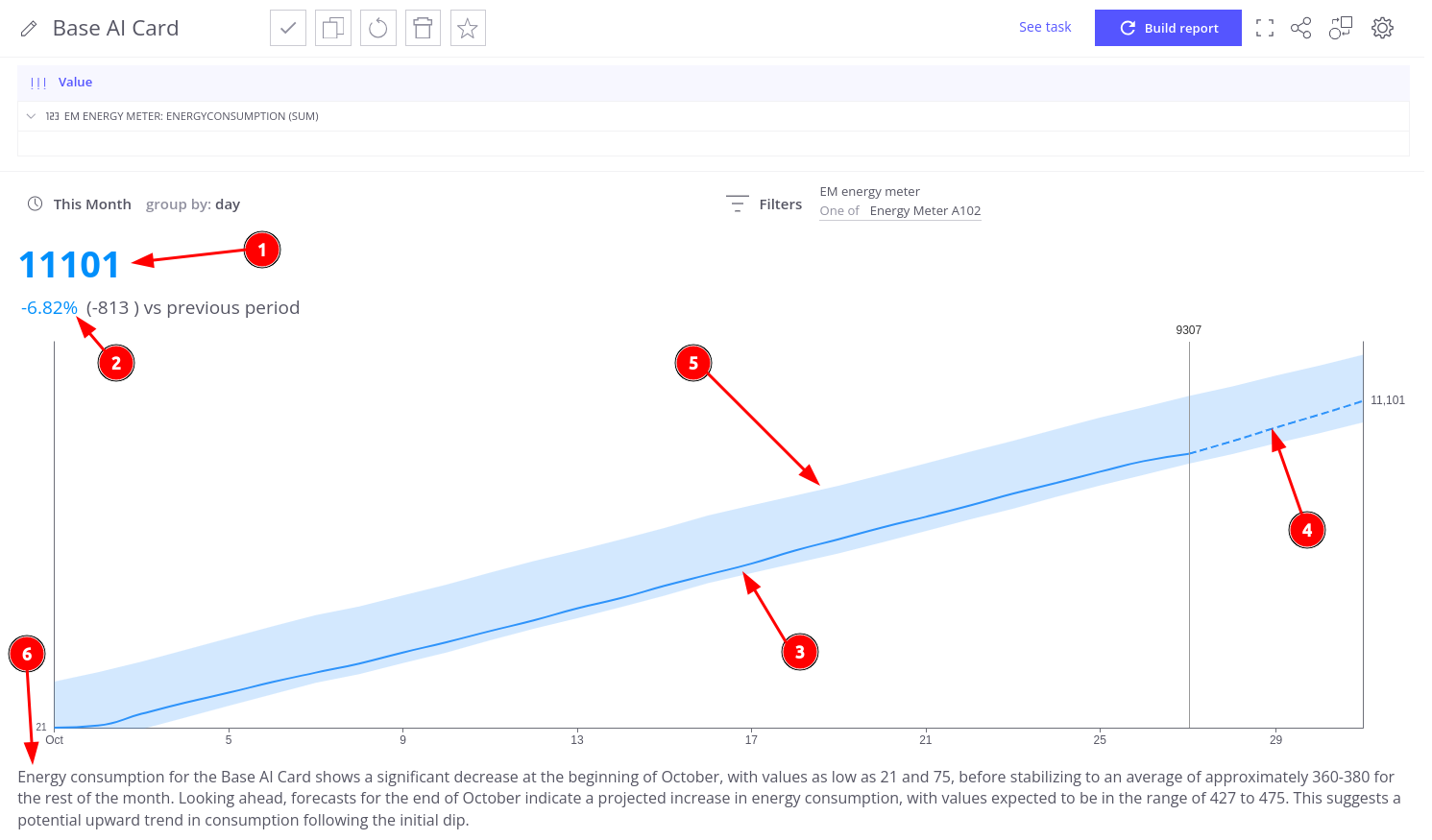
The AI Card presents the next key elements (numbered in the screenshot):
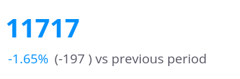
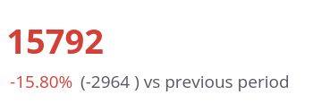
- Current Cumulative Value: The total cumulative value for the selected time range, including the predicted data. This value is color-coded based on performance thresholds
- Difference from Previous Period: Shows both the absolute change and percentage difference of the Current Cumulative Value compared to the equivalent previous period.
- Historical Data (Solid Line): Represents actual cumulative telemetry data recorded up to the current day.
- Predicted Data (Dashed Line): Extends past the current date to show the forecasted trend for the remainder of your selected period.
- Previous Period Trend Area (Shaded Region): Displays the cumulative trend from the previous equivalent period, providing a visual baseline for comparison against current data
- AI Summary: An automatically generated interpretation based on analysis of the previous period, current data, and predictions. The summary is created using your selected AI prompt.
AI Card Configuration
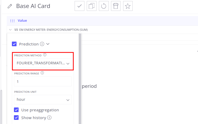
Prediction Configuration
Prediction Method
The AI Card uses Fourier Transformation as the default prediction method, but you can easily switch to alternative approaches based on your data characteristics.
To change the prediction method:
- Click on the telemetry field in the Value column to open settings
- Navigate to the Prediction section
- Select your desired method from the available options
Prediction Time Range
The AI Card’s primary goal is to provide complete analysis (historical plus predicted data) for a specific period.
We recommend using predefined ranges such as This Month or This Year to ensure the combined real and predicted data covers a meaningful, easy-to-interpret period. But you can select any custom time range. The system generates predictions specifically for all dates within that range that fall after the current timestamp.
Example Scenarios:
- This Month range: Combines actual data from the start of the month through today with predictions for the remaining days
- Custom range (Oct 1 - Nov 15): If today is October 27th, shows actual data for Oct 1-27 and predictions for Oct 28 - Nov 15
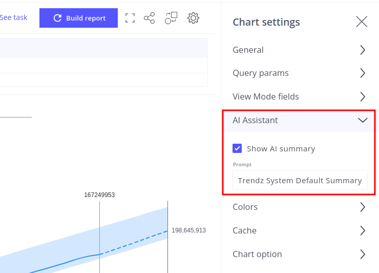
AI Summary Configuration
The AI Summary feature provides automatically generated interpretation of your cumulative telemetry data and trends. You control both the feature’s visibility and the analysis approach.
If you prefer not to use AI features on the card:
- Navigate to Chart settings → AI Assistant menu
- Uncheck Show AI summary
The AI prompt determines the focus and content of your generated summary, so you can select the prompt that in the best way interprets your data:
- Go to Chart settings → AI Assistant menu
- Select your desired prompt from the Prompt dropdown
You can create custom prompts tailored to your specific use cases. Learn more in the Trendz AI Prompts Overview
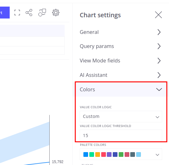
Value Color Threshold Logic
The AI Card uses color-coding to provide immediate visual feedback on the current cumulative value’s performance relative to the previous period.
The current cumulative value displayed at the top of the card changes color based on the magnitude of change compared to the previous period:
- Blue (Normal Performance): The value appears in blue when the absolute percentage change is within the threshold range (10% by default). This indicates stable, expected performance.
- Red (Significant Deviation): The value appears in red when the absolute percentage change exceeds the threshold (more than 10% by default). This signals a significant deviation or performance shift requiring attention.
Customizing the Threshold
You can adjust the sensitivity of the color-coding system through the Value Color Logic setting:
- Default: Uses the standard 10% threshold for all color calculations.
- Custom: Allows you to set a specific threshold percentage that matches your performance monitoring needs.
- Example: Set to 5% for more sensitive deviation alerts
- Example: Set to 20% for less frequent alerts on larger changes only
- Unset: Disables color-coding entirely. The current cumulative value displays without color highlighting, regardless of the percentage difference.