- Introduction
- Getting started:
- Prerequisites
- Step 1: Table with energy consumption by source
- Step 2: Table with energy consumption by area
- Step 3: Compare energy usage by source type
- Step 4: Compare current and previous year energy usage with monthly breakdown
- Step 5: Calculate carbon emissions and show dynamic over last 6 months
- Step 6: Create energy consumption analytic dashboard in ThingsBoard
- Summary
Introduction
In today’s competitive business landscape, companies are always looking for ways to reduce costs, improve their bottom line and implement sustainable business practices. One of the most significant expenses for many businesses is energy consumption, particularly those that operate out of large buildings. However, without accurate data on energy usage, identifying areas for improvement can be challenging. This includes tracking elements such as carbon emission accounting, an increasingly important aspect of sustainable operations. In this article, we will describe how to gain insights into energy usage patterns, identify areas for improvement, and implement measures to reduce costs, improve sustainability, and integrate carbon emission accounting into everyday business practices.
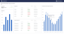
Task definition - create an analytic dashboard to analyze energy consumption sources in the building and identify areas for improvement.
Implementation plan
- Create a table with energy consumption data breakdown by source (HVAC, lighting, plug loads, elevators, etc.)
- Create similar table but with breakdown by areas inside a building (offices, meeting rooms, kitchen, storage, etc.)
- Stacked bar chart to compare energy consumption by source.
- Stacked bar chart to compare current and previous year with monthly breakdown.
- Calculate carbon emissions in a building
- Create ThingsBoard dashboard to visualize data with filtering options
Getting started:
Prerequisites
Energy meters already installed in the building and connected to ThingsBoard via MQTT API. To simplify data aggregation and analysis, each meter has 2 attributes:
sourceType- name of energy consumption source (HVAC, lighting, plug loads, elevators, etc.). There are multiple meters with the same source.area- name of the area where it is installed (office, meeting room, hall kitchen, etc.). There are multiple meters in the area.
Energy meters has relations to the Building asset. Each building has relation to the Customer. Such relations simplify data aggregation and analysis on different levels - we can track metrics for specific building or for all buildings of specific customer.
Step 1: Table with energy consumption by source
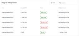
We have many different energy consumption sources in the building. To understand energy usage structure we will compute following metrics for each consumption source type:
- Energy consumed in kWh
- Price in USD
- CO2 emissions in kg
This table report should be able to show data for any building and any time range. Also user should be able to filter data by source type, area and building. Let’s get started:
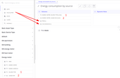
- Create table view in Trendz
- Add
energyMeter.sourceTypeinto columns section - it allows to split readings from energy meters by source type of the meter. - Add
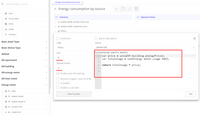
energyMeter.usageKWHinto columns section with aggregationSUM- this field shows total energy usage for each source. - Add calculated field with label Price, set unit to
$and decimals to2. Here is a code to calculate total price for each source based on the energy price in the building:
1
2
3
4
var price = uniq(building.energyPrice);
var totalUsage = sum(energyMeter.usageKWH);

return totalUsage * price;
- Add calculated field with label CO2 emissions, set unit to
kg CO2eand decimals to1
1
2
3
4
var emissionConversionFactor = 0.21233;
var totalUsage = sum(energyMeter.usageKWH);

return totalUsage * emissionConversionFactor;
To make it easier to end users to understand the report lets sort it descending by default and add filter options:
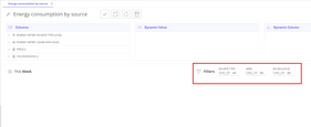
- Add
energyMeter.sourceTypeinto filters section - Add
energyMeter.areainto filters section - Add
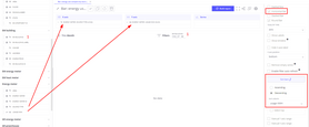
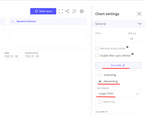
buildinginto filters section - Open view settings,
Generalsection and configure default sorting- Click on
Sort order - Enable descending sorting
- Sort column -
usageKWH
- Click on
- Set default time range - this month
- Save report with the name Energy consumption by source
Report is ready, latter we will add it to the dashboard.
Step 2: Table with energy consumption by area
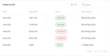
Similar table report can be created, but in this case we will focus on areas instead of source types. For making that we should repeat the same steps as in the previous table report.
The only difference is to use energyMeter.area instead of energyMeter.sourceType field. Save view with the following name - Energy consumption by area.
Step 3: Compare energy usage by source type
Tables created in previous steps are usefull to get exact numbers about energy usage. But they are not ideal for quick compare of different consumption sources. To make it easier to compare energy usage by source type we will create a stacked bar chart.
- Create bar chart in Trendz
- Add
energyMeter.sourceTypeinto X-axis section - Add
energyMeter.usageKWHinto Y-axis section - Add
buildinginto filters section - Set default time range - this month
- Open view settings,
Generalsection and configure default sorting- Click on
Sort order - Enable descending sorting
- Sort column -
usageKWH
- Click on
- Make bar chart horizontal by enabling
Horizontal Barcheckbox in view settings - Save report with the name Bar: energy use compare by sources
With such visualization it would be much quicker and easier understand top consumers in the system.
Step 4: Compare current and previous year energy usage with monthly breakdown
To better understand year over year and month over month dynamic of energy usage we will create a bar chart that will show monthly consumption. Also we will split it into multiple series to compare monthly energy consumption in different years. Here is a description how to do that:
- Create bar chart in Trendz
- Add
Datefield with typeMONTHinto X-axis section - it allows to split data by months - Add
energyMeter.usageKWHinto Y-axis section - Add
Datefield with typeYEARinto Series section - it allows to split data by year - Add
energyMeter.sourceTypeinto filters section - Add
energyMeter.areainto filters section - Add
buildinginto filters section - Set default time range - last 3 years
- Save report with the name Bar: compare year-to-year energy usage
Such visualization allows to quickly identify months with high energy consumption and compare it with previous year to understand year to year dynamic.
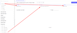


Step 5: Calculate carbon emissions and show dynamic over last 6 months
Final card should show overall CO2 footprint of the building to simplify carbon emission accounting. Showing only 1 metric is not interesting because it does not describe the whole picture. Since we work on energy usage analysis let’s add additional insights to this card. First one would be a comparison with the previous time period. Second one would be a dynamic of carbon emissions over the last 6 months as a sparkline chart.
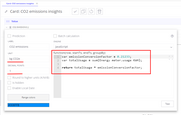
- Create
Card with line chartview in Trendz - Add calculated field with label CO2 emissions, set unit to
kg CO2eand decimals to1
1
2
3
4
var emissionConversionFactor = 0.21233;
var totalUsage = sum(energyMeter.usageKWH);

return totalUsage * emissionConversionFactor;
- Set default time range to this month
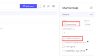
Now we have card with CO2 emissions for the current month and with daily breakdown which would highlight abnormal behaviour and trend line. Now let’s enable comparison:
- Open
Generalview settings - Set checkbox
Enable comparisontotrue - Set card title to CO2 emissions
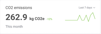
- Save view with name Card: CO2 emissions insights
Now our card has comparison of CO2 emissions. Value that we see is in percent compared to the previous time period. By default, value is green if it is higher than previous period and red if it is lower.
But we can reverse color schema by enabling Reverse compariosn colors in view settings.
Step 6: Create energy consumption analytic dashboard in ThingsBoard
In final step we will connect all views that we created into 1 interactive dashboard for our users. That dashboard can be shared with all our customers and it will show only data that is relevant to the user. They would be able to use filters to select buildings, consumption sources and areas. We begin with adding all Trendz views that we created on one dashboard in ThingsBoard:
- In ThingsBoard create dashboard with name Energy consumption report
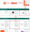
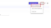
- In Trendz: for each widget that we created in previous steps:
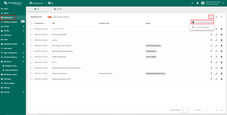
- Click on
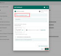
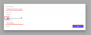
Share to ThingsBoardbutton and copyAdd on Dashboard. - Select Energy consumption report dashboard.
- Enable Create alias checkbox.
- Select
Buildingas a filter.
- Click on
- Return to ThingsBoard Energy consumption report dashboard and tune dashboard layout.
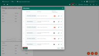
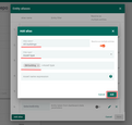
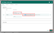
Then we would create dashboard aliases that will be used to filter data in the dashboard.
- Create new alias All buildings - this alias would hold all buildings that are visible to the user.
- Filter type - Asset type
- Asset type - Building
- Create new alias Selected entity - this alias would hold an Entity that user clicked on.
- Filter type - Entity from dashboard state
- State entity parameter name -
selectedEntity
Finally, we have to add hierarchy widget that will show all buildings/floors/areas in the hotel and allow user to select specific area. Once user would click on entity - Filtered areas alias will refresh and load all areas for the selected entity. After that all Trendz widgets on the dashboard would be updated because they use Filtered areas alias as a datasource. As a result user will see occupancy data for the selected areas.
- Add ThingsBoard table widget
Cards->Entities tableto the dashboard. It will show all buildings that are visible for the user.- Set datasource alias to All buildings
- Latest data key - Name
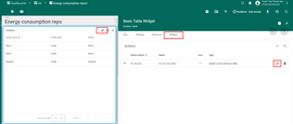
- Add
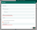
On row clickaction for entity table widget. It will updateselectedEntityparameter in the dashboard state.- Action type -
Update current dashboard state - State entity parameter name -
selectedEntity
- Action type -
- For all Trendz widgets on the dashboard set datasource alias to
selectedEntity. - Save dashboard.
Summary
Reducing energy consumption and carbon emissions is crucial for businesses looking to improve their bottom line and sustainability. To achieve this, gaining insights into energy usage patterns and identifying areas for improvement is essential. By following the implementation plan outlined in this article, businesses can create an analytic dashboard to visualize their energy consumption data by source and areas inside the building, compare current and previous years with monthly breakdown, and compute CO2 emissions. These steps can help businesses reduce costs, improve sustainability, and contribute to a more sustainable future. By taking a proactive approach to energy consumption, businesses can position themselves for long-term success in a competitive business landscape.
