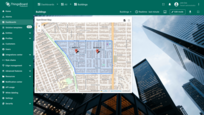
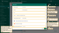
Actions feature can be treated as navigation among dashboard’s states or between different dashboards. Actions allow quickly and easily configuring the transition to created state, transferring to other dashboards, or even updating the dashboard you are in. Depending on the widget, the action sources differ. However, the type of action you are able to choose will be the same for all widgets. Actions can be configured both when editing and creating the required widget.
In this guide, we will configure actions in the editing mode using the Entities table widget as an example. Please, learn here how to add an Entity table widget to your dashboard.
To fully understand how to use Actions, you have to add a State to your dashboard. You can find information on how to do this here.
Add action
Let's add your first action. In this step, we will outline only the general steps without going into the details of each setting. Examples of using each type of action and action source will be covered later in the guide for better understanding.
Most widgets offer two configuration options: basic and advanced. Accordingly, the process of adding actions differs slightly between these modes. Let’s explore both:
If you're using the basic widget configuration:
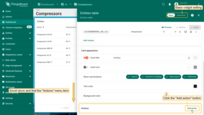
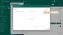
- Enter the editing mode of the widget to which you want to add an action, scroll down and find the “Actions” menu item;
- Click the “Add action” button (once you have created one or more actions, the “Add actions” button will change to the
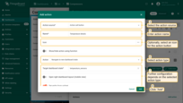
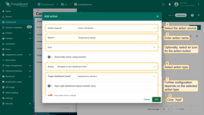
+icon). The “Actions” window will open. Right now, it’s empty, but later it will display all created actions; - Click the ‘plus’ icon in the top right corner of the screen to open a new “Add action” window. Here you must configure a new action by entering a name, specifying the action source, and selecting the action type. Further action configuration will depend on the selected action type. Then, click “Add” to proceed;
- Now in the “Actions” window, you can see the configured action, allowing you to double-check the action source, icon, and action type. Click “Save”;
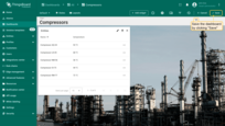
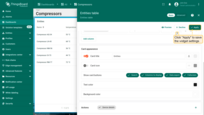
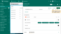
- Click “Apply” to save the widget settings;
- Save the dashboard by clicking “Save” in the upper right corner of the dashboard page.
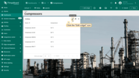


If you're using the advanced widget settings:
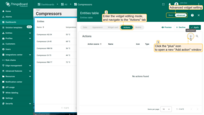
- Enter the widget editing mode, and navigate to the “Actions” tab. Currently, it is empty, but later all created actions will be displayed here;
- Click the “plus” icon in the top right corner of the screen to open a new “Add action” window. Here you must configure a new action by entering a name, specifying the action source, and selecting the action type. Further action configuration will depend on the selected action type. Then, click “Add” to proceed;
- Now, you can see the configured action, so you can double-check the action source, icon, and action type. Click “Save”;
- Click “Apply” to save the widget settings;
- Save the dashboard by clicking “Save” in the upper right corner of the dashboard page.

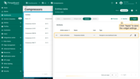
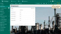
Now, you can use the action. This can involve clicking on a separate button, the widget title, an individual row of entity, etc.
Action types
The types of action define the specific action that will be taken. There are seven action types that are applicable to all widgets:
- Navigate to new dashboard state - transfers you to the specified state within the current dashboard;
- Update current dashboard state - updates the dashboard that you are currently on;
- Navigate to other dashboard - transfers you to a specified dashboard;
- Custom action - allows manual configuration of a function for an individual action on your widget;
- Custom action (with HTML template) - allows manual entry of a function within an existing HTML template;
- Mobile action - allows the use of various mobile device functions such as taking photos, scanning QR codes, getting device location, making phone calls and so on;
- Open URL - allows you to go to any resource represented by a URL.
There is also a special action type available exclusively for Map widgets:
- Place map item — allows you to create and place a new entity directly on the map widget in just a few clicks.
Let's consider each of these types of actions separately.
Navigate to new dashboard state
States are so-called levels that allow you to navigate between different devices, assets, and widget objects to see the information you need in more detail. When choosing the Navigate to new dashboard state action type, you will be transferred to the previously created state of your choice.
We assume that you have already added a new state to the dashboard and familiarized yourself with the “Add action” step. Therefore, we will proceed directly to the action configuration step.
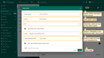
- Enter edit widget mode and open “Add action” window;
- As an example for this manual, select “Action cell button” action source;
- Input a name for the action and select an icon that will represent a button. With this icon, action will be performed;
- Select a “Navigate to new dashboard state” action type from the “Action” drop-down menu;
- After choosing an action type, the “Target dashboard state” drop-down menu appears. Select a previously created state you’d like to be transitioned to;
- When the desired state has been selected, click the “Add” button at the bottom of the “Add action” window;
- Now in the “Actions” window, you can see the configured action, allowing you to double-check the action source, icon, and action type. Click “Save”, and then click “Apply” to save the widget settings.
- Save the dashboard by clicking “Save” in the upper right corner of the dashboard page.


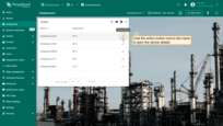
After saving your changes, you’ll see an action icon next to each entity. Click on any of them. You will be transferred to the state specified in the action.
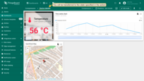
Open new dashboard state in a separate dialog or in a popup window
There are times when it doesn’t make sense to move to a separate dashboard state to view the details of a widget, and you just want to open it on the same dashboard page. For these situations, there is an Dashboard state display option feature that allows opening another state on the same page in a separate dialog box or in a popup window.
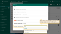
In the action settings, select the desired dashboard state display option and make additional window settings such as show/hide dashboard toolbar, popup window width and height, etc.
As an example, consider displaying the new dashboard state in a separate dialog window:
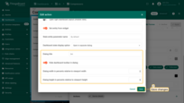
- Select an “Open in separate dialog” option in the “Dashboard state display option” field;
- By default, the checkbox “Hide dashboard toolbar in dialog” is ticked. If you need to see a toolbar in the dialog window, you should uncheck it. The toolbar displays entities, time window, dashboard export button, and expand to a fullscreen button;
- It is optional to adjust a dialog width and height in percents. Width is relative to viewport height, and height is relative to width correspondingly;
- When the action has been configured, save all changes.
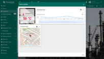
To perform an action and open a dialog window with the new state, click an action button next to any entity.

Update current dashboard state
This action type allows updating a dashboard that you are currently on. While using a dashboard, you can view detailed information about a specific device/asset in real-time. The most common use of this action type is through Chart widgets where you can see the details more accurately.
For this example, in addition to the “Entities table” widget, you need to add another widget to your dashboard - “Timeseries Line Chart”. As a data source, specify the asset type “Entity from dashboard state”:
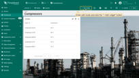
- Enter edit mode of the dashboard and click the "Add new widget" button at the top of the screen;
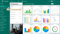
- Find the "Charts" widget bundle and click on it;
- Select the "Time series chart" widget;
- Navigate to the "Entity alias" tab in the "Datasource" section. Enter the desirable alias name in the "Entity alias" field and click the "Create a new one!" button;
- Select the "Entity from dashboard state" from the "Filter type" field and click "Add";
- Replace the label of the "temperature" key with ${entityName}. Then, click "Add" to add new widget on the dashboard;
- Drag the "Time series chart" widget to a free space and resize it.

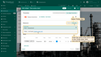
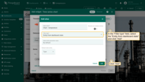
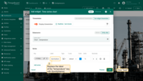
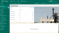
Now let’s add an action with the type “Update current dashboard state” for the “Entities table” widget. We assume that you are already familiar with the “Add action” step. Therefore, we will proceed directly to the action configuration step.
- Enter edit widget mode and open “Add action” window;
- As an example for this manual, select “Action cell button” action source;
- Input a name for the action and select an icon that will represent a button. With this icon, action will be performed;
- Select an “Update current dashboard state” action type from the “Action” drop-down menu;
- Click the “Add” button at the bottom of the “Add action” window;
- Now in the “Actions” window, you can see the configured action, allowing you to double-check the action source, icon, and action type. Click “Save”, and then click “Apply” to save the widget settings.
- Save the dashboard by clicking “Save” in the upper right corner of the dashboard page.
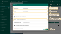
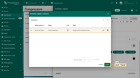
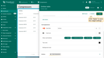
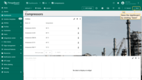
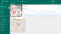
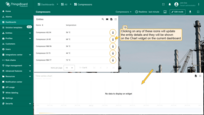
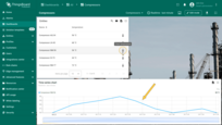
After saving changes, you will see icons opposite the entity names in the “Entities table” widget. Clicking on any of these icons will update the entity details, and they will be shown on the “Timeseries Line Chart” widget on the current dashboard.
Navigate to other dashboard
This type of action transfers you to a previously created dashboard of your choice.
We assume that you are already familiar with the “Add action” step. Therefore, we will proceed directly to the action configuration step.
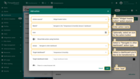
- Enter edit widget mode and open “Add action” window;
- As an example for this manual, select “Widget header button” action source;
- Input a name for the action and select an icon that will represent a button. With this icon, action will be performed;
- Select a “Navigate to other dashboard” action type from the “Action” drop-down menu;
- After choosing an action type, the “Target dashboard state” drop-down menu appears. Select a dashboard you’d like to be transitioned to. Note that you can also navigate to an existing state of the selected dashboard;
- When the desired dashboard has been selected, click the “Add” button at the bottom of the “Add action” window;
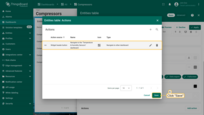
- Now in the “Actions” window, you can see the configured action, allowing you to double-check the action source, icon, and action type. Click “Save”, and then click “Apply” to save the widget settings;
- Save the dashboard by clicking “Save” in the upper right corner of the dashboard page.
After saving the changes, you can see an icon in the upper right part of the widget. Click this icon. You will be transferred to the previously selected dashboard (or chosen state in that dashboard).


Custom action
A Custom action allows manually configuring a function that can be used to add an individual action to your widget (for example deleting listed devices/assets). To configure a custom action with a function (with an example of a device deletion):
We assume that you are already familiar with the “Add action” step. Therefore, we will proceed directly to the action configuration step.
- Enter edit widget mode and open “Add action” window;
- As an example for this manual, select “Action cell button” action source;
- Input a name for the action and select an icon that will represent an action button. With this icon, action will be performed;
- Select a “Custom action” action type from the “Action” drop-down menu;
- After choosing a Custom action type, a field for inputting a function will appear;
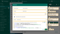
- Enter your custom function there. An example in this manual is an action that adds the ability to delete devices right from the table (you will find an example of this function below);
An example of the function for a device deletion (click to expand):
1
2
3
4
5
6
7
8
9
10
11
12
13
14
15
16
17
18
19
20
21
22
23
24
25
let $injector = widgetContext.$scope.$injector;
let dialogs = $injector.get(widgetContext.servicesMap.get('dialogs'));
let deviceService = $injector.get(widgetContext.servicesMap.get('deviceService'));

openDeleteDeviceDialog();

function openDeleteDeviceDialog() {
    let title = "Are you sure you want to delete the device " + entityName + "?";
    let content = "Be careful, after the confirmation, the device and all related data will become unrecoverable!";
    dialogs.confirm(title, content, 'Cancel', 'Delete').subscribe(
        function(result) {
            if (result) {
                deleteDevice();
            }
        }
    );
}

function deleteDevice() {
    deviceService.deleteDevice(entityId.id).subscribe(
        function() {
            widgetContext.updateAliases();
        }
    );
}
- After input function, click the “Add” button at the bottom of the “Add action” window;
- Now in the “Actions” window, you can see the configured action, allowing you to double-check the action source, icon, and action type. Click “Save”, and then click “Apply” to save the widget settings;
- Save the dashboard by clicking “Save” in the upper right corner of the dashboard page.


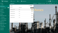
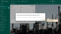
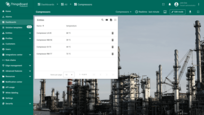
After saving the changes, you will see an action button next to the entity names in the “Entities Table” widget. Clicking on one of them will perform the action of deleting the corresponding object.
Custom action (with HTML template)
A Custom action with an HTML template allows manually entering a function in an existing HTML template (for example creating dialog windows with an opportunity to create or edit listed devices/assets). After choosing a Custom action type (with HTML template), four tabs appear for setting up the action:
-
“Resources” tab is used to specify external JavaScript/CSS resources used by the widget;
-
“CSS” tab contains custom action specific CSS style definitions;
-
“HTML” tab contains custom action HTML code;
-
“JavaScript” tab contains JS code of your custom action.
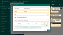
In this example, we will add two action buttons. In the upper right corner of the widget there will be located action button for adding new entities. The second action will be responsible for the buttons next to the entity names for editing these entities.
Let’s start with the action button for adding new entities. We assume that you have already completed the “Add action” step. Therefore, we will proceed directly to the action configuration step.
- Enter edit widget mode and open “Add action” window;
- As an example for this manual, select “Widget header button” action source;
- Input a name for the action and select an icon that will represent an action button. With this icon, action will be performed;
- Select a “Custom action (with HTML template)” action type from the “Action” drop-down menu;
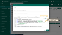
- In the tabs that appear, select “JavaScript” tab. Enter a JavaScript function for your custom action. In this example, we use a function that adds the ability to create a new entity (you will find an example of this function below);
Example of a JavaScript function that adds the ability to add a device or an asset (click to expand):
1
2
3
4
5
6
7
8
9
10
11
12
13
14
15
16
17
18
19
20
21
22
23
24
25
26
27
28
29
30
31
32
33
34
35
36
37
38
39
40
41
42
43
44
45
46
47
48
49
50
51
52
53
54
55
56
57
58
59
60
61
62
63
64
65
66
67
68
69
70
71
72
73
74
75
76
77
78
79
80
81
82
83
84
85
86
87
88
89
90
91
92
93
94
95
96
97
98
99
100
101
102
103
104
105
106
107
108
109
110
111
112
113
114
115
116
117
118
119
120
121
122
123
124
125
126
127
let $injector = widgetContext.$scope.$injector;
let customDialog = $injector.get(widgetContext.servicesMap.get('customDialog'));
let assetService = $injector.get(widgetContext.servicesMap.get('assetService'));
let deviceService = $injector.get(widgetContext.servicesMap.get('deviceService'));
let attributeService = $injector.get(widgetContext.servicesMap.get('attributeService'));
let entityRelationService = $injector.get(widgetContext.servicesMap.get('entityRelationService'));

openAddEntityDialog();

function openAddEntityDialog() {
customDialog.customDialog(htmlTemplate, AddEntityDialogController).subscribe();
}

function AddEntityDialogController(instance) {
let vm = instance;

    vm.allowedEntityTypes = ['ASSET', 'DEVICE'];
    vm.entitySearchDirection = {
        from: "FROM",
        to: "TO"
    }

    vm.addEntityFormGroup = vm.fb.group({
     entityName: ['', [vm.validators.required]],
     entityType: ['DEVICE'],
     entityLabel: [null],
     type: ['', [vm.validators.required]],
     attributes: vm.fb.group({
         latitude: [null],
         longitude: [null],
         address: [null],
         owner: [null],
         number: [null, [vm.validators.pattern(/^-?[0-9]+$/)]],
         booleanValue: [null]
     }),
     relations: vm.fb.array([])
    });

    vm.cancel = function() {
        vm.dialogRef.close(null);
    };

    vm.relations = function() {
        return vm.addEntityFormGroup.get('relations');
    };

    vm.addRelation = function() {
        vm.relations().push(vm.fb.group({
         relatedEntity: [null, [vm.validators.required]],
         relationType: [null, [vm.validators.required]],
         direction: [null, [vm.validators.required]]
        }));
    };

    vm.removeRelation = function(index) {
        vm.relations().removeAt(index);
        vm.relations().markAsDirty();
    };

    vm.save = function() {
        vm.addEntityFormGroup.markAsPristine();
        saveEntityObservable().subscribe(
            function (entity) {
                widgetContext.rxjs.forkJoin([
                    saveAttributes(entity.id),
                    saveRelations(entity.id)
                ]).subscribe(
                    function () {
                        widgetContext.updateAliases();
                        vm.dialogRef.close(null);
                    }
                );
            }
        );
    };

    function saveEntityObservable() {
        const formValues = vm.addEntityFormGroup.value;
        let entity = {
            name: formValues.entityName,
            type: formValues.type,
            label: formValues.entityLabel
        };
        if (formValues.entityType == 'ASSET') {
            return assetService.saveAsset(entity);
        } else if (formValues.entityType == 'DEVICE') {
            return deviceService.saveDevice(entity);
        }
    }

    function saveAttributes(entityId) {
        let attributes = vm.addEntityFormGroup.get('attributes').value;
        let attributesArray = [];
        for (let key in attributes) {
            if(attributes[key] !== null) {
                attributesArray.push({key: key, value: attributes[key]});
            }
        }
        if (attributesArray.length > 0) {
            return attributeService.saveEntityAttributes(entityId, "SERVER_SCOPE", attributesArray);
        }
        return widgetContext.rxjs.of([]);
    }

    function saveRelations(entityId) {
        let relations = vm.addEntityFormGroup.get('relations').value;
        let tasks = [];
        for(let i=0; i < relations.length; i++) {
            let relation = {
                type: relations[i].relationType,
                typeGroup: 'COMMON'
            };
            if (relations[i].direction == 'FROM') {
                relation.to = relations[i].relatedEntity;
                relation.from = entityId;
            } else {
                relation.to = entityId;
                relation.from = relations[i].relatedEntity;
            }
            tasks.push(entityRelationService.saveRelation(relation));
        }
        if (tasks.length > 0) {
            return widgetContext.rxjs.forkJoin(tasks);
        }
        return widgetContext.rxjs.of([]);
    }
}
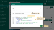
- In “HTML” tab, enter an HTML code for your custom action (you will find an example of this function below);
Example of a HTML code that adds the ability to add a device or an asset (click to expand):
1
2
3
4
5
6
7
8
9
10
11
12
13
14
15
16
17
18
19
20
21
22
23
24
25
26
27
28
29
30
31
32
33
34
35
36
37
38
39
40
41
42
43
44
45
46
47
48
49
50
51
52
53
54
55
56
57
58
59
60
61
62
63
64
65
66
67
68
69
70
71
72
73
74
75
76
77
78
79
80
81
82
83
84
85
86
87
88
89
90
91
92
93
94
95
96
97
98
99
100
101
102
103
104
105
106
107
108
109
110
111
112
113
114
115
116
117
118
119
120
121
122
123
124
125
126
127
128
129
130
131
132
133
134
135
136
137
138
139
140
141
142
143
144
145
146
147
148
149
150
151
152
153
154
155
<form #addEntityForm="ngForm" [formGroup]="addEntityFormGroup"
      (ngSubmit)="save()" class="add-entity-form">
    <mat-toolbar fxLayout="row" color="primary">
        <h2>Add entity</h2>
        <span fxFlex></span>
        <button mat-icon-button (click)="cancel()" type="button">
            <mat-icon class="material-icons">close</mat-icon>
        </button>
    </mat-toolbar>
    <mat-progress-bar color="warn" mode="indeterminate" *ngIf="isLoading$ | async">
    </mat-progress-bar>
    <div style="height: 4px;" *ngIf="!(isLoading$ | async)"></div>
    <div mat-dialog-content fxLayout="column">
        <div fxLayout="row" fxLayoutGap="8px" fxLayout.xs="column"  fxLayoutGap.xs="0">
            <mat-form-field fxFlex class="mat-block">
                <mat-label>Entity Name</mat-label>
                <input matInput formControlName="entityName" required>
                <mat-error *ngIf="addEntityFormGroup.get('entityName').hasError('required')">
                    Entity name is required.
                </mat-error>
            </mat-form-field>
            <mat-form-field fxFlex class="mat-block">
                <mat-label>Entity Label</mat-label>
                <input matInput formControlName="entityLabel" >
            </mat-form-field>
        </div>
        <div fxLayout="row" fxLayoutGap="8px" fxLayout.xs="column"  fxLayoutGap.xs="0">
            <tb-entity-type-select
                    class="mat-block"
                    formControlName="entityType"
                    [showLabel]="true"
                    [allowedEntityTypes]="allowedEntityTypes"
            ></tb-entity-type-select>
            <tb-entity-subtype-autocomplete
                    fxFlex *ngIf="addEntityFormGroup.get('entityType').value == 'ASSET'"
                    class="mat-block"
                    formControlName="type"
                    [required]="true"
                    [entityType]="'ASSET'"
            ></tb-entity-subtype-autocomplete>
            <tb-entity-subtype-autocomplete
                    fxFlex *ngIf="addEntityFormGroup.get('entityType').value != 'ASSET'"
                    class="mat-block"
                    formControlName="type"
                    [required]="true"
                    [entityType]="'DEVICE'"
            ></tb-entity-subtype-autocomplete>
        </div>
        <div formGroupName="attributes" fxLayout="column">
            <div fxLayout="row" fxLayoutGap="8px" fxLayout.xs="column"  fxLayoutGap.xs="0">
                <mat-form-field fxFlex class="mat-block">
                    <mat-label>Latitude</mat-label>
                    <input type="number" step="any" matInput formControlName="latitude">
                </mat-form-field>
                <mat-form-field fxFlex class="mat-block">
                    <mat-label>Longitude</mat-label>
                    <input type="number" step="any" matInput formControlName="longitude">
                </mat-form-field>
            </div>
            <div fxLayout="row" fxLayoutGap="8px" fxLayout.xs="column"  fxLayoutGap.xs="0">
                <mat-form-field fxFlex class="mat-block">
                    <mat-label>Address</mat-label>
                    <input matInput formControlName="address">
                </mat-form-field>
                <mat-form-field fxFlex class="mat-block">
                    <mat-label>Owner</mat-label>
                    <input matInput formControlName="owner">
                </mat-form-field>
            </div>
            <div fxLayout="row" fxLayoutGap="8px" fxLayout.xs="column"  fxLayoutGap.xs="0">
                <mat-form-field fxFlex class="mat-block">
                    <mat-label>Integer Value</mat-label>
                    <input type="number" step="1" matInput formControlName="number">
                    <mat-error *ngIf="addEntityFormGroup.get('attributes.number').hasError('pattern')">
                        Invalid integer value.
                    </mat-error>
                </mat-form-field>
                <div class="boolean-value-input" fxLayout="column" fxLayoutAlign="center start" fxFlex>
                    <label class="checkbox-label">Boolean Value</label>
                    <mat-checkbox formControlName="booleanValue" style="margin-bottom: 40px;">

                    </mat-checkbox>
                </div>
            </div>
        </div>
        <div class="relations-list">
            <div class="mat-body-1" style="padding-bottom: 10px; color: rgba(0,0,0,0.57);">Relations</div>
            <div class="body" [fxShow]="relations().length">
                <div class="row" fxLayout="row" fxLayoutAlign="start center" formArrayName="relations" *ngFor="let relation of relations().controls; let i = index;">
                    <div [formGroupName]="i" class="mat-elevation-z2" fxFlex fxLayout="row" style="padding: 5px 0 5px 5px;">
                        <div fxFlex fxLayout="column">
                            <div fxLayout="row" fxLayoutGap="8px" fxLayout.xs="column"  fxLayoutGap.xs="0">
                                <mat-form-field class="mat-block" style="min-width: 100px;">
                                    <mat-label>Direction</mat-label>
                                    <mat-select formControlName="direction" name="direction">
                                        <mat-option *ngFor="let direction of entitySearchDirection | keyvalue" [value]="direction.value">

                                        </mat-option>
                                    </mat-select>
                                    <mat-error *ngIf="relation.get('direction').hasError('required')">
                                        Relation direction is required.
                                    </mat-error>
                                </mat-form-field>
                                <tb-relation-type-autocomplete
                                        fxFlex class="mat-block"
                                        formControlName="relationType"
                                        [required]="true">
                                </tb-relation-type-autocomplete>
                            </div>
                            <div fxLayout="row" fxLayout.xs="column">
                                <tb-entity-select
                                        fxFlex class="mat-block"
                                        [required]="true"
                                        formControlName="relatedEntity">
                                </tb-entity-select>
                            </div>
                        </div>
                        <div fxLayout="column" fxLayoutAlign="center center">
                            <button mat-icon-button color="primary"
                                    aria-label="Remove"
                                    type="button"
                                    (click)="removeRelation(i)"
                                    matTooltip="Remove relation"
                                    matTooltipPosition="above">
                                <mat-icon>close</mat-icon>
                            </button>
                        </div>
                    </div>
                </div>
            </div>
            <div>
                <button mat-raised-button color="primary"
                        type="button"
                        (click)="addRelation()"
                        matTooltip="Add Relation"
                        matTooltipPosition="above">
                    Add
                </button>
            </div>
        </div>
    </div>
    <div mat-dialog-actions fxLayout="row" fxLayoutAlign="end center">
        <button mat-button color="primary"
                type="button"
                [disabled]="(isLoading$ | async)"
                (click)="cancel()" cdkFocusInitial>
            Cancel
        </button>
        <button mat-button mat-raised-button color="primary"
                type="submit"
                [disabled]="(isLoading$ | async) || addEntityForm.invalid || !addEntityForm.dirty">
            Create
        </button>
    </div>
</form>
- After input functions, click the “Add” button at the bottom of the “Add action” window.

Now let’s add an action button to edit the entities.
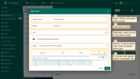
- Click the “plus” icon in the top right corner of the screen again to open a new “Add action” window;
- As an example for this manual, select “Action cell button” action source;
- Input a name for the action and select an icon that will represent an action button. With this icon, action will be performed;
- Select a “Custom action (with HTML template)” action type from the “Action” drop-down menu;
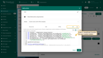
- In the tabs that appear, select “JavaScript” tab. Enter a JavaScript function for your custom action. In this example, we use a function that adds the ability to edit an entity (you will find an example of this function below);
Example of a JavaScript function that adds a possibility to edit a device or an asset (click to expand):
1
2
3
4
5
6
7
8
9
10
11
12
13
14
15
16
17
18
19
20
21
22
23
24
25
26
27
28
29
30
31
32
33
34
35
36
37
38
39
40
41
42
43
44
45
46
47
48
49
50
51
52
53
54
55
56
57
58
59
60
61
62
63
64
65
66
67
68
69
70
71
72
73
74
75
76
77
78
79
80
81
82
83
84
85
86
87
88
89
90
91
92
93
94
95
96
97
98
99
100
101
102
103
104
105
106
107
108
109
110
111
112
113
114
115
116
117
118
119
120
121
122
123
124
125
126
127
128
129
130
131
132
133
134
135
136
137
138
139
140
141
142
143
144
145
146
147
148
149
150
151
152
153
154
155
156
157
158
159
160
161
162
163
164
165
166
167
168
169
170
171
172
173
174
175
176
177
178
179
180
181
182
183
184
185
186
187
188
189
190
191
192
193
194
195
196
197
198
199
200
201
202
203
204
205
206
207
208
209
210
211
212
213
214
215
let $injector = widgetContext.$scope.$injector;
let customDialog = $injector.get(widgetContext.servicesMap.get('customDialog'));
let entityService = $injector.get(widgetContext.servicesMap.get('entityService'));
let assetService = $injector.get(widgetContext.servicesMap.get('assetService'));
let deviceService = $injector.get(widgetContext.servicesMap.get('deviceService'));
let attributeService = $injector.get(widgetContext.servicesMap.get('attributeService'));
let entityRelationService = $injector.get(widgetContext.servicesMap.get('entityRelationService'));

openEditEntityDialog();

function openEditEntityDialog() {
customDialog.customDialog(htmlTemplate, EditEntityDialogController).subscribe();
}

function EditEntityDialogController(instance) {
let vm = instance;

    vm.entityName = entityName;
    vm.entityType = entityId.entityType;
    vm.entitySearchDirection = {
        from: "FROM",
        to: "TO"
    };
    vm.attributes = {};
    vm.oldRelationsData = [];
    vm.relationsToDelete = [];
    vm.entity = {};

    vm.editEntityFormGroup = vm.fb.group({
        entityName: ['', [vm.validators.required]],
        entityType: [null],
        entityLabel: [null],
        type: ['', [vm.validators.required]],
        attributes: vm.fb.group({
            latitude: [null],
            longitude: [null],
            address: [null],
            owner: [null],
            number: [null, [vm.validators.pattern(/^-?[0-9]+$/)]],
            booleanValue: [false]
        }),
        oldRelations: vm.fb.array([]),
        relations: vm.fb.array([])
    });

    getEntityInfo();

    vm.cancel = function() {
        vm.dialogRef.close(null);
    };

    vm.relations = function() {
        return vm.editEntityFormGroup.get('relations');
    };

    vm.oldRelations = function() {
        return vm.editEntityFormGroup.get('oldRelations');
    };

    vm.addRelation = function() {
        vm.relations().push(vm.fb.group({
            relatedEntity: [null, [vm.validators.required]],
            relationType: [null, [vm.validators.required]],
            direction: [null, [vm.validators.required]]
        }));
    };

    function addOldRelation() {
        vm.oldRelations().push(vm.fb.group({
            relatedEntity: [{value: null, disabled: true}, [vm.validators.required]],
            relationType: [{value: null, disabled: true}, [vm.validators.required]],
            direction: [{value: null, disabled: true}, [vm.validators.required]]
        }));
    }

    vm.removeRelation = function(index) {
        vm.relations().removeAt(index);
        vm.relations().markAsDirty();
    };

    vm.removeOldRelation = function(index) {
        vm.oldRelations().removeAt(index);
        vm.relationsToDelete.push(vm.oldRelationsData[index]);
        vm.oldRelations().markAsDirty();
    };

    vm.save = function() {
        vm.editEntityFormGroup.markAsPristine();
        widgetContext.rxjs.forkJoin([
            saveAttributes(entityId),
            saveRelations(entityId),
            saveEntity()
        ]).subscribe(
            function () {
                widgetContext.updateAliases();
                vm.dialogRef.close(null);
            }
        );
    };

    function getEntityAttributes(attributes) {
        for (var i = 0; i < attributes.length; i++) {
            vm.attributes[attributes[i].key] = attributes[i].value;
        }
    }

    function getEntityRelations(relations) {
        let relationsFrom = relations[0];
        let relationsTo = relations[1];
        for (let i=0; i < relationsFrom.length; i++) {
            let relation = {
                direction: 'FROM',
                relationType: relationsFrom[i].type,
                relatedEntity: relationsFrom[i].to
            };
            vm.oldRelationsData.push(relation);
            addOldRelation();
        }
        for (let i=0; i < relationsTo.length; i++) {
            let relation = {
                direction: 'TO',
                relationType: relationsTo[i].type,
                relatedEntity: relationsTo[i].from
            };
            vm.oldRelationsData.push(relation);
            addOldRelation();
        }
    }

    function getEntityInfo() {
        widgetContext.rxjs.forkJoin([
            entityRelationService.findInfoByFrom(entityId),
            entityRelationService.findInfoByTo(entityId),
            attributeService.getEntityAttributes(entityId, 'SERVER_SCOPE'),
            entityService.getEntity(entityId.entityType, entityId.id)
        ]).subscribe(
            function (data) {
                getEntityRelations(data.slice(0,2));
                getEntityAttributes(data[2]);
                vm.entity = data[3];
                vm.editEntityFormGroup.patchValue({
                    entityName: vm.entity.name,
                    entityType: vm.entityType,
                    entityLabel: vm.entity.label,
                    type: vm.entity.type,
                    attributes: vm.attributes,
                    oldRelations: vm.oldRelationsData
                }, {emitEvent: false});
            }
        );
    }

    function saveEntity() {
        const formValues = vm.editEntityFormGroup.value;
        if (vm.entity.label !== formValues.entityLabel){
            vm.entity.label = formValues.entityLabel;
            if (formValues.entityType == 'ASSET') {
                return assetService.saveAsset(vm.entity);
            } else if (formValues.entityType == 'DEVICE') {
                return deviceService.saveDevice(vm.entity);
            }
        }
        return widgetContext.rxjs.of([]);
    }

    function saveAttributes(entityId) {
        let attributes = vm.editEntityFormGroup.get('attributes').value;
        let attributesArray = [];
        for (let key in attributes) {
            if (attributes[key] !== vm.attributes[key]) {
                attributesArray.push({key: key, value: attributes[key]});
            }
        }
        if (attributesArray.length > 0) {
            return attributeService.saveEntityAttributes(entityId, "SERVER_SCOPE", attributesArray);
        }
        return widgetContext.rxjs.of([]);
    }

    function saveRelations(entityId) {
        let relations = vm.editEntityFormGroup.get('relations').value;
        let tasks = [];
        for(let i=0; i < relations.length; i++) {
            let relation = {
                type: relations[i].relationType,
                typeGroup: 'COMMON'
            };
            if (relations[i].direction == 'FROM') {
                relation.to = relations[i].relatedEntity;
                relation.from = entityId;
            } else {
                relation.to = entityId;
                relation.from = relations[i].relatedEntity;
            }
            tasks.push(entityRelationService.saveRelation(relation));
        }
        for (let i=0; i < vm.relationsToDelete.length; i++) {
            let relation = {
                type: vm.relationsToDelete[i].relationType
            };
            if (vm.relationsToDelete[i].direction == 'FROM') {
                relation.to = vm.relationsToDelete[i].relatedEntity;
                relation.from = entityId;
            } else {
                relation.to = entityId;
                relation.from = vm.relationsToDelete[i].relatedEntity;
            }
            tasks.push(entityRelationService.deleteRelation(relation.from, relation.type, relation.to));
        }
        if (tasks.length > 0) {
            return widgetContext.rxjs.forkJoin(tasks);
        }
        return widgetContext.rxjs.of([]);
    }
}
- In “HTML” tab, enter an HTML code for your custom action (you will find an example of this function below);
Example of HTML code that adds a possibility to edit a device or an asset (click to expand):
1
2
3
4
5
6
7
8
9
10
11
12
13
14
15
16
17
18
19
20
21
22
23
24
25
26
27
28
29
30
31
32
33
34
35
36
37
38
39
40
41
42
43
44
45
46
47
48
49
50
51
52
53
54
55
56
57
58
59
60
61
62
63
64
65
66
67
68
69
70
71
72
73
74
75
76
77
78
79
80
81
82
83
84
85
86
87
88
89
90
91
92
93
94
95
96
97
98
99
100
101
102
103
104
105
106
107
108
109
110
111
112
113
114
115
116
117
118
119
120
121
122
123
124
125
126
127
128
129
130
131
132
133
134
135
136
137
138
139
140
141
142
143
144
145
146
147
148
149
150
151
152
153
154
155
156
157
158
159
160
161
162
163
164
165
166
167
168
169
170
171
172
173
174
175
176
177
178
179
180
181
182
183
184
185
186
187
<form #editEntityForm="ngForm" [formGroup]="editEntityFormGroup"
      (ngSubmit)="save()"  class="edit-entity-form">
    <mat-toolbar fxLayout="row" color="primary">
        <h2>Edit  </h2>
        <span fxFlex></span>
        <button mat-icon-button (click)="cancel()" type="button">
            <mat-icon class="material-icons">close</mat-icon>
        </button>
    </mat-toolbar>
    <mat-progress-bar color="warn" mode="indeterminate" *ngIf="isLoading$ | async">
    </mat-progress-bar>
    <div style="height: 4px;" *ngIf="!(isLoading$ | async)"></div>
    <div mat-dialog-content fxLayout="column">
        <div fxLayout="row" fxLayoutGap="8px" fxLayout.xs="column"  fxLayoutGap.xs="0">
            <mat-form-field fxFlex class="mat-block">
                <mat-label>Entity Name</mat-label>
                <input matInput formControlName="entityName" required readonly="">
            </mat-form-field>
            <mat-form-field fxFlex class="mat-block">
                <mat-label>Entity Label</mat-label>
                <input matInput formControlName="entityLabel">
            </mat-form-field>
        </div>
        <div fxLayout="row" fxLayoutGap="8px" fxLayout.xs="column"  fxLayoutGap.xs="0">
            <mat-form-field fxFlex class="mat-block">
                <mat-label>Entity Type</mat-label>
                <input matInput formControlName="entityType" readonly>
            </mat-form-field>
            <mat-form-field fxFlex class="mat-block">
                <mat-label>Type</mat-label>
                <input matInput formControlName="type" readonly>
            </mat-form-field>
        </div>
        <div formGroupName="attributes" fxLayout="column">
            <div fxLayout="row" fxLayoutGap="8px" fxLayout.xs="column"  fxLayoutGap.xs="0">
                <mat-form-field fxFlex class="mat-block">
                    <mat-label>Latitude</mat-label>
                    <input type="number" step="any" matInput formControlName="latitude">
                </mat-form-field>
                <mat-form-field fxFlex class="mat-block">
                    <mat-label>Longitude</mat-label>
                    <input type="number" step="any" matInput formControlName="longitude">
                </mat-form-field>
            </div>
            <div fxLayout="row" fxLayoutGap="8px" fxLayout.xs="column"  fxLayoutGap.xs="0">
                <mat-form-field fxFlex class="mat-block">
                    <mat-label>Address</mat-label>
                    <input matInput formControlName="address">
                </mat-form-field>
                <mat-form-field fxFlex class="mat-block">
                    <mat-label>Owner</mat-label>
                    <input matInput formControlName="owner">
                </mat-form-field>
            </div>
            <div fxLayout="row" fxLayoutGap="8px" fxLayout.xs="column"  fxLayoutGap.xs="0">
                <mat-form-field fxFlex class="mat-block">
                    <mat-label>Integer Value</mat-label>
                    <input type="number" step="1" matInput formControlName="number">
                    <mat-error *ngIf="editEntityFormGroup.get('attributes.number').hasError('pattern')">
                        Invalid integer value.
                    </mat-error>
                </mat-form-field>
                <div class="boolean-value-input" fxLayout="column" fxLayoutAlign="center start" fxFlex>
                    <label class="checkbox-label">Boolean Value</label>
                    <mat-checkbox formControlName="booleanValue" style="margin-bottom: 40px;">

                    </mat-checkbox>
                </div>
            </div>
        </div>
        <div class="relations-list old-relations">
            <div class="mat-body-1" style="padding-bottom: 10px; color: rgba(0,0,0,0.57);">Relations</div>
            <div class="body" [fxShow]="oldRelations().length">
                <div class="row" fxLayout="row" fxLayoutAlign="start center" formArrayName="oldRelations"
                     *ngFor="let relation of oldRelations().controls; let i = index;">
                    <div [formGroupName]="i" class="mat-elevation-z2" fxFlex fxLayout="row" style="padding: 5px 0 5px 5px;">
                        <div fxFlex fxLayout="column">
                            <div fxLayout="row" fxLayoutGap="8px" fxLayout.xs="column"  fxLayoutGap.xs="0">
                                <mat-form-field class="mat-block" style="min-width: 100px;">
                                    <mat-label>Direction</mat-label>
                                    <mat-select formControlName="direction" name="direction">
                                        <mat-option *ngFor="let direction of entitySearchDirection | keyvalue" [value]="direction.value">

                                        </mat-option>
                                    </mat-select>
                                    <mat-error *ngIf="relation.get('direction').hasError('required')">
                                        Relation direction is required.
                                    </mat-error>
                                </mat-form-field>
                                <tb-relation-type-autocomplete
                                        fxFlex class="mat-block"
                                        formControlName="relationType"
                                        required="true">
                                </tb-relation-type-autocomplete>
                            </div>
                            <div fxLayout="row" fxLayout.xs="column">
                                <tb-entity-select
                                        fxFlex class="mat-block"
                                        required="true"
                                        formControlName="relatedEntity">
                                </tb-entity-select>
                            </div>
                        </div>
                        <div fxLayout="column" fxLayoutAlign="center center">
                            <button mat-icon-button color="primary"
                                    aria-label="Remove"
                                    type="button"
                                    (click)="removeOldRelation(i)"
                                    matTooltip="Remove relation"
                                    matTooltipPosition="above">
                                <mat-icon>close</mat-icon>
                            </button>
                        </div>
                    </div>
                </div>
            </div>
        </div>
        <div class="relations-list">
            <div class="mat-body-1" style="padding-bottom: 10px; color: rgba(0,0,0,0.57);">New Relations</div>
            <div class="body" [fxShow]="relations().length">
                <div class="row" fxLayout="row" fxLayoutAlign="start center" formArrayName="relations" *ngFor="let relation of relations().controls; let i = index;">
                    <div [formGroupName]="i" class="mat-elevation-z2" fxFlex fxLayout="row" style="padding: 5px 0 5px 5px;">
                        <div fxFlex fxLayout="column">
                            <div fxLayout="row" fxLayoutGap="8px" fxLayout.xs="column"  fxLayoutGap.xs="0">
                                <mat-form-field class="mat-block" style="min-width: 100px;">
                                    <mat-label>Direction</mat-label>
                                    <mat-select formControlName="direction" name="direction">
                                        <mat-option *ngFor="let direction of entitySearchDirection | keyvalue" [value]="direction.value">

                                        </mat-option>
                                    </mat-select>
                                    <mat-error *ngIf="relation.get('direction').hasError('required')">
                                        Relation direction is required.
                                    </mat-error>
                                </mat-form-field>
                                <tb-relation-type-autocomplete
                                        fxFlex class="mat-block"
                                        formControlName="relationType"
                                        [required]="true">
                                </tb-relation-type-autocomplete>
                            </div>
                            <div fxLayout="row" fxLayout.xs="column">
                                <tb-entity-select
                                        fxFlex class="mat-block"
                                        [required]="true"
                                        formControlName="relatedEntity">
                                </tb-entity-select>
                            </div>
                        </div>
                        <div fxLayout="column" fxLayoutAlign="center center">
                            <button mat-icon-button color="primary"
                                    aria-label="Remove"
                                    type="button"
                                    (click)="removeRelation(i)"
                                    matTooltip="Remove relation"
                                    matTooltipPosition="above">
                                <mat-icon>close</mat-icon>
                            </button>
                        </div>
                    </div>
                </div>
            </div>
            <div>
                <button mat-raised-button color="primary"
                        type="button"
                        (click)="addRelation()"
                        matTooltip="Add Relation"
                        matTooltipPosition="above">
                    Add
                </button>
            </div>
        </div>
    </div>
    <div mat-dialog-actions fxLayout="row" fxLayoutAlign="end center">
        <button mat-button color="primary"
                type="button"
                [disabled]="(isLoading$ | async)"
                (click)="cancel()" cdkFocusInitial>
            Cancel
        </button>
        <button mat-button mat-raised-button color="primary"
                type="submit"
                [disabled]="(isLoading$ | async) || editEntityForm.invalid || !editEntityForm.dirty">
            Save
        </button>
    </div>
</form>
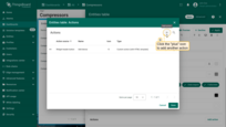
- After input functions, click the “Add” button at the bottom of the “Add action” window;
- Now in the “Actions” window, you can see the configured actions, allowing you to double-check the action source, icon, and action type. Click “Save”, and then click “Apply” to save the widget settings;
- Save the dashboard by clicking “Save” in the upper right corner of the dashboard page.
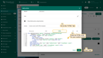
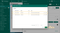
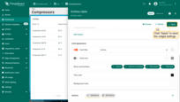

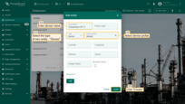
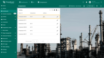
Perform the actions of adding a new device by clicking the “Add device” action button at the top of the widget. In the “Add entity” window that opens, select the type of new entity - “Device” and enter its name. Enter the required data and click “Create”.
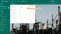
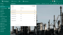
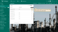
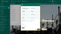
Click on the action button next to the name of the device you want to edit. After clicking the action button, the device editing window will open. Make the necessary changes and click “Save”.
Mobile action
Mobile action is explained in mobile application configuration. See Mobile actions for details.
Open URL
This type of action will transfer you to the resource represented by the URL. This resource can be an HTML page, a document, an image, internal ThingsBoard page (for example, Alarms), etc.
We assume that you are already familiar with the “Add action” step. Therefore, we will proceed directly to the action configuration step.
- Enter edit widget mode and open “Add action” window;
- As an example for this manual, select “Widget header button” action source;
- Input a name for the action and select an icon that will represent a button. With this icon, action will be performed;
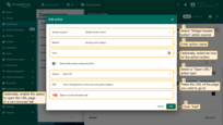
- Select an “Open URL” action type from the “Action” drop-down menu;
- After selecting an action type, “URL” menu appears. Insert the URL link to the page you want to navigate to when the action button is clicked;
- Optionally, enable the option to open the URL page in a new browser tab;
- Click the “Add” button at the bottom of the “Add action” window;
- Now in the “Actions” window, you can see the configured action, allowing you to double-check the action source, icon, and action type. Click “Save”, and then click “Apply” to save the widget settings;
- Save the dashboard by clicking “Save” in the upper right corner of the dashboard page.

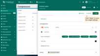

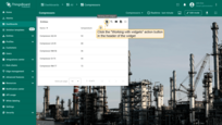
After saving the changes, you can see an icon in the upper right part of the widget. Click this icon. You will be transferred to the URL specified in the action. In our case, it’s the “Working with ThingsBoard widgets” documentation page.
Place map item
The Place map item action type allows users to create new entities and immediately place them on the map widget.
As an example, let's add a button that allows users to place charging stations on the map:
To start, and to ensure that newly created entities are instantly displayed on the map, you need to configure the data source.
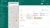
- In the “Overlays” section, under the “Marker” tab, create a new entity alias as the data source. Name it “EV stations”.
- Since we'll be creating entities of the type “EV station”, set the filter type to “Asset type” and specify the type as “EV station”.
- Apply changes.
Now let's move on to configuring the action:
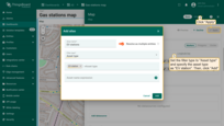
- Scroll down to the “Actions” section and click the “Add action” button.
- A new window will open, displaying all your created actions. Click the “plus” icon button in the top-right corner to add one.
- Select the action source as “Widget header button”, enter a name for the button, and choose its type.
- Optionally, change the icon that will appear next to the button or hide it entirely. You can also set a custom color for the button.
- From the dropdown menu, select the type of action to be performed. In our case, it's “Place map item”.
- Next, choose the type of map item to be placed — we'll be placing a “Marker”.
- The custom action function field already contains a default function that opens a dialog for creating a device or an asset — exactly what we need.
- In the “Action” section, choose “Place map item” from the dropdown menu. Select the type of map item to be placed — in our case, it's “Marker”. The Custom action function field contains a default function that opens a dialog to create a device or an asset — exactly what we need.
- Then click “Add”.
- Apply all changes and save the dashboard.
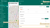
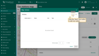
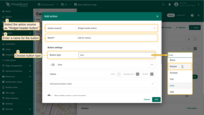
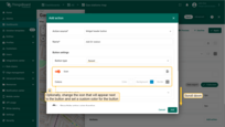
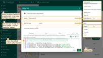
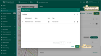
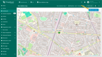
A new action button labeled “Add EV station” has now appeared at the top of the map. Let's use it.
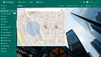
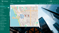
- Click the newly created "Add EV station" button. Then, find the location on the map where you want to place the EV station and click on it.
- In the "Add entity" dialog that appears, make sure to enter a name for the new entity and select its type — Asset. The other fields are optional. Then click "Create".
- The new "EV station" marker is now added to the map.
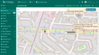
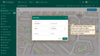
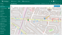
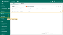
Go to the “Assets” page — there you'll find your newly created asset, “EV station 1”.
Action sources
Action sources are specific actions that need to be performed to achieve a goal (like clicking a widget header button, double-clicking a row, or a map’s marker). They vary across different widgets. Action sources will be explained separately for each widget type, separately using an example of the most commonly used type of action “Navigate to new dashboard state”.
Next, we will demonstrate how to utilize each action source using the “Entities table” widget as an example. If you’re unfamiliar with adding an Entity table widget to your dashboard, you can learn how to do so here.
Action cell button
The “Action cell button” action adds an action button to each individual entity in the widget, such as deleting devices/assets or editing them. This action button is often used in the “Entity table” widget. In the example of this widget, let’s consider the use of “Action cell button”. Clicking on the action icon of a selected entity will transfer us to another state with detailed information about that entity.
We assume that you have already added a new state to the dashboard and familiarized yourself with the “Add action” step. Therefore, we will proceed directly to the action configuration step.
- Enter edit widget mode and open “Add action” window;
- Select “Action cell button” as the action source;
- Input a name for the action and select an icon that will represent a button. With this icon, action will be performed;
- Select a “Navigate to new dashboard state” action type from the “Action” drop-down menu;
- After choosing an action type, the “Target dashboard state” drop-down menu appears. Select a previously created state you’d like to be transitioned to;
- When the desired state has been selected, click the “Add” button at the bottom of the “Add action” window;
- Now in the “Actions” window, you can see the configured action, allowing you to double-check the action source, icon, and action type. Click “Save”, and then click “Apply” to save the widget settings.
- Save the dashboard by clicking “Save” in the upper right corner of the dashboard page.


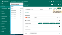

As you can see, there is an action cell button next to each entity name. By clicking this button, the corresponding action will be executed, namely transitioning to the chosen state.

On cell click
* only in Entities table, Alarms table, Device admin table, and Asset admin table widgets.
The “On cell click” action adds a function for each cell in the specified table column.
Let’s explore how this action works using the “Entities table” widget as an example. It displays a list of devices and their latest temperature and humidity readings. We will configure this widget so that clicking on a cell in a specific column will open a popup with detailed telemetry information for the selected device.
For this, we will need to add an action for each column of the table.
We assume that you have already added two new states to the dashboard and familiarized yourself with the “Add action” step. Therefore, we will proceed directly to the action configuration step.
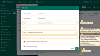
Let’s add the first action for the “temperature” column:
- Select the “On cell click “ as the action source;
- From the “Column index” drop-down menu, select the “temperature” column to which this action will be applied;
- Enter a name for the action, and optionally, choose an icon;
- For the action type, select “Navigate to new dashboard state” from the drop-down menu;
- Specify the “Target dashboard state” which will display detailed temperature data for the selected device;
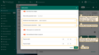
- Select the “Open in popover” option in the “Dashboard state display options” field;
- Specify the placement of the popover;
- Optionally, specify the width and height of the popover;
- Click “Add” to add the action.
We have configured an action for the “temperature” column.
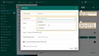

Now, we need to add another action for the “humidity” column:
- Click the “plus” icon in the top right corner of the “Actions” window to start adding a new action;
- Repeat the steps as above but select the “humidity” column this time from the “Column index” drop-down menu;
- Specify the “Target dashboard state” which will display detailed humidity data for the selected device;
- Select the “Open in popover” option in the “Dashboard state display options” field;
- Specify the placement of the popover;
- Optionally, specify the width and height of the popover;
- Click “Add” to add the action;
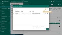
- After configuring the actions, click “Save” and then “Apply” to save the widget settings;
- Save your entire dashboard configuration by clicking “Save” located in the upper right corner of the dashboard page.
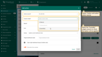

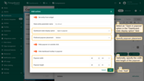
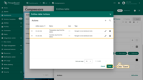
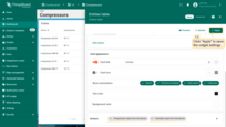

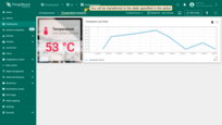
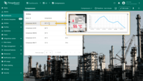
Now, when you click on a cell in the “temperature” column for any device, an action will be performed: a popup window will appear with detailed information about the temperature of the selected device.
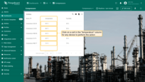
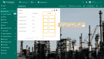
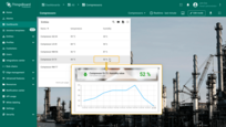
Similarly, clicking on a cell in the “humidity” column will appear with detailed information about the humidity of the selected device.
Widget header button
The “Widget header button” action adds an action button in the header of the widget. Clicking this button executes an action. This button is responsible for the whole widget, not for separate entities. The widget header button is the most commonly used action source, and it can be found in all widgets. To configure the Widget header button action source, you should follow these steps:
We assume that you have already added a new state to the dashboard and familiarized yourself with the “Add action” step. Therefore, we will proceed directly to the action configuration step.
- Enter edit widget mode and open “Add action” window;
- Select “Widget header button” as the action source;
- Input a name for the action and select an icon that will represent a button. With this icon, action will be performed;
- Select a “Navigate to new dashboard state” action type from the “Action” drop-down menu;
- After choosing an action type, the “Target dashboard state” drop-down menu appears. Select a previously created state you’d like to be transitioned to;
- When the desired state has been selected, click the “Add” button at the bottom of the “Add action” window;
- Now in the “Actions” window, you can see the configured action, allowing you to double-check the action source, icon, and action type. Click “Save”, and then click “Apply” to save the widget settings.
- Save the dashboard by clicking “Save” in the upper right corner of the dashboard page.
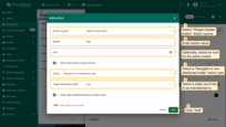
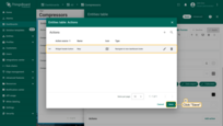
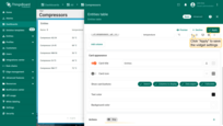

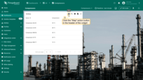
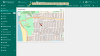
As you see now, an action button has appeared in the header of the widget. After you click it, action will be performed, namely, the transition to the chosen state.
On row click
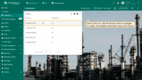
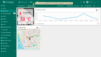
The “On row click” action triggers an action when a row in the widget is clicked. This action button is often used in the “Entity table” widget. Let’s illustrate the use of the “On row click” action with the aforementioned widget as an example. Clicking on a row of the selected entity in the widget will navigate us to another state with detailed information about that entity.
We assume that you have already added a new state to the dashboard and familiarized yourself with the “Add action” step. Therefore, we will proceed directly to the action configuration step.
- Enter edit widget mode and open “Add action” window;
- Select “On row click” as the action source;
- Input a name for the action. Optionally, select an icon;
- Select a “Navigate to new dashboard state” action type from the “Action” drop-down menu;
- After choosing an action type, the “Target dashboard state” drop-down menu appears. Select a previously created state you’d like to be transitioned to;
- When the desired state has been selected, click the “Add” button at the bottom of the “Add action” window;
- Now in the “Actions” window, you can see the configured action, allowing you to double-check the action source, icon, and action type. Click “Save”, and then click “Apply” to save the widget settings.
- Save the dashboard by clicking “Save” in the upper right corner of the dashboard page.
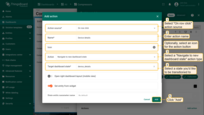

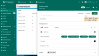

Click on any entity row to perform an action, namely, to navigate to the selected state where detailed information about the chosen device is displayed.
On row double click
The “On row double click” action triggers an action when a row in the widget is double-clicked. Let’s explore its use with the “Entities table” widget, where this action is often used. Double-clicking on a row of the selected entity in the widget will navigate us to another state with detailed information about that entity.
We assume that you have already added a new state to the dashboard and familiarized yourself with the “Add action” step. Therefore, we will proceed directly to the action configuration step.
- Enter edit widget mode and open “Add action” window;
- Select “On row double click” as the action source;
- Input a name for the action. Optionally, select an icon;
- Select a “Navigate to new dashboard state” action type from the “Action” drop-down menu;
- After choosing an action type, the “Target dashboard state” drop-down menu appears. Select a previously created state you’d like to be transitioned to;
- When the desired state has been selected, click the “Add” button at the bottom of the “Add action” window;
- Now in the “Actions” window, you can see the configured action, allowing you to double-check the action source, icon, and action type. Click “Save”, and then click “Apply” to save the widget settings.
- Save the dashboard by clicking “Save” in the upper right corner of the dashboard page.
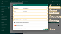
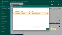


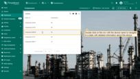
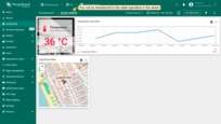
Double-click on an entity row to perform an action, namely, navigate to the selected state. In our example, clicking a node will navigate you to a state displaying the details of the selected node.
On node selected
* only in Entities Hierarchy widget.
In this example, we’ll add an “Entity hierarchy” widget to our dashboard. Entities Hierarchy widget displays the hierarchy of entities based on their relations. For more information about entities and relations, you can read here. Clicking on any entity (node) in the Entities hierarchy will perform the configured action.
We assume that you have already added a new state to the dashboard. Let’s start setting up the action:
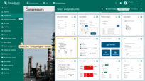
- Enter dashboard edit mode. Click the "Add widget" button at the top of the screen or click the large "Add new widget" icon in the center of the screen (if this is your first widget on this dashboard);
- Find the "Entity widgets" widget bundle and click on it;
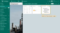
- Select the "Entity hierarchy" widget;
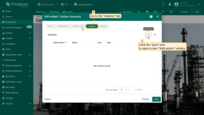
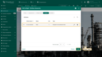
- Specify the data source for the widget and navigate to the "Actions" tab. Click the "plus" icon in the top right corner of the screen to open a new "Add action" window;
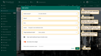
- Select "On node selected" as the action source. Input a name for the action. Optionally, select an icon. Select a "Navigate to new dashboard state" action type from the "Action" drop-down menu. After choosing an action type, the "Target dashboard state" drop-down menu appears. Select a previously created state you'd like to be transitioned to. When the desired state has been selected, click the "Add" button;
- Now in the "Actions" window, you can see the configured action. Click "Apply" to save the widget settings;
- Save the dashboard by clicking "Save" in the upper right corner of the dashboard page.

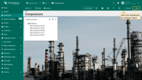
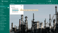
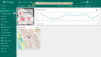
To perform an action you should click any of the nodes in the Entities hierarchy. In our example, clicking a node will navigate to a state that displays the details of the selected node.
On HTML element click
| Only for HTML widgets |
On HTML element click allows you to trigger an action (navigate to a state, open a link, execute a custom action, etc.) when a user clicks on an element in the HTML layout of the widget.
How it works
When configuring On HTML element click, the id attribute is the link between the HTML code of the widget and the action defined in the widget's Actions tab.
You can assign the id to any HTML element (e.g., <div>, <span>, <p>, <h1>, <button>). Typically, the id is applied to a container element (like <p> or <div>), so the entire block becomes clickable.
1
2
3
<p id="details" class="blue-box">
    Current temperature: <span>22.5 °C</span>
</p>
Tips
- Works only with HTML widgets; for tables, charts, and others use their specific action sources (On row click, On cell click, On node selected, etc.).
IDmust match Name exactly (case-sensitive).- For more advanced scenarios (dialogs, forms), use Custom action with HTML template / widgetContext.dialogs / widgetContext.customDialog in widgets that support it.
Configuration step by step
- Enter widget edit mode → go to the Actions tab → click + (Add action).
- In Action source, select On HTML element click.
- Set a Name (this will also serve as the ID for the HTML element).
- In Action, choose the action type (e.g., Navigate to new dashboard state) and specify the target state.
- Save the action (Add).
- Go to the Appearance tab → HTML section, and add an element with an
idthat exactly matches the action's Name. - Apply changes (Apply) and save the dashboard.
After saving, ThingsBoard “listens” for clicks on the element with an id that matches the Name of the created action for that widget. If found, the chosen action type (navigate, update state, custom action, etc.) is executed.
Example: Markdown/HTML Card widget — Click the blue area
Preparation:
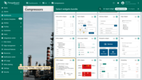
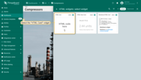
- Add a Markdown/HTML Card widget to your dashboard using the HTML and CSS provided below.
- Create a new dashboard state with device temperature details.
Alternative: You can download a pre-configured dashboard with the Markdown/HTML Card widget and the details state already set up, then import it into your ThingsBoard instance.
Add the Markdown/HTML Card
Markdown/HTML pattern:
1
2
3
4
5
const entity = data[0];
const color = entity.temperature > 25 ? "red" : entity.temperature > 20 ? 'green' : 'blue'
const entityName = `### Temperature value card\n - Current entity: <span >${entity.entityName}</span>\n `
const temp = `- Current temperature: <span style="color:${color};">${entity.temperature.toFixed(1)} °C</span>\n `
return entityName + temp;
Markdown/HTML CSS:
Add the action
- Enter widget edit mode → go to the Actions tab → click + (Add action).
- Choose Action source: On HTML element click.
- Enter details as the action name.
- In Action, select Navigate to new dashboard state.
- In Target dashboard state, select the state you created earlier.
- Click Add to save the action.
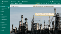
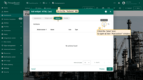
Add the action: Choose Action source: On HTML element click; Enter details as the action name; In Action, select Navigate to new dashboard state; In Target dashboard state, select the state you created earlier; Click Add to save the action.
Add id to the HTML
- Go to the Appearance tab → HTML section.
-
Add an element with the
id=detailsto the<p class="blue-box">line.
Replace it with:1
<p id="details" class="blue-box">
This makes the entire blue-box block clickable and tied to the details action.
- Apply changes (Apply) and save the dashboard.
Result
Clicking the blue block with the current temperature will execute the configured action and navigate to your target state.
Map widget action sources
Map widget has unique action sources that need to be considered separately.
Let's start by adding a map widget, namely OpenStreetMap widget. We have a separate guide on how to create and configure a map widget. Please, familiarize yourself with it first.
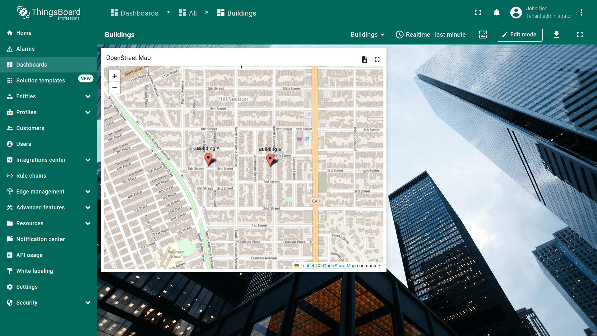
Now it's time to add an action. All further explanations concerning actions assume that you have already added a new state to the dashboard and familiarized yourself with the “Add action” step. Therefore, we will proceed directly to the action configuration step.
On circle click
Circle is a plane figure, boundary points of which are always the same distance away from a fixed central point. We use circle which is based on coordinates that are specified within the device we use. Learn how to add a circle on the Map widget, by reading here.
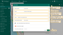
- Enter edit widget mode and open “Add action” window;
- Select “On circle click” as the action source;
- Input a name for the action. Optionally, select an icon;
- Select a “Navigate to new dashboard state” action type from the “Action” drop-down menu;
- After choosing an action type, the “Target dashboard state” drop-down menu appears. Select a previously created state you’d like to be transitioned to;
- When the desired state has been selected, click the “Add” button at the bottom of the “Add action” window;
- Now in the “Actions” window, you can see the configured action, allowing you to double-check the action source, icon, and action type. Click “Save”, and then click “Apply” to save the widget settings.
- Save the dashboard by clicking “Save” in the upper right corner of the dashboard page.
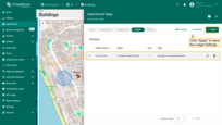
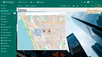
After clicking on the circle on the map, action will be performed, namely, the transition to the specified state.
On marker click
The action will be executed by clicking on the red entity marker on the map.
- Enter edit widget mode and open “Add action” window;
- Select “On marker click” as the action source;
- Input a name for the action. Optionally, select an icon;
- Select a “Navigate to new dashboard state” action type from the “Action” drop-down menu;
- After choosing an action type, the “Target dashboard state” drop-down menu appears. Select a previously created state you’d like to be transitioned to;
- When the desired state has been selected, click the “Add” button at the bottom of the “Add action” window;
- Now in the “Actions” window, you can see the configured action, allowing you to double-check the action source, icon, and action type. Click “Save”, and then click “Apply” to save the widget settings.
- Save the dashboard by clicking “Save” in the upper right corner of the dashboard page.
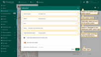
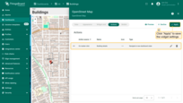
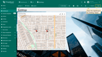
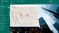
Clicking on the marker on the map will take you to the specified state.
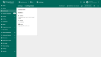
On polygon click
Polygon is a plane figure that’s described by a finite number of dots. We use polygon which is based on coordinates specified within the device we use, but you can use any other entity. You may mark your assets and any other entities with a polygon option. Learn how to add a polygon on the Map widget, by reading here.
- Enter edit widget mode and open “Add action” window;
- Select “On polygon click” as the action source;
- Input a name for the action. Optionally, select an icon;
- Select a “Navigate to new dashboard state” action type from the “Action” drop-down menu;
- After choosing an action type, the “Target dashboard state” drop-down menu appears. Select a previously created state you’d like to be transitioned to;
- When the desired state has been selected, click the “Add” button at the bottom of the “Add action” window;
- Now in the “Actions” window, you can see the configured action, allowing you to double-check the action source, icon, and action type. Click “Save”, and then click “Apply” to save the widget settings.
- Save the dashboard by clicking “Save” in the upper right corner of the dashboard page.
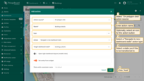
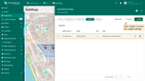
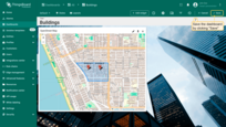
To execute an action click anywhere inside the polygon.
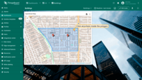
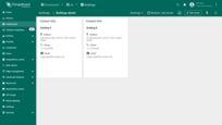
Tooltip tag action
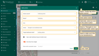
You can configure the map widget settings so that when you click on a marker, a tooltip appears. The tooltip can contain a link that will execute the configured action. Please note, in this manual explains only the basic usage of the tooltip tag action source. It is possible to configure several links for various devices/assets that return different values. Use the tooltip function in the advanced mode of the map widget to accomplish this.
- Enter edit widget mode and open “Add action” window;
- Select “Tooltip tag action” as the action source;
- Input a name for the action. Optionally, select an icon;
- Select a “Navigate to new dashboard state” action type from the “Action” drop-down menu;
- After choosing an action type, the “Target dashboard state” drop-down menu appears. Select a previously created state you’d like to be transitioned to;
- When the desired state has been selected, click the “Add” button at the bottom of the “Add action” window;
- Now in the “Actions” window, you can see the configured action, allowing you to double-check the action source, icon, and action type.
- Now navigate to the “Appearance” tab of the widget;
- Scroll down to the Tooltip configuration and toggle the “Show tooltip” checkbox;
- In the Tooltip line find link-act name and input an ID of the action which is its name in a format:
1
<link-act name='TooltipTag'>Navigate to the ${entityName}</link-act>
where TooltipTag is an action name and Navigate to the Building A is the text that will be shown as a link on a tooltip.
- Click “Apply” to save the widget settings;
- Save the dashboard by clicking “Save” in the upper right corner of the dashboard page.
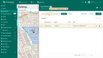
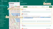

Click on the marker on the map to display the tooltip. To perform the action, click on the link text at the bottom of the tooltip.


Special actions settings
Open right dashboard layout (mobile view)
Often, users need to see updated information about an entity from one widget on another widget next to it. For example, we have a list of assets in the “Entity table” widget, and we want to see their details in the “Time series chart” widget next to it. On the desktop, this is easy to set up by placing the two widgets side by side and selecting the action type “Update current dashboard state”. However, on the responsive screen of the ThingsBoard PE Mobile Application the widgets are automatically stacked one below the other. This means that you’ll need to scroll down to view the relevant information on the second widget.
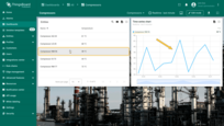
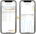
Layouts feature solves this issue. To configure layouts, you should:
- Enter the Dashboard's edit mode On the left top of the window click "Manage layouts" icon;
- In the opened "Manage layouts" window, turn on the "Divider" option;
- Now we have two layouts. Optionally, you can adjust the size of the windows in a certain percentage ratio relative to each other. Click "Save";
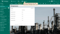
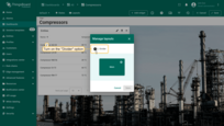
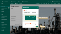
Now we need to add the “Time series chart” widget to the right layout:
- Click the "Add new widget" button in the center of the right layout;
- Find the "Charts" widget bundle and click on it;
- Select the "Time series chart" widget;
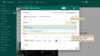
- Navigate to the "Entity alias" tab in the "Datasource" section. Enter the desirable alias name in the "Entity alias" field and click the "Create a new one!" button;
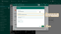
- Select the "Entity from dashboard state" from the "Filter type" field and click "Add";
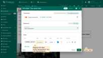
- Replace the label of the "temperature" key with ${entityName}. Then, click "Add" to add new widget on the dashboard;
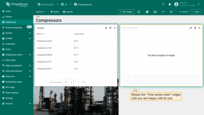
- Resize the "Time series chart" widget until you are happy with its size.
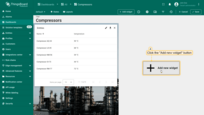
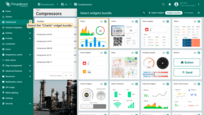

Now let’s add an action button with the “Update current dashboard state” type for each entity of the “Entities table” widget. We assume that you are already familiar with the “Add action” step. Therefore, we will proceed directly to the action configuration step.
- Enter the editing mode of the “Time series chart” widget and open the “Add action” window;
- As an example for this manual, select “On row click” action source;
- Input a name for the action and select an icon that will represent a button. With this icon, action will be performed;
- Select an “Update current dashboard state” action type from the “Action” drop-down menu;
- Turn on the “Open right dashboard layout (mobile view)” option;
- Click the “Add” button at the bottom of the “Add action” window;
- Now in the “Actions” window, you can see the configured action, allowing you to double-check the action source, icon, and action type. Click “Save”, and then click “Apply” to save the widget settings.
- Save the dashboard by clicking “Save” in the upper right corner of the dashboard page.
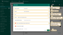
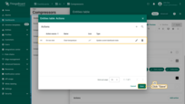
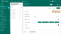
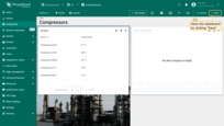
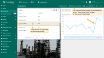
Click the row of any entity in the “Entity Table” widget to perform an action, namely, update the details about the selected entity. This entity’s data will be displayed in the “Time series chart” widget on the current dashboard.
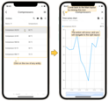
Now open this dashboard in your ThingsBoard PE Mobile Application. In the “Entity table” widget click a row of any entity. You will be moved directly to the “Time series chart” widget where you can see the details of the selected entity of the main widget.
Set entity from widget
Set entity from widget checkbox is responsible for adding specific entity from the widget to the state. This allows you to use the entity in the target dashboard state by creating the “Entity from dashboard state” or other aliases. For example, if you have a list of devices in the table widget and would like to display specific device details when you click on the table row.
Sometimes you need to store more then one entity in the state. For example, you would like to navigate to customer list, then to devices of the customer and finally to specific device details. In such case, you may have three states: “Main”, “Customer Devices” and “Device Details”. You may use two different state entity parameters to reference current customer (e.g. “currentCustomer”) and current device (e.g. “currentDevice”) on the “Device Details” state.
