| Available since TB Version 3.8.0 |
SCADA (Supervisory Control and Data Acquisition) refers to an architecture used to monitor and control various machines and manufacturing processes. In this system, ThingsBoard serves as the supervisory computer element, gathering data from various PLCs (Programmable Logic Controllers) and RTUs (Remote Terminal Units), often with the assistance of the IoT Gateway software or physical gateway devices. Additionally, ThingsBoard offers robust alarm and notification systems, which are essential components of any IoT system.
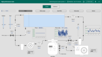
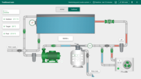
Starting from release 3.8.0, ThingsBoard introduces support for SCADA-like HMI dashboards, which we will cover in this documentation.
SCADA dashboard layout
A SCADA dashboard in ThingsBoard provides all the functionalities of a typical platform Dashboard with a specialized SCADA layout, designed to facilitate the creation of SCADA HMIs (Human-Machine Interfaces).
The SCADA dashboard typically consists of special scalable widgets known as SCADA symbols. Each symbol can represent the state of a physical object such as a valve, pump, motor, tank, or pipe. Users can also interact with these widgets to send commands to the physical objects, such as turning a pump on and off, or opening and closing a valve. Additionally, you can combine SCADA widgets with over 500 existing ThingsBoard widgets on the same dashboard.
Here are some key features of the SCADA layout:
-
Margin
In the SCADA layout, there is no margin between widgets. This intentional design ensures that pipes and other SCADA symbols always connect properly. -
Widget appearance
By default, regular widgets are placed with a transparent background and without a shadow, allowing them to blend seamlessly into the SCADA dashboard.
Building a SCADA dashboard
To begin building a SCADA dashboard, create a new dashboard:
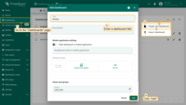
- Go to the "Dashboards" page, and click on the "plus" icon located in the upper-right corner of the screen to add a new dashboard. Select "Create new dashboard" from the dropdown menu that appears. In the dialog box that opens, type in the title for the dashboard and confirm by clicking "Add";
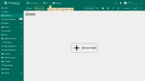
- Once created, the new dashboard will open automatically, allowing you to configure it immediately. Click on the "Layouts" sign in the top-left corner of the dashboard interface;
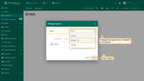
- Then, simply change the layout from "Default" to "SCADA", then save your changes.
Layout settings
Layout settings determine the background configurations of the dashboard and how widgets will be arranged on it. Click the “gear” icon in the “Manage layouts” window. This opens a small window with layout settings.
- Click the "gear" icon in the "Manage layouts" window;
- This opens a small window with layout setting.
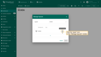
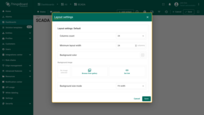
Here are some key settings for the SCADA layout:
Columns count. The number of columns in the layout settings must be divisible by 24 (e.g., 24, 48, 72, up to 1008). This value defines how your screen is divided into a widget placeholder matrix and determines the dashboard’s granularity. You can configure different layout settings for each layout breakpoint: xl, lg, md, sm, xs.
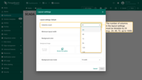
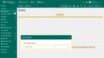
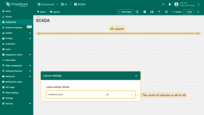
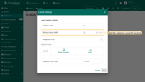
Minimum layout width. By default, the minimum number of columns is 24. You can increase or decrease this number. The minimum number of columns is 10. We recommend the value of this setting to be equal or more then columns count value.

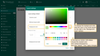
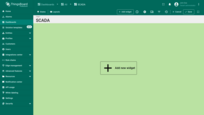
Background color. The “Background color” setting allows you to customize the color of the dashboard’s background.
To change the background color, click the color in the small square on the right in the background color section.
In the popup window, select the desired color and transparency. Then click “Select”. Afterwards, apply the layout settings.
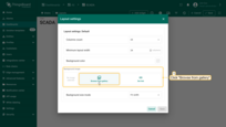
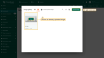
Background image and Background size mode. This option allows you to set an image as the background of the dashboard. You can choose an image from the Image gallery or set a direct link.
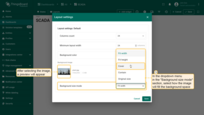
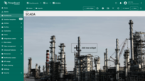
To select an image from the gallery, click “Browse from gallery”. Choose an already uploaded image or add a new one. Background size mode. To adjust the positioning of the image more precisely, click the dropdown menu in the “Background size mode” section and select how exactly the image will fill the background space. For example, let’s choose “Cover” and click “Save” to see how the background has changed.
Multi-state dashboards
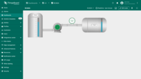
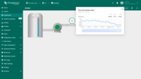
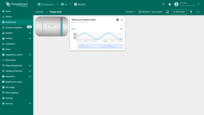
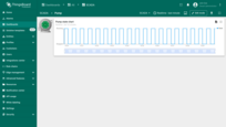
Experienced platform users know that a dashboard can contain multiple states. A single dashboard can combine regular dashboard states with SCADA states. For instance, the main state might display a high-level overview of the SCADA system, while clicking on a particular element can open a regular dashboard state or a popup widget.
Below is a sample dashboard that does not display real data, but you can import it into your environment to explore how navigation between states is implemented.
SCADA symbol
ThingsBoard SCADA symbols are based on SVG (Scalable Vector Graphics) files. The use of vector graphics ensures that SCADA symbols scale seamlessly to any screen size. ThingsBoard’s engineers have extended the SVG format to make these symbols interactive. Specifically, we define how the SVG object changes based on the properties configured by the user or the data received from the device. We also define clickable areas of the SVG object, allowing users to configure actions that can be triggered once the symbol is added to the dashboard.
High-performance SCADA symbols in ThingsBoard are optimized graphical elements used to display information about the status of processes and equipment in SCADA systems created on the ThingsBoard platform. They are designed to enhance the efficiency of information perception and speed up decision-making by the operator.
Key features of High-performance SCADA symbols in ThingsBoard:
- Simplified Design: Minimalist symbols that exclude unnecessary decorative elements. Priority is given to informativeness and readability.
- Color Coding: Main states (normal) are typically represented by neutral colors (e.g., gray). Critical states (emergencies, errors) are highlighted with bright colors such as red or yellow.
- Dynamic Changes: Symbols can change color depending on their state (e.g., valve closed/open, or pump on/off).
- Standardization: A standardized set of symbols is used for different types of devices or processes to reduce user training time.
- Compatibility: Symbols are easily adaptable to different screen sizes and device types (desktops, tablets, smartphones).
We currently provide 100+ SCADA symbols available out of the box, with plans to increase this number to 500+ in upcoming releases.
If you need a symbol that is not available, you are encouraged to create your own using the following guide.
SCADA symbol widget
The SCADA symbol widget is designed to place any SCADA symbol onto the dashboard. It acts as a bridge between the generic SCADA symbol and the dashboard.
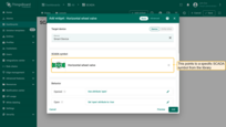
The SCADA symbol widget contains five configuration blocks, which we will explain below using the ‘Horizontal wheel valve’ symbol as a reference:
Let’s first add this widget to the dashboard:
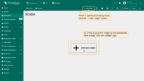
- While in dashboard editing mode, сlick the "+ Add widget" icon at the top of the screen, or (if this is your first widget on this dashboard) click a large "Add new widget" sign in the middle of the screen to open the Select widgets bundle dialog box;
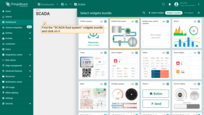
- Find the "SCADA fluid system" widgets bundle and click on it;
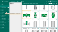
- Choose the "Horizontal wheel valve" widget.
Target entity
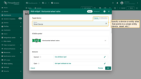
This points the widget to a single entity: device, asset, etc. It defines the entity that will be used to control the behavior of the symbol. You may omit the target entity parameter if interactive behavior is not required. Experienced users may use entity aliases that resolve to a single entity. This is particularly useful for advanced use cases, such as configuring the target entity to an asset instead of a device.
In our example, we will select the smart device that controls our valve. Typically, this device is connected via an IoT Gateway using a Modbus connector, but we will omit these details for simplicity in this guide.
SCADA symbol
This points to a specific SCADA symbol from the library. In our case, we have selected the ‘Horizontal wheel valve’ from the library. Ensure you have selected ‘Include system symbols’ if this symbol is not visible in the library.
Behavior
The list of behavior parameters is specific to the chosen SCADA symbol and is entirely controlled by the symbol’s author.
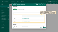
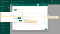
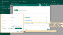
There are three types of behavior parameters: “Value”, “Action”, and “Widget action”.
- “Value” parameters usually control the visual representation of the symbol and may change over time based on the received value;
- “Action” parameters define the actions performed against the target entity when a specific event occurs;
- “Widget action” parameters define the actions triggered when the user clicks on the component of the SCADA symbol.
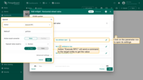
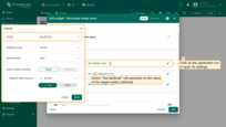
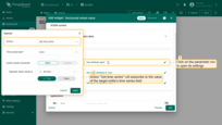
Action types to retrieve value:
- “Do nothing” action will just take the constant defined by the user.
- “Execute RPC” action will send a command to the target device to get the value. The value is resolved once during the creation of the widget.
- “Get attribute” action will subscribe to the value of the target entity’s attribute. The widget will receive updates when the attribute value changes.
- “Get time series” action will subscribe to the value of the target entity’s time series field. The widget will receive updates when new time series data arrives.
- “Get alarm status” action subscribes to the alarm status field. The widget will receive updates according to the type of alarm.
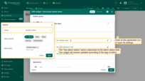
- “Get dashboard state” action will use the name of the current dashboard state. This is useful in specific cases that are not related to the state of the target device.
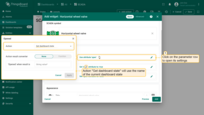
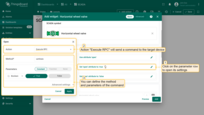
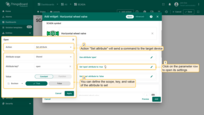
The platform supports three types of actions regarding the target entity:
- “Execute RPC” will send a command to the target device. You can define the method and parameters of the command.
- “Set attribute” will send a command to the target device. You can define the scope, key, and value of the attribute to set.
- “Add time series” will add a new time series value to the target device. You can define the key and value of the new time series data.
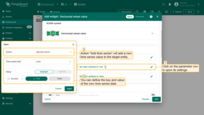
Widget action parameter “On click” defines the actions triggered when the user clicks on the component. In our example, the valve symbol does not have any widget action parameters, but you may explore other symbols like ‘Left motor pump’ for such actions. Possible action types are documented here.
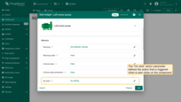
As an example, we will consider the parameters of the “Horizontal Wheel Valve” symbol:
-
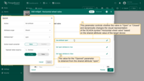
The first parameter “Opened” controls the visual representation of the SCADA symbol “Horizontal Wheel Valve” and can dynamically change, usually based on the value of an attribute or time series data received from the device. In the case of our valve, this parameter determines whether the valve is “Open” or “Closed”;
-
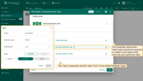
The second and third parameters determine which action should be executed in relation to the target object when the user interacts with the valve. In the case of the horizontal wheel valve, there are two actions: “Open” and “Close”. The “Open” action sets the value “true” for the “open” attribute, and the “Close” action sets the value “false” for the “open” attribute.
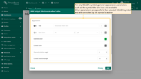
Appearance
There are common appearance parameters, such as symbol title and icon, available for any SCADA symbol. Other parameters are specific to the chosen SCADA symbol and are controlled by the symbol’s author. In the case of our valve, you can define the color of the valve symbol in both the opened and closed states. You can also configure the animation of the wheel by setting the angle of rotation. There are several types of appearance parameters, which are intuitive for the end user. For more details, see the symbol development guide.
Card Appearance
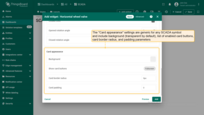
The card appearance settings are generic for any SCADA symbol and include background (transparent by default), list of enabled card buttons, card border radius, and padding parameters.
