- Widget types
- Adding a widget to the dashboard
- Widget settings
- Import and Export widget
- Next steps
A widget is a dashboard element that displays a specific type of data or provides functionality.
Widgets are used to:
- Visualize device data (telemetry and attributes)
- Remotely control devices (RPC)
- Work with alarms (create/view/acknowledge)
- Show static custom HTML content
Widget types
ThingsBoard provides five main widget types:
- Time series widgets. Show data over a selected time window. The window can be:
- Real time — a rolling interval such as the last 5 minutes or last 24 hours.
- Historical — a fixed, past interval.
Example: line, bar, or area chart widgets.
Note: Time series widgets are designed for telemetry (time series) rather than attributes.
-
Latest values widgets. Display the most recent values of selected attributes or telemetry keys.
Examples: device model attribute, latest temperature reading. -
Control widgets. Send RPC commands to your devices.
Example: set a target temperature on a thermostat. - Alarm widgets. Display and manage alarms and notifications.
- Static widgets. Present static content such as a floor plan or company information (including custom HTML).
Learn more about widget types here.
Adding a widget to the dashboard
To add a new widget to a dashboard, you should:
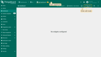
- Open your dashboard and switch to Edit mode;
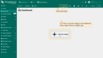
- Click the + Add widget at the top of the screen. If this is your first widget on the dashboard, you can also click Add new widget in the center of the screen to open the Widget bundle dialog;
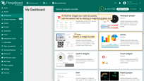
- Choose a widget bundle (for example, Charts). To quickly find your desired widget, use the search bar by clicking the magnifying glass icon and entering the widget's name;
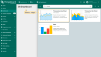
- Select a widget (for example, Time series chart) to open the Add widget dialog;
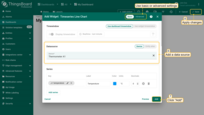
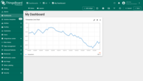
- Specify the data source, add at least one data key, and click Add. Then Apply changes.
- The widget is now created.
Widget settings
Widget configuration includes setting up one or more data sources (some widgets may have none), as well as configuring appearance, widget card parameters, actions, and layout.
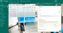
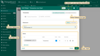
When creating a widget, you can switch between Basic and Advanced modes using the toggle in the top‑right corner of the widget dialog.
Basic mode
Use Basic mode for a quick start with a single data source and no extra filters. You’ll configure:
- the time window (or inherit it from the dashboard),
- the data source (entity alias or specific device),
- a minimal set of appearance options that depend on the widget type.
Advanced mode
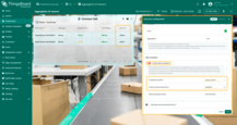
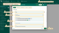
Advanced mode supports multiple data sources (when supported by the widget), filtering, and five configuration tabs for fine‑grained control: Data, Appearance, Widget card, Actions, and Layout.
Additional data source types are available in Advanced mode (widget‑dependent): Function, Entities count, and Alarms count.
Data settings
Widget time window
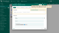
The widget's time window defines the time interval and aggregation function used to fetch telemetry or alarm data.
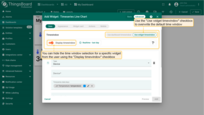
By default, each widget uses its own time window. You can instead use the dashboard time window by enabling the corresponding option.
To hide the time-window selector from end users for this widget, turn off the Display time window option.
Learn more in the time window guide.
Data source types
Widget data settings let you add one or multiple data sources.
The data source combines a data source type, an optional filter, and a list of data keys (attributes / telemetry). It defines which specific entity (or entities) the widget will pull data from to display.
Available types:
- Device — read data from a single, specific device.
- Entity — read data from entities resolved by an entity alias and optional filters.
- Function — generate data (e.g., random) to preview a widget without live telemetry.
- Entities count — show how many entities match an alias/filter.
- Alarms count — show how many alarms match selected filters.
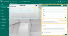
Device as datasource
Use this to fetch telemetry from one device.
Example: Suppose you have a device that publishes indoor temperature values, and you want to show this data in a widget. Let's visualize it with the Thermometer scale widget.
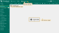
- Open your dashboard and enter edit mode. Then click the "+ Add widget" icon at the top of the screen, or (if this is your first widget on this dashboard) click a large "Add new widget" sign in the middle of the screen to open the "Widgets bundle” dialog window;
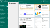
- Select "Analogue gauge" widget bundle;
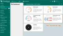
- Then select a "Thermometer scale" widget;
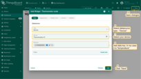
- The "Add Widget" dialog window will open. Select data source type - "Device" and select your device. Then add data key - "temperature". Click "Add" and save all changes;
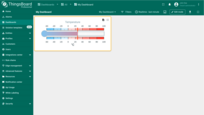
- Thermometer scale widget is created.
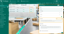
Entity as datasource
Use this to fetch data from entities resolved by an entity alias (for example: all devices, devices by type, assets in a group, etc.).
Example: list all devices in an Entities table.
- Open your dashboard and enter edit mode. Then click the "+ Add widget" icon at the top of the screen, or (if this is your first widget on this dashboard) click a large "Add new widget" sign in the middle of the screen to open the "Widgets bundle” dialog window;
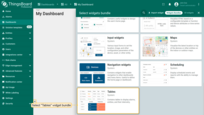
- Select "Tables" widget bundle;
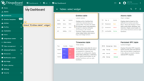
- Then select an "Entities table" widget;
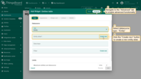
- The "Add Widget" dialog window will open. Select data source type - "Entity". Now, we need to create a new entity alias. Click "Create new" button in the entity alias row;
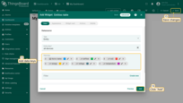
- In the opened Add alias dialog, enter an alias name, select filter type - "Entity type", and choose an entity type - "Device". Click "Add";
- Add data keys. Then click "Add" and save all changes;
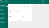
- A widget has been added that displays all devices using an entity alias as the datasource.


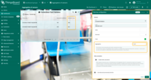
Function as datasource
Use this when you don't have any data but want to test the widget's visualization.
Example: showing a random value on a Value card.
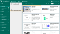
- Open your dashboard and enter edit mode. Then click the "+ Add widget" icon at the top of the screen, or (if this is your first widget on this dashboard) click a large "Add new widget" sign in the middle of the screen to open the "Widgets bundle” dialog window;
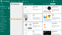
- Select a "Cards" widget bundle;
- Then select a "Value card" widget;
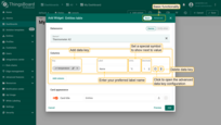
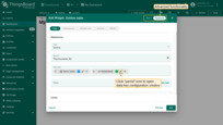
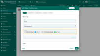
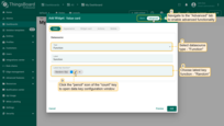
- The "Add Widget" dialog window will open. Navigate to the advanced functionality and select data source type - "Random". Then add a function - "Random" and click the "pencil" icon of the "Random" key to open data key configuration window;
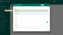
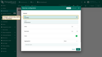
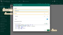
- Change the label name to "temperature" and specify units. Click "Save";
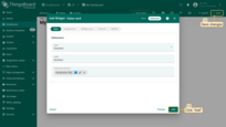
- Click "Add" and save all changes;
- Created the value card widget which displays random value.


Entities count
Shows the number of entities that match an alias/filter (e.g., total devices).
Example: display total device count on a Value card.
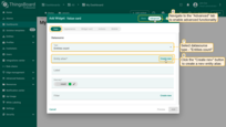
- Open your dashboard and enter edit mode. Then click the "+ Add widget" icon at the top of the screen, or (if this is your first widget on this dashboard) click a large "Add new widget" sign in the middle of the screen to open the "Widgets bundle” dialog window;
- Select a "Cards" widget bundle;
- Then select a "Value card" widget;
- The "Add Widget" dialog window will open. Go to the advanced functionality and select data source type - "Entities count". Now, we need create new entity alias. Click "Create new" button in the entity alias row;
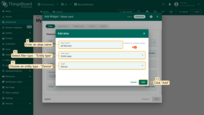
- In the opened Add alias dialog, enter an alias name, select filter type - "Entity type", and choose an entity type - "Device". Click "Add";
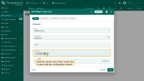
- In the Data key row click the "pencil" icon of the "count" key to open data key configuration window;
- Change label name to "Devices count" and specify units. Click "Save";
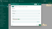
- Finally, click "Add" and save all changes;
- Now we have a widget that displays the number of existing devices.




Alarms count
Shows the number of alarms that match the selected alias/filter (e.g., all device alarms, severity, status).
Example: display total alarms on a Value card.
- Open your dashboard and enter edit mode. Then click the "+ Add widget" icon at the top of the screen, or (if this is your first widget on this dashboard) click a large "Add new widget" sign in the middle of the screen to open the "Widgets bundle” dialog window;
- Select "Cards" widget bundle;
- Then select a "Value card" widget;
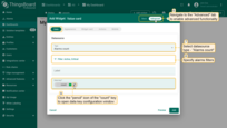
- The "Add Widget" dialog window will open. Go to the advanced functionality, select data source type - "Alarms count" and specify filters. In the Data key row click the "pencil" icon of the "count" key to open data key configuration window;
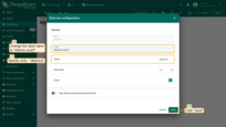
- Change label name to "Alarms count" and specify units. Click "Save";
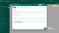
- Finally, click "Add" and apply changes;
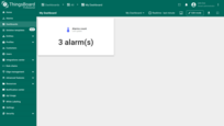
- Now we have a widget that displays all alarms of existing devices.


Data keys
A data key identifies the telemetry, attribute, or entity field a widget should use.
Sources of keys
- Attributes — the combined set of Client, Server, and Shared attributes of the selected entity. If a needed attribute doesn't exist yet, you can still add the key; the widget will show data once the device reports it.
- Time series — telemetry keys reported by devices or written by the Rule Engine / REST API.
- Entity fields — metadata fields that depend on entity type and may evolve over time (e.g. created time, entity type, name, type, label).
The data keys list for data source depends on the widget type:
- Timeseries widgets allow choosing time series data keys. Additionally, you can configure time window;
- Latest values widgets allow choosing time series, attributes and entity fields;
- Static and Control widgets do not require a data key;
- Alarm widgets allow choosing all data keys: time series, attributes, entity and alarm fields. Additionally, you can configure time window and alarm filter.
Adding keys
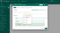
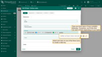
Click the Data keys row and select a key from the dropdown. If a key is not yet present in the database, type its name and select the type (Attribute, Entity field, or Time series). The widget will display values once they become available.
Configuring data keys
Data keys can be configured in two modes:
- General — common options shown in Basic mode and during widget creation.
- Advanced — full per‑key controls; open by clicking the pencil icon next to a key in Advanced widget settings.
Basic options (vary by widget)
In Basic mode, these settings appear in the Add widget dialog.
- Key — specify the key to show its data).
- Label — the human‑readable name shown in the widget (e.g., table column header or legend item).
- Units — a symbol or unit shown next to values.
Note: Starting with ThingsBoard 4.1, widgets support automatic data conversion and unit switching based on the selected unit system. - Decimals — number of digits after the decimal point.
- Color — used by many chart widgets for series styling.
Advanced options
In Advanced mode, open settings via the key's pencil icon.
Let's look at the basic data key settings an example of the “Entities table” widget from the “Tables” bundle:
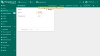
- Key. You can change the name of the key. In this case, will be displayed data of the key, which key name you specify in the “Key” line. Change the name of the key and click “Save”.
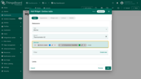
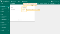
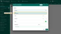
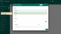
- Label. In your widget, the name of the data column is the label name. Change the label name as desired and click “Save” in the lower right corner of the dialog window.
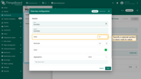
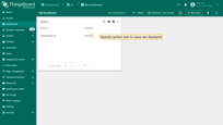
- Units. You can indicate a special symbol that will be displayed next to the value. Enter the desired character in the units field and click “Save”.
Starting from ThingsBoard 4.1, widgets also support automatic data conversion and unit switching based on the selected unit system. Learn more about this here.
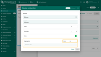
- Decimals. Specify the desired number of digits to be displayed after floating-point number and click “Save”.
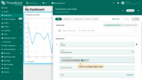
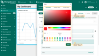
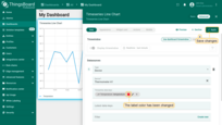
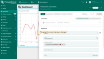
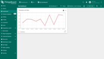
- Color. Each key is assigned a different color. In some widgets (for example, Chart), the color of the graph line displayed in the widget is the color of the key. You can change color of the key. Click on the colored circle, select the desired label color and press “Select”.
- Use data post-processing function — enable a custom function to transform raw values before display.
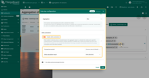
Aggregation of key
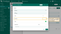
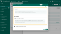
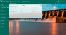
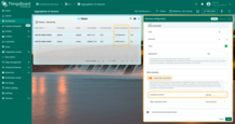
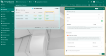
By default, the Latest values widgets do not have the time window. If you enable aggregation for any data key in the Latest values widgets, the time window control will appear. You can set up aggregation for each telemetry key individually, which you want to display and at the same time do not need to store it in the database. The time window configuration is limited to the real-time intervals (Current Hour/Day/Month) and History time intervals. The real-time intervals like last 30 minutes or last 24 hours are not supported for performance reasons. If you need to store the aggregation as telemetry, follow for more details at the link.
Aggregation options:
- Min or Max:
Selects the minimum or maximum value from the given interval. Using to detect peak negative or positive values. For example, power surges in the power cable, air pollution, equipment workload, etc.
- Average:
Calculates the average from the selected interval (Summarizes, then divides by the count of telemetry from the selected interval). For example, you can use average aggregation for weekly fuel consumption, acoustical noise in dB, rotation fan speed, signal quality, etc.
- Sum:
Summarizes all telemetry for the specified period. Aggregation, for example, uses for different types of telemetry, mileage (km), water consumption, idle time, etc.
- Count:
Calculates the total number of transmitted messages for the selected period. It can be useful in setting up and optimizing devices running on battery power or when evaluating sensor activation sensitivity, etc.
Delta function:
Allows you to calculate the delta between aggregated values for current and relative time window intervals.
Comparison period - is a parameter that takes the history interval as a basis and converts it according to the selected option. List of options below.
- Previous interval (default) - set as a default option, when calculating, not only time is taken into account, but
also the type of interval (Current day or Current day so far, etc.)
Example: History - Current month so far option, suppose is interval 1.09.22 to 25.09.22 then previous interval will be 1.08.22 to 25.08.22
- Day ago - from the start and end of the history interval, takes away 24 hours.
For example, with the amount of water spent Current day and Delta - Day ago:
- Week ago - takes interval one week earlier from history interval (168 hours).
Example with average, history interval - Current day, and Week ago delta:
- Month ago - The same interval (in days) as the history interval and subtracts from the current history interval.
Example, if the current month is February (28 days) then Month ago would be the previous 28 days, not the entire previous month.
Example, with sum water, history - Current day and Delta - Month ago:
- Year ago - Interval that was 365 days ago from the current history interval.
If it is necessary to compare, suppose the aggregation for the previous month and the month of the past year.
- Custom interval - This option is for setting individual intervals. The maximum allowed value is limited to the int type. Example: 43200000 = 12 hours.
Delta calculation result:
This option allows you to specify how the result should be displayed:
-
Previous Value - Displays aggregation value of compare interval (not current history interval).
-
Delta (absolute) - Displays the difference between compared intervals, this option is set by default.
-
Delta (percent) - Displays the result as a percentage relative to the previous interval
formula: (IntervalValue - prevIntervalValue)/prevIntervalValue*100
Data post-processing function
The data post-processing function enables real-time transformation of incoming telemetry values before they are displayed in widgets. This feature allows you to apply custom JavaScript logic to each data point — for example, convert units, filter out anomalies, or calculate derived metrics without touching upstream sources.
How to use:
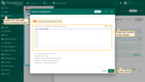
- In the widget → go to section with Data keys → click the Pencil icon of the target data key.
- Enable toggle Use data post-processing function.
- Enter your code in the function body. The platform automatically injects the function header:
function (time, value, prevValue, timePrev, prevOrigValue) {
YOUR_JS_CODE
} - Click Save button.
Once enabled, the function has access to the following parameters:
- time – timestamp of the current value,
- value – the current value,
- prevValue – value returned by the previous function call,
- timePrev – timestamp of the previous value,
- prevOrigValue – original previous value.
The function must return a value (number|string|boolean|null). Returning null excludes the data point from visualization.
Advanced data key settings
Advanced data keys configuration is responsible for the visibility, style, and appearance of a specific data key column on the widget. Entity table widget, alarms table widget, and entity admin widget bundles have the same advanced data key configuration. Charts widget bundle has its own unique advanced data key configuration. All other widget bundles have only basic data key configuration.
Learn more about advanced data key settings here.
Filters
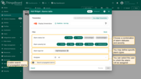
Filters let you narrow which data a widget retrieves from its data sources. Filters are built by adding keys and defining conditions on those keys. You can combine multiple keys and conditions.
Key types:
When adding a filter, choose one of the following key types:
- Entity field. A built‑in field on the entity (e.g., device name, type, label, createdTime, etc.). Useful for targeting entities by metadata rather than telemetry.
- Attribute. A generic attribute key when you don’t need to distinguish where the attribute is stored.
- Client attribute. Attributes set or reported by the device/edge client (typically via MQTT/HTTP/CoAP). Example: firmware build reported by the device at runtime.
- Server attribute. Attributes stored on the platform and usually configured by users or services. Example: targetTemperature, threshold.
- Shared attribute. Often used to deliver configuration from the server to devices (e.g., displayUnits).
- Time series. Telemetry keys that represent values over time (e.g., temperature, humidity, voltage). Best for conditions based on recent or historical readings.
Operations
Use operations to define how the key is compared to a value: equal, not equal, greater than, less than, greater or equal, less or equal.
For the comparison value, you can use a fixed literal or a Dynamic source type. Dynamic sources let the filter pull the value from context at runtime. This makes filters adaptable—for instance, “temperature greater or equal than targetTemperature (server attribute)” or “voltage less than the value the user selects in a control widget”.
Alarm filter
Alarm widgets allow you to filter alarms based on status, severity, and type. You can choose a combination of alarm statuses and severity. You may also define specific alarm types as well as enable search of propagated alarms.
Appearance
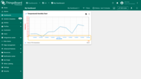
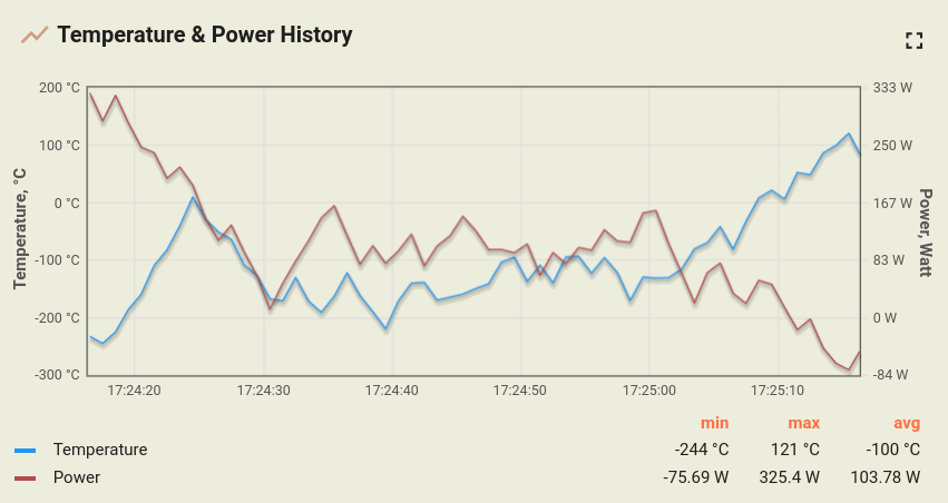
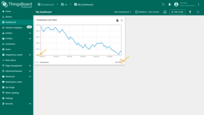
Let's assume you have added the “Timeseries Line Chart” widget to display thermometers using the widget data configuration step only. You should see a similar widget (note that you should send/simulate some data to see the actual lines in the chart):
Let's use the basic widget settings to customize the widget. We will demonstrate how each setting affects the widget.
Data settings
You can choose which symbol to display next to the value and the number of digits after the floating-point number. These settings are useful if you want to apply the same settings for all axes.
-
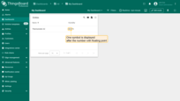
Units by default. If you are showing temperature readings for multiple devices, you can add symbol (e.g., °C or °F). However, if you are displaying both temperature and humidity, you have to configure these data keys separately using data key settings.
-
Decimals by default. Controls how many decimal places are displayed when a data key doesn't have its own formatting.
-
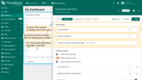
“No data to display” message. An alternative message shown when the widget has no data in the selected time window or cannot render values (e.g., missing keys). Use it to provide helpful next steps.
Examples:
• “No data to display”
• “No data for the selected time range”
• “No telemetry received yet — check the device connection or time range”.
Common settings
Stacking mode
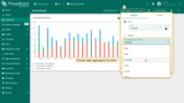
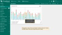
This option is relevant to the “Timeseries Bar Chart” widget. The Stacking mode function displays the summed entity values to prevent overlap, with each value distinguished by a unique color. This function can be used only if the data aggregation function is not set to None. Without activating the “Enable stacking mode”, the bars will be split according to the values of the entities used. To view the values of all entities, you need to hover your mouse over the bar.
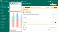
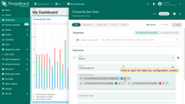
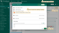
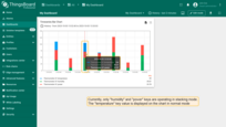
If you need to exclude a specific key from stacking, go to the advanced data key configuration, and check the “Exclude from stacking” checkbox.
Legend settings
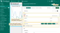
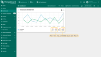
The legend displays statistical values including minimum, maximum, average, total, and latest values.
By default, the show legend option is enabled only for chart widgets. For other widgets, this option is disabled, but you can enable it by switching the Legend toggle in the widget settings.
In the legend settings, you can:
- Configure font settings and colors for labels, values, and column headers.
- Choose the legend position.
- Select which statistical values to display (minimum, maximum, average, total, latest).
- Enable sorting of data keys or keep them unsorted.
- Configure font settings and colors for labels, values, and column headers.
- Choose the legend position.
- Select which statistical values to display (minimum, maximum, average, total, latest).
- Enable sorting of data keys or keep them unsorted.
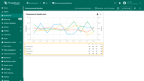
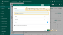
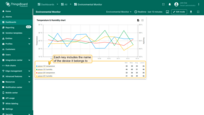
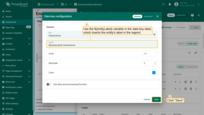
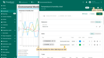
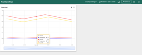
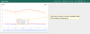
The legend displays a label for each data key. When a widget contains data from multiple devices, or when several devices use the same data key name (for example, temperature), it may be difficult to determine which key value corresponds to which device in the legend or tooltip.
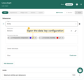
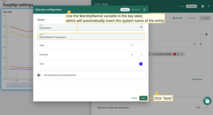
To make the legend clearer, you should use ${entityName} or ${entityLabel} in the Label field of the data key configuration.
- ${entityName} – a variable that automatically inserts the system name of the entity in the legend. This helps clearly identify the object, especially when its technical name or unique identifier is important.
Example: If a device has the name sensor-101, then in the field where ${entityName} is used, you will see sensor-101.
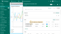

- ${entityLabel} – a variable that inserts the entity’s label in the legend. This is often used as a human-readable label and allows you to display a more descriptive name of the device or entity.
Example: A device has:- Name = sensor-101
- Label = Temperature Sensor, Warehouse #1
In the field where ${entityLabel} is used, the operator will see the more understandable text: Temperature Sensor, Warehouse #1.

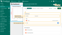
Axis settings
Configure the preferred axis parameters.
Specify the titles of the vertical and horizontal axes, and set the minimum and maximum scale values.
You can also set the ticks color, the number of decimal places, and step size between ticks.
Vertical axis settings:
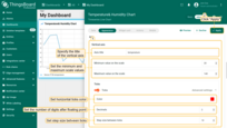
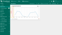
Horizontal axis settings:
Ticks formatter function, f(value)
Let's say we have telemetry which takes values of very large numbers, especially when there is a special symbol near values. However, we need to build a small graph (since we don’t have a lot of free space on the dashboard). Therefore, using the ticks-formatter function, we can convert the ticks values to a more compact form.
1
return value.toExponential(1) + " C";
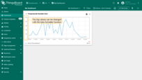
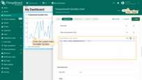
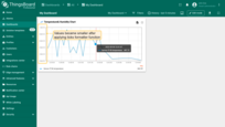
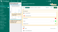
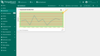
Chart background settings
You can change the appearance of the chart grid: customize the color of the background, the grid frame and its ticks, and turn off lines visibility.
Tooltip settings
-
Hover individual points. When the box “Hover individual points” is checked, you won't see value points on the lines.
-
Show cumulative values in stacking mode. While stacking mode is on, you can check the box “Cumulative values” to enable your chart to display sum of all entity values.
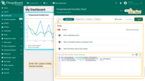
Tooltip value format function, f(value, latestData) is used when you want to manually customize the tooltip.
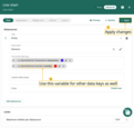
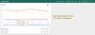
To make the tooltip clearer, you should use ${entityName} or ${entityLabel} in the Label field of the data key configuration.
- ${entityName} – a variable that automatically inserts the system name of the entity in the tooltip. This helps clearly identify the object, especially when its technical name or unique identifier is important.
Example: If a device has the name Sensor 1, then in the field where ${entityName} is used, you will see Sensor 1.
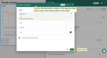
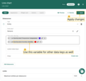
- ${entityLabel} – a variable that inserts the entity’s label in the tooltip. This is often used as a human-readable label and allows you to display a more descriptive name of the device or entity.
Example: A device has:- Name = Sensor 1
- Label = Sensor 1 Label
In the field where ${entityLabel} is used, the operator will see the more understandable text: Sensor 1 Label.
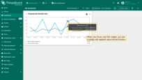
You can customize the values that will be displayed in the tooltip via tooltip settings or Advanced Data key configuration. Tooltip configuration via Settings is basic and applied to all entities at the same time. When configured in the Advanced Data key configuration, it is applied only to the specific time series data, and the basic tooltip function will be overwritten by this configuration.
In State Chart, you can configure entity states to be shown on a tooltip depending on entity values.
Let's use the function to convert values from Celsius to Fahrenheit and display these values side by side:
1
2
3
let celsiusValue = parseFloat(value).toFixed(2);
let farenheitValue = parseFloat(celsiusValue*1.8 + 32).toFixed(2);
return celsiusValue + ' °C (' + farenheitValue + ' °F)';
- In the Tooltip value format function field, enter your tooltip function, then apply changes;
- Hover with your mouse over the widget to see tooltip with applied value format function.
Comparison settings
You can show historical data with which to compare.
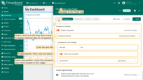
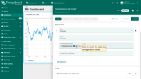
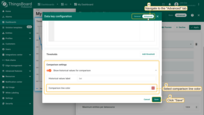
- In the "Appearance" tab, toggle the "Enable comparison" checkbox and from the drop-down menu select time to show historical data with which to compare. In the "Comparison X axis settings" section, select axis position, where the compared axis will be located on the widget. Also, you can enter the axis title and show axis tick labels;
- Navigate to the "Data" tab and click the “pencil” icon of a key in the data keys row;
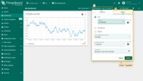
- In the data key configuration window, navigate to the "Advanced" tab and choose the comparison line color. When you are done with Comparison Settings configuration, then apply changes;
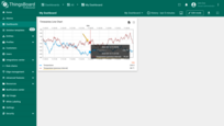
- Since comparison settings work only in history time window mode, click "Edit time window" icon in the dashboard toolbar, go to the "History" tab, and select the time interval with which you want to compare the current data. Then click "Update" to apply;
- Now you can compare the value for the current minute and the five minutes ago.
Custom legend settings
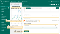
Use Custom Legend Settings when you need to showcase data that isn't suitable for chart representation, such as specific attributes, or when you want to display only certain time series in the Chart legend. For instance, consider active/inactive attributes that can be displayed in a Table widget but not on a Chart.
- Navigate to the "Appearance" tab. Activate the "Enable custom legend" option to use attribute or time series values as key labels. Click on "+ Add new key". In the drop-down menu that appears, input the key name and choose the key type;
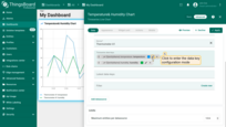
- Proceed to the "Data" tab. Click the pencil icon next to a data key to access the Data key configuration window;
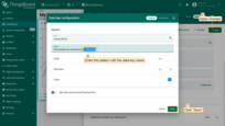
- In the label line, input the pattern ${} and place the data key name within the brackets. Click "Save" to set the new label name and apply all changes;
- Now, when you view the widget, you'll see that the custom legend settings have been applied.

Widget card
Widget title settings
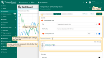
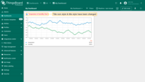
You can input custom widget title, tooltip and title style. You may also add an icon to the title and control icon color and size. See configuration and the corresponding result below.
Title style from the screen above:
1
2
3
4
{
  "fontSize": "15px",
  "fontWeight": 600
}
Widget style settings
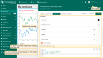
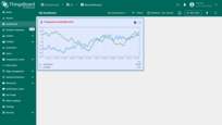
You can customize personal style for the widget using CSS properties. This style will be applied to the main div element of the widget.
You may also disable the widget shadow using the “Drop shadow” checkbox and disable fullscreen using the “Enable fullscreen” checkbox. All those settings are enabled by default.
You can also change the background color, text color, padding, and margin. See the configuration and the corresponding result below.
Please note that the style and background color are just an example and are definitely not part of our guidelines.
Widget style from the screen above:
1
2
3
4
{
  "border": "3px solid #2E86C1",
  "cursor": "pointer"
}
Widget buttons settings
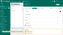
Enable data export
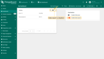
The “Enable data export” button is responsible for enabling/disabling the ability to export data that is displayed in the widget. By default, data export is enabled. To download data, click on the “Export widget data” icon at the top right of the widget. You can export the data in csv, xls or xlsx format.


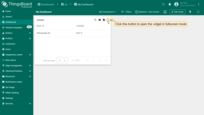
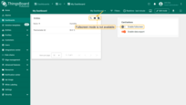
Enable fullscreen
You may disable fullscreen using the “Enable fullscreen” checkbox. This setting is enabled by default.
All those settings are enabled by default.
Widget actions
Actions allow quickly and easily configuring the transition to the created state, transferring to other dashboards, or even updating the dashboard you are in. Depending on the widget, the action sources differ. However, the type of action you are able to choose will be the same for all widgets. Actions are adjusted in the Edit mode of the needed widget. To fully understand how to use Actions, you have to add a State to your widget.
Read more about widget actions in the documentation dedicated to it.
Layout settings
Use the Layout tab to control how the widget behaves inside the dashboard grid across desktop and mobile layouts.
Resize options
- Resizable. Allows the widget to be resized by the user in Edit mode. When disabled, the widget keeps its current size and resize handles are hidden.
- Preserve aspect ratio. Keeps the widget's width‑to‑height ratio when it is resized. This helps charts and media avoid distortion across different screen sizes and grid breakpoints. If disabled, width and height can change independently.
Mobile
These options control visibility and sizing in mobile mode (responsive layout):
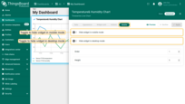
- Hide widget in mobile mode. Do not render this widget when the dashboard is viewed on a mobile layout. Useful for large visualizations that don’t fit small screens.
- Hide widget in desktop mode. Render this widget only on mobile; hide it on desktop. Handy when you design a compact, mobile‑only alternative to a complex desktop widget.
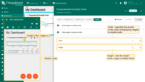
- Order. Sets the widget's position relative to other widgets in the mobile layout. Lower numbers appear earlier (top‑left). Use integers (e.g., 1, 2, 3…).
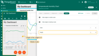
- Height. Defines the widget’s height in the mobile grid (in grid rows). Increase the value to give lists and cards more space on phones; reduce it for small KPIs.
Best practices:
- Keep mobile Order consistent across related widgets to maintain reading flow.
- Test with real devices or the dashboard’s mobile preview to validate Height and scrolling behavior.
Import and Export widget
Import widget
You can import a widget from a JSON file.
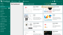
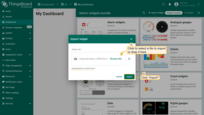
- Open your dashboard and switch to Edit mode. Click + Add widget. The Select widgets bundle dialog opens.
- Click Import widget in the top‑right corner.
- In the import dialog, upload the JSON file and click Import.
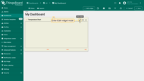
- The widget has been added to the dashboard. It may not show data yet because the data source needs to be updated.
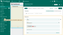
- Enter widget edit mode, specify the data source, add the required data key(s), and apply changes.
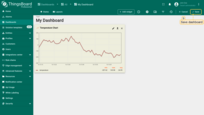
- Verify that the widget displays data (e.g., a temperature chart) and Save the dashboard.

Export widget
Export saves a widget's configuration (as JSON) so you can reuse it elsewhere.
Steps:
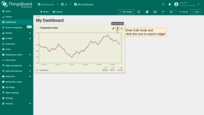
- Open the dashboard containing the widget and switch to Edit mode.
- On the widget's top‑right toolbar, click Export widget.
- A JSON file with the widget configuration is downloaded to your computer.
Next steps
-
Connect your device - Learn how to connect devices based on your connectivity technology or solution.
-
Data visualization - These guides contain instructions on how to configure complex ThingsBoard dashboards.
-
Data processing & actions - Learn how to use ThingsBoard Rule Engine.
-
IoT Data analytics - Learn how to use rule engine to perform basic analytics tasks.
-
Advanced features - Learn about advanced ThingsBoard features.
