- Introduction
- Creating new widget definition
- Integrating existing code to create widget definition
- Widget code debugging tips
- ThingsBoard extensions
Introduction
ThingsBoard widgets are additional UI modules that seamlessly integrate into any IoT Dashboard. They provide end-user functions such as data visualization, remote device control, alarms management, and display of static custom HTML content. Each widget definition represents a specific Widget Type based on the provided features.
Creating new widget definition
In order to create a new widget definition, navigate to “Widget Library” and open existing “Widgets Bundle” or create a new one. In the “Widgets Bundle” view, click the “+” button at the top-right part of the screen and then click the “Create new widget” button.
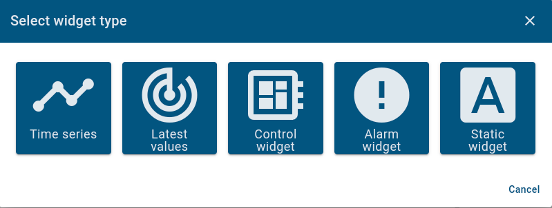
“Select widget type” window should appear with select options corresponding to the widget type you intend to develop.
After that, the pre-populated “Widget Editor” page will open with starter widget template according to previously selected widget type.
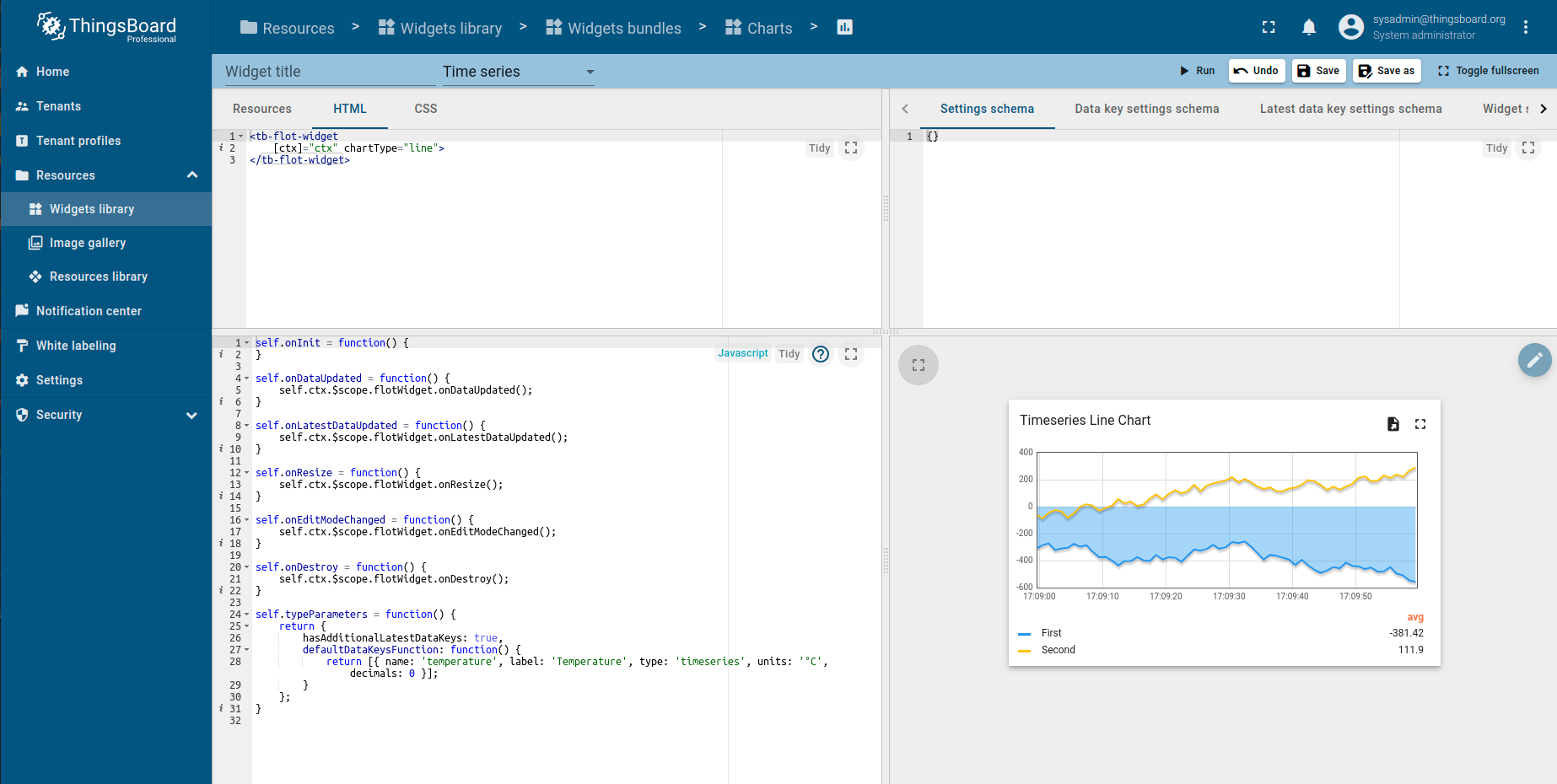
Widget Editor overview
Widget Editor view is a mini IDE designed to develop custom widget definitions. It consists of top toolbar and four main sections:
Widget Editor Toolbar
Widget Editor Toolbar consists of the following items:
- Widget Title field - used to specify title of the widget definition
- Widget Type selector - used to specify type of the widget definition
- Run button - used to run widget code and view result in Widget preview section
- Undo button - reverts all editor sections to latest saved state
- Save button - saves widget definition
- Save as button - allows to save a new copy of widget definition by specifying new widget type name and target Widgets Bundle
Resources/HTML/CSS section
This section consists of three tabs:
The first Resources tab is used to specify external JavaScript/CSS resources used by the widget.
Second HTML tab contains the widget’s HTML code (Note: some widgets create HTML content dynamically, thus their initial HTML content can be empty).
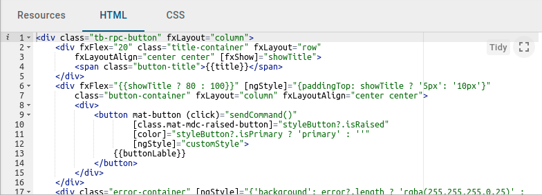
Third CSS tab contains widget specific CSS style definitions.
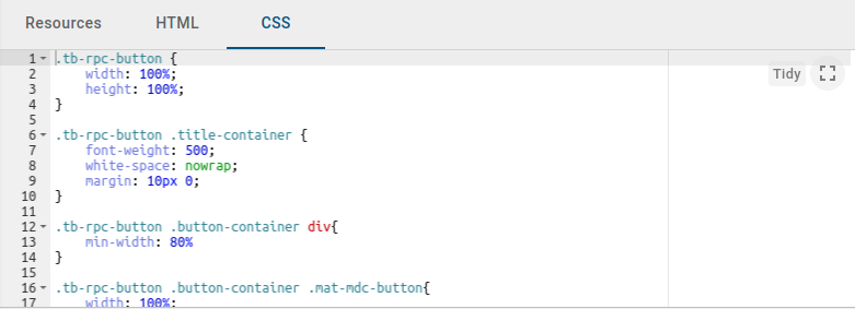
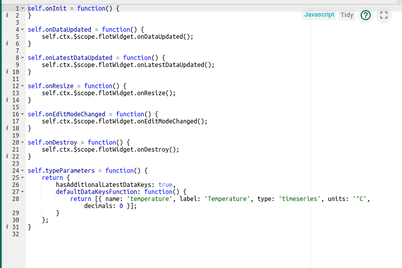
JavaScript section
This section contains all widget related JavaScript code according to the Widget API.
Settings schema section
This section consists of two tabs:
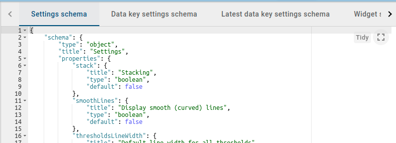
The first tab, Settings schema, is used to specify the JSON schema of widget settings for automatically generating a UI form using the react-schema-form builder. This generated UI form is displayed in the Advanced mode in the Appearance tab of widget settings. The Settings Object serialized by this schema, is used to store specific widget settings and is accessible from the widget’s JavaScript code.
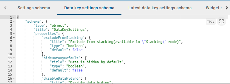
The second tab, Data key settings schema, is used to specify JSON schema of data key settings for automatically generating a UI form using the react-schema-form builder. This generated UI form is displayed in Advanced tab of the Data key configuration dialog. The Settings Object serialized by this schema is used to store specific settings for each data key of the datasource defined in the widget. These settings are accessible from widget’s JavaScript code.
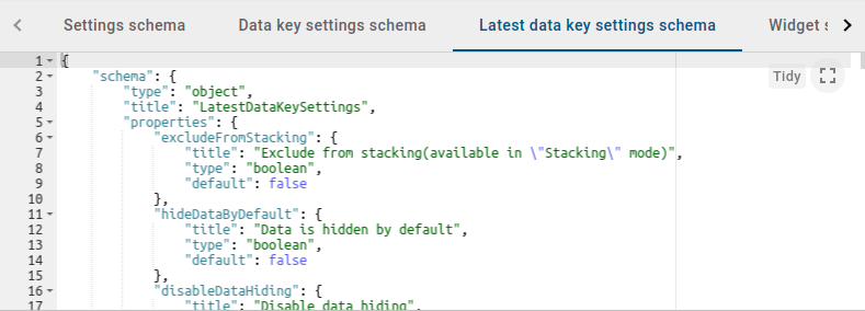
The third tab, Latest data key settings schema, is used to specify JSON schema of the latest data key for automatically generating a UI form using the react-schema-form builder. The Latest data key settings schema is available only for Time series widgets. This generated UI form is displayed in Advanced tab of the Data key configuration dialog of the Latest keys. The Settings Object serialized by this schema is used to store specific settings for each data key of the datasource defined in the widget. These settings are accessible from widget JavaScript code.
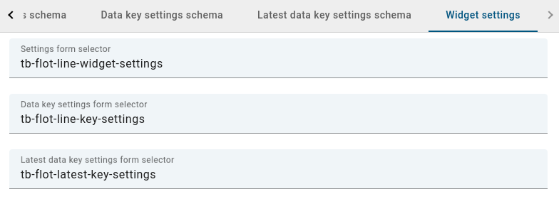
Starting from v3.4, auto-generated advanced widget settings JSON forms are replaced with Angular components. When creating new settings schemas for custom widgets, don’t forget to remove components from Widget Settings tab.
Here is the basic example of the settings schema:
1
2
3
4
5
6
7
8
9
10
11
12
13
14
15
16
17
18
19
20
21
22
23
24
25
26
27
28
29
30
31
32
33
34
35
36
37
38
39
40
{
"schema": {
"type": "object",
"title": "Settings",
"properties": {
"cardType": {
"title": "Card type",
"type": "string",
"default": "Average"
},
"cardTitle": {
"title": "Card title",
"type": "string",
"default": "Gateways online"
}
},
"required": ["cardType"]
},
"form": [
{
"key": "cardType",
"type": "rc-select",
"multiple": false,
"items": [
{
"value": "avg",
"label": "Average"
},
{
"value": "max",
"label": "Maximum"
},
{
"value": "min",
"label": "Minimum"
}]
},
"cardTitle"
]
}
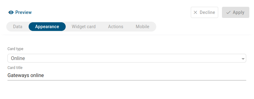
Here is the result of applying settings schema, will be visible in Appearance tab of the widget settings:
The schema property supports types such as Number, Boolean, String and Object. In the form array, every property can be specified as an input, checkbox, dropdown, functional field(JS, HTML, CSS), image selection, color picker, or an array of properties. Fields can be displayed conditionally and grouped in logical blocks.
Here is the complex example of the custom settings schema:
1
2
3
4
5
6
7
8
9
10
11
12
13
14
15
16
17
18
19
20
21
22
23
24
25
26
27
28
29
30
31
32
33
34
35
36
37
38
39
40
41
42
43
44
45
46
47
48
49
50
51
52
53
54
55
56
57
58
59
60
61
62
63
64
65
66
67
68
69
70
71
72
73
74
75
76
77
78
79
80
81
82
83
84
85
86
87
88
89
90
91
92
93
94
95
96
97
98
99
100
101
102
103
104
105
{
"schema": {
"type": "object",
"properties": {
"button": {
"title": "Button settings",
"type": "object",
"properties": {
"color": {
"title": "Primary color",
"type": "string",
"default": "#545454"
},
"backgroundColor": {
"title": "Background color",
"type": "string",
"default": null
}
}
},
"markerImage": {
"title": "Custom marker image",
"type": "string"
},
"markerImageSize": {
"title": "Custom marker image size (px)",
"type": "number",
"default": 34
},
"useMarkerImageFunction": {
"title": "Use marker image function",
"type": "boolean",
"default": false
},
"markerImageFunction": {
"title": "Marker image function: f(data, images, dsData, dsIndex)",
"type": "string"
},
"markerImages": {
"title": "Marker images",
"type": "array",
"items": {
"title": "Marker image",
"type": "string"
}
}
},
"required": []
},
"form": [
[
{
"key": "button",
"items": [
{
"key": "button.color",
"type": "color"
},
{
"key": "button.backgroundColor",
"type": "color"
}
]
}
],
[
"useMarkerImageFunction",
{
"key": "markerImage",
"type": "image",
"condition": "model.useMarkerImageFunction !== true"
},
{
"key": "markerImageSize",
"condition": "model.useMarkerImageFunction !== true"
},
{
"key": "markerImageFunction",
"type": "javascript",
"helpId": "widget/lib/map/marker_image_fn",
"condition": "model.useMarkerImageFunction === true"
},
{
"key": "markerImages",
"items": [
{
"key": "markerImages[]",
"type": "image"
}
],
"condition": "model.useMarkerImageFunction === true"
}
]
],
"groupInfoes": [
{
"formIndex": 0,
"GroupTitle": "Button Style Settings"
},
{
"formIndex": 1,
"GroupTitle": "Marker Settings"
}
]
}
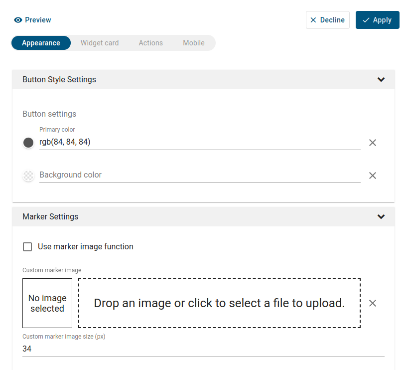
The result of applying custom settings schema to the widget:
Widget preview section
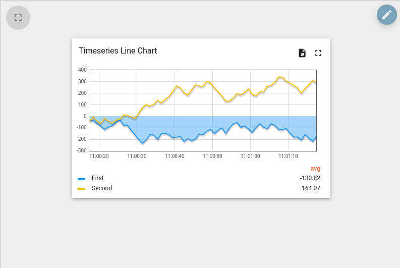
This section is used to preview and test widget definitions. It is presented as a mini dashboard containing one widget instantiated from the current widget definition. It has most of the functionality provided by a typical ThingsBoard dashboard, with some limitations. For example, “Function” can only be selected as datasource type in widget datasources section for debugging purposes.
Basic widget API
All widget-related code is located in the JavaScript section. The built-in variable self that is a reference to the widget instance is also available. Each widget function should be defined as a property of the self variable. The self variable has a property ctx of type WidgetContext, which is a reference to the widget context that contains all the necessary API and data used by widget instance. Below is a brief description of widget context properties:
Property | Type | Description |
---|---|---|
$container | jQuery Object | Container element of the widget. Can be used to dynamically access or modify widget DOM using jQuery API. |
$scope | IDynamicWidgetComponent | Reference to the current widget component. Can be used to access/modify component properties when widget is built using Angular approach. |
width | Number | Current width of widget container in pixels. |
height | Number | Current height of widget container in pixels. |
isEdit | Boolean | Indicates whether the dashboard is in in the view or editing state. |
isMobile | Boolean | Indicates whether the dashboard view is less then 960px width (default mobile breakpoint). |
widgetConfig | WidgetConfig | Common widget configuration containing properties such as color (text color), backgroundColor (widget background color), etc. |
settings | Object | Widget settings containing widget specific properties according to the defined settings json schema. |
datasources | Array<Datasource> | Array of resolved widget datasources. See Subscription object. |
data | Array<DatasourceData> | Array of latest datasources data. See Subscription object. |
timeWindow | WidgetTimewindow | Current widget timewindow (applicable for timeseries widgets). Holds information about current timewindow bounds. minTime - minimum time in UTC milliseconds, maxTime - maximum time in UTC milliseconds, interval - current aggregation interval in milliseconds. |
units | String | Optional property defining units text of values displayed by widget. Useful for simple widgets like cards or gauges. |
decimals | Number | Optional property defining how many positions should be used to display decimal part of the value number. |
hideTitlePanel | Boolean | Manages visibility of widget title panel. Useful for widget with custom title panels or different states. updateWidgetParams() function must be called after this property change. |
widgetTitle | String | If set, will override configured widget title text. updateWidgetParams() function must be called after this property change. |
detectChanges() | Function | Trigger change detection for current widget. Must be invoked when widget HTML template bindings should be updated due to widget data changes. |
updateWidgetParams() | Function | Updates widget with runtime set properties such as widgetTitle, hideTitlePanel, etc. Must be invoked in order these properties changes take effect. |
pageLink(pageSize, page, textSearch, sortOrder) | PageLink | Is used to create sorting configuration for GET requests. pageSize - determines the number of entities displayed on a page, page - specifies which page should be displayed, textSearch - filters entities based on the included text, sortOrder - sets the order in which entities are displayed. |
defaultSubscription | IWidgetSubscription | Default widget subscription object contains all subscription information, including current data, according to the widget type. See Subscription object. |
timewindowFunctions | TimewindowFunctions | Object with timewindow functions used to manage widget data time frame. Can be used by Time-series or Alarm widgets. See Timewindow functions. |
controlApi | RpcApi | Object that provides API functions for RPC (Control) widgets. See Control API. |
actionsApi | WidgetActionsApi | Set of API functions to work with user defined actions. See Actions API. |
stateController | IStateController | Reference to Dashboard state controller, providing API to manage current dashboard state. See State Controller. |
In order to implement a new widget, the following JavaScript functions should be defined (Note: each function is optional and can be implemented according to widget specific behaviour):
Function | Description |
---|---|
onInit() |
The first function that is called when the widget is ready for initialization. It should be used to prepare widget DOM, process widget settings and handle initial subscription information. |
onDataUpdated() |
Called when the new data is available from the widget subscription. Latest data can be accessed from the defaultSubscription object of widget context (ctx). |
onResize() |
Called when widget container is resized. Latest width and height can be obtained from widget context (ctx). |
onEditModeChanged() |
Called when dashboard editing mode is changed. Latest mode is handled by isEdit property of ctx. |
onMobileModeChanged() |
Called when dashboard view width crosses mobile breakpoint. Latest state is handled by isMobile property of ctx. |
onDestroy() |
Called when widget element is destroyed. Should be used to cleanup all resources if necessary. |
getSettingsSchema() |
Optional function returning widget settings schema json as alternative to Settings tab of Settings schema section. |
getDataKeySettingsSchema() |
Optional function returning particular data key settings schema json as alternative to Data key settings schema tab of Settings schema section. |
typeParameters() |
Returns WidgetTypeParameters object describing widget datasource parameters. See Type parameters object. |
actionSources() |
Returns map describing available widget action sources (WidgetActionSource) used to define user actions. See Action sources object. |
Subscription object
The widget subscription object is instance of IWidgetSubscription and contains all subscription information, including current data, according to the widget type. Depending on widget type, subscription object provides different data structures. For Latest values and Time-series widget types, it provides the following properties:
- datasources - array of datasources (Array<Datasource>) used by this subscription, using the following structure:
1
2
3
4
5
6
7
8
9
10
11
12
13
14
15
16
17
18
19
20
21
22
datasources = [
{ // datasource
type: 'entity',// type of the datasource. Can be "function" or "entity"
name: 'name', // name of the datasource (in case of "entity" usually Entity name)
aliasName: 'aliasName', // name of the alias used to resolve this particular datasource Entity
entityName: 'entityName', // name of the Entity used as datasource
entityType: 'DEVICE', // datasource Entity type (for ex. "DEVICE", "ASSET", "TENANT", etc.)
entityId: '943b8cd0-576a-11e7-824c-0b1cb331ec92', // entity identificator presented as string uuid.
dataKeys: [ // array of keys (Array<DataKey>) (attributes or timeseries) of the entity used to fetch data
{ // dataKey
name: 'name', // the name of the particular entity attribute/timeseries
type: 'timeseries', // type of the dataKey. Can be "timeseries", "attribute" or "function"
label: 'Sin', // label of the dataKey. Used as display value (for ex. in the widget legend section)
color: '#ffffff', // color of the key. Can be used by widget to set color of the key data (for ex. lines in line chart or segments in the pie chart).
funcBody: "", // only applicable for datasource with type "function" and "function" key type. Defines body of the function to generate simulated data.
settings: {} // dataKey specific settings with structure according to the defined Data key settings json schema. See "Settings schema section".
},
//...
]
},
//...
]
- data - array of latest data (Array<DatasourceData>) received in scope of this subscription, using the following structure:
1
2
3
4
5
6
7
8
9
10
11
12
13
14
data = [
{
datasource: {}, // datasource object of this data. See datasource structure above.
dataKey: {}, // dataKey for which the data is held. See dataKey structure above.
data: [ // array of data points
[ // data point
1498150092317, // unix timestamp of datapoint in milliseconds
1, // value, can be either string, numeric or boolean
],
//...
]
},
//...
]
For Alarm widget type it provides the following properties:
- alarmSource - (Datasource) information about entity for which alarms are fetched, using the following structure:
1
2
3
4
5
6
7
8
9
10
11
12
13
14
15
16
17
18
alarmSource = {
type: 'entity',// type of the alarm source. Can be "function" or "entity"
name: 'name', // name of the alarm source (in case of "entity" usually Entity name)
aliasName: 'aliasName', // name of the alias used to resolve this particular alarm source Entity
entityName: 'entityName', // name of the Entity used as alarm source
entityType: 'DEVICE', // alarm source Entity type (for ex. "DEVICE", "ASSET", "TENANT", etc.)
entityId: '943b8cd0-576a-11e7-824c-0b1cb331ec92', // entity identificator presented as string uuid.
dataKeys: [ // array of keys indicating alarm fields used to display alarms data
{ // dataKey
name: 'name', // the name of the particular alarm field
type: 'alarm', // type of the dataKey. Only "alarm" in this case.
label: 'Severity', // label of the dataKey. Used as display value (for ex. as a column title in the Alarms table)
color: '#ffffff', // color of the key. Can be used by widget to set color of the key data.
settings: {} // dataKey specific settings with structure according to the defined Data key settings json schema. See "Settings schema section".
},
//...
]
}
- alarms - array of alarms (Array<Alarm>) received in scope of this subscription, using the following structure:
1
2
3
4
5
6
7
8
9
10
11
12
13
14
15
16
17
18
19
20
21
22
23
24
25
26
alarms = [
{ // alarm
id: { // alarm id
entityType: "ALARM",
id: "943b8cd0-576a-11e7-824c-0b1cb331ec92"
},
createdTime: 1498150092317, // Alarm created time (unix timestamp)
startTs: 1498150092316, // Alarm started time (unix timestamp)
endTs: 1498563899065, // Alarm end time (unix timestamp)
ackTs: 0, // Time of alarm acknowledgment (unix timestamp)
clearTs: 0, // Time of alarm clear (unix timestamp)
originator: { // Originator - id of entity produced this alarm
entityType: "ASSET",
id: "ceb16a30-4142-11e7-8b30-d5d66714ea5a"
},
originatorName: "Originator Name", // Name of originator entity
type: "Temperature", // Type of the alarm
severity: "CRITICAL", // Severity of the alarm ("CRITICAL", "MAJOR", "MINOR", "WARNING", "INDETERMINATE")
status: "ACTIVE_UNACK", // Status of the alarm
// ("ACTIVE_UNACK" - active unacknowledged,
// "ACTIVE_ACK" - active acknowledged,
// "CLEARED_UNACK" - cleared unacknowledged,
// "CLEARED_ACK" - cleared acknowledged)
details: {} // Alarm details object derived from alarm details json.
}
]
For RPC or Static widget types, subscription object is optional and does not contain necessary information.
Timewindow functions
Object with timewindow functions (TimewindowFunctions) used to manage widget data time frame. Can by used by Time-series or Alarm widgets. Path: widgetContext.dashboard.
Function | Description |
---|---|
onUpdateTimewindow(startTimeMs, endTimeMs) |
This function can be used to update current subscription time frame to historical one identified by startTimeMs and endTimeMs arguments. |
onResetTimewindow() |
Resets subscription time frame to default defined by widget timewindow component or dashboard timewindow depending on widget settings. |
Control API
The Control API (RpcApi) provides API functions for the Control widgets. Path: widgetContext.controlApi.
Function | Description |
---|---|
sendOneWayCommand(method, params, timeout) |
Sends one way (without response) RPC command to the device. Returns command execution promise. method - RPC method name, string, params - RPC method params, custom json object, timeout - maximum delay in milliseconds to wait until response/acknowledgement is received. |
sendTwoWayCommand(method, params, timeout) |
Sends two way (with response) RPC command to the device. Returns command execution promise with response body in success callback. |
completedCommand() |
Stops the RPC execution for the device. |
Actions API
Set of API functions (WidgetActionsApi) to work with user defined actions. Path: widgetContext.actionsApi.
Function | Description |
---|---|
getActionDescriptors(actionSourceId) |
Returns the list of action descriptors for provided actionSourceId. |
handleWidgetAction($event, descriptor, entityId, entityName) |
Handles action produced by particular action source. $event - event object associated with action, descriptor - action descriptor, entityId and entityName - current entity id and name provided by action source if available. |
getActiveEntityInfo() |
Returns information about the first found entity in the widget. |
openDashboardStateInSeparateDialog(targetDashboardStateId, params?, dialogTitle?, hideDashboardToolbar?, dialogWidth?, dialogHeight?) |
Open the dashboard state in a separate dialog using stateId. The parameter targetDashboardStateId refers to the ID of the state that will be opened in this separate dialog. The params - contains information about state entity and additional info. The dialogTitle sets the title for the separate dialog. The hideDashboardToolbar parameter determines the visibility of the dashboard toolbar. dialogWidth and dialogHeight define the width and height of the separate dialog, respectively. |
openDashboardStateInPopover($event, targetDashboardStateId, params?, hideDashboardToolbar?, preferredPlacement?, hideOnClickOutside?, popoverWidth?, popoverHeight?, popoverStyle?) |
Opens dashboard state in the popover window by stateId. The $event - event object associated with the action. The targetDashboardStateId refers to the id of the state that will be open in popover. The params - contains information about state entity and additional info. The hideDashboardToolbar parameter determines the visibility of the dashboard toolbar. The referredPlacement determines the position for opening the popover. The hideOnClickOutside parameter, when enabled, ensures the popup closes upon an outside click. The popoverStyle sets the style of popover window. popoverWidth and popoverHeight define the width and height of the separate dialog, respectively. |
Widget Subscription API
Set of API functions (WidgetSubscriptionApi) to work with custom subscriptions. Path: widgetContext.subscriptionApi.
Function | Description |
---|---|
createSubscription(options, subscribe?) |
Creates subscription to the data. The options - contain information regarding the subscription, subscribe - controls the arrival of updated data. |
createSubscriptionFromInfo(type, subscriptionsInfo, options, useDefaultComponents, subscribe) |
Creates subscription to the data. The type - type of widget, the subscriptionsInfo - describes the data for a subscription, options - contain information regarding the subscription, useDefaultComponents - if enabled, the default subscription settings will be used, subscribe - controls the arrival of updated data. |
removeSubscription(id) |
Removes subscription. The id parameter refers id of subscription. |
State Controller
Reference to Dashboard state controller (IStateController), providing API to manage current dashboard state. Path: widgetContext.dashboard.stateController.
Function | Description |
---|---|
openState(id, params, openRightLayout) |
Navigates to new dashboard state. id - id of the target dashboard state, params - object with state parameters to use by the new state, openRightLayout - optional boolean argument to force open right dashboard layout if present in mobile view mode. |
updateState(id, params, openRightLayout) |
Updates current dashboard state. id - optional id of the target dashboard state to replace current state id, params - object with state parameters to update current state parameters, openRightLayout - optional boolean argument to force open right dashboard layout if present in mobile view mode. |
resetState() |
Resets current dashboard state. |
getStateId() |
Returns current dashboard state id. |
getStateIndex() |
Returns the depth of nesting of the state. |
getStateIdAtIndex(index) |
Returns stateId by index. |
getCurrentStateName() |
Returns name of current state. |
getStateParams() |
Returns current dashboard state parameters. |
getEntityId(entityParamName) |
Returns entityId by state entity parameter name. entityParamName - state entity parameter name. |
getStateParamsByStateId(id) |
Returns state parameters for particular dashboard state identified by id. |
openRightLayout() |
Opens right layout of the current state (in mobile mode). |
preserveState() |
Saves state parameters into preservedState. |
cleanupPreservedStates() |
Clears the preservedState. |
Broadcast Service
The Broadcast Service (BroadcastService) is used for data exchange between widgets at the UI level.
Function | Description |
---|---|
broadcast(name, args) |
Sends data to subscribers. name - unique identifier, argc - data that you want to send. |
on(name, listener) |
Subscribe to data using a unique identifier and process it accordingly. Multiple subscribers can be added. The name serves as the unique identifier for subscriptions, while listener is the function that will process the received data. |
For example, consider sending data from Widget 1 to Widget 2.
In Widget 1 you must send data using broadcast(…) function:
1
2
3
4
5
6
7
8
9
self.onInit = function() {
...
let $scope = self.ctx.$scope;
self.ctx.broadcastService = $scope.$injector.get(self.ctx.servicesMap.get('broadcastService'));
$scope.click = function() {
self.ctx.broadcastService.broadcast('ID', 'Some data');
}
...
}
In Widget 2 you must subscribe on data using on(…) function:
1
2
3
4
5
6
7
8
9
10
11
self.onInit = function() {
...
let $scope = self.ctx.$scope;
$scope.widgetText = 'Ready to get data';
self.ctx.broadcastService = $scope.$injector.get(self.ctx.servicesMap.get('broadcastService'));
self.ctx.broadcastService.on('ID', (event, args) => {
$scope.widgetText = args[0];
self.ctx.detectChanges();
});
...
}
as a result on Widget 2 you can see your data:
Type parameters object
Object WidgetTypeParameters describing widget datasource parameters. It has the following properties:
1
2
3
4
5
return {
maxDatasources: -1, // Maximum allowed datasources for this widget, -1 - unlimited
maxDataKeys: -1, //Maximum allowed data keys for this widget, -1 - unlimited
dataKeysOptional: false //Whether this widget can be configured with datasources without data keys
}
Action sources object
Map describing available widget action sources (WidgetActionSource) to which user actions can be assigned. It has the following structure:
1
2
3
4
5
6
return {
'headerButton': { // Action source Id (unique action source identificator)
name: 'Header button', // Display name of action source, used in widget settings ('Actions' tab).
multiple: true // Boolean property indicating if this action source supports multiple action definitions (for ex. multiple buttons in one cell, or only one action can by assigned on table row click.)
}
};
Creating simple widgets
The tutorials below show how to create minimal widgets of each type. In order to minimize the amount of code, the Angular framework will be used, on which ThingsBoard UI is actually based. By the way, you can always use pure JavaScript or jQuery API in your widget code.
Latest Values widget
In the Widgets Bundle view, click the big “+” button at the bottom-right part of the screen and then click the “Create new widget type” button. Click the Latest Values button on the Select widget type popup. The Widget Editor will open, pre-populated with the content of the default Latest Values template widget.
- Clear content of the CSS tab of “Resources” section.
- Put the following HTML code inside the HTML tab of “Resources” section:
1
2
3
4
5
6
7
8
<div fxFlex fxLayout="column" style="height: 100%;" fxLayoutAlign="center stretch">
<div>My first latest values widget.</div>
<div fxFlex fxLayout="row" *ngFor="let dataKeyData of data" fxLayoutAlign="space-around center">
<div>{{dataKeyData.dataKey.label}}:</div>
<div>{{(dataKeyData.data[0] && dataKeyData.data[0][0]) | date : 'yyyy-MM-dd HH:mm:ss' }}</div>
<div>{{dataKeyData.data[0] && dataKeyData.data[0][1]}}</div>
</div>
</div>
- Put the following JavaScript code inside the “JavaScript” section:
1
2
3
4
5
6
7
self.onInit = function() {
self.ctx.$scope.data = self.ctx.defaultSubscription.data;
}
self.onDataUpdated = function() {
self.ctx.detectChanges();
}
- Click the Run button on the Widget Editor Toolbar in order to see the result in Widget preview section.
In this example, the data property of subscription is assigned to the $scope and becomes accessible within the HTML template. Inside the HTML, a special *ngFor structural angular directive is used in order to iterate over available dataKeys & datapoints then render latest values with their corresponding timestamps.
Time-Series widget
In the Widgets Bundle view, click the big “+” button at the bottom-right part of the screen, then click the “Create new widget type” button. Click the Time-Series button on the Select widget type popup. The Widget Editor will open, pre-populated with default Time-Series template widget content.
- Replace content of the CSS tab in “Resources” section with the following one:
1
2
3
.my-data-table th {
text-align: left;
}
- Put the following HTML code inside the HTML tab of “Resources” section:
1
2
3
4
5
6
7
8
9
10
11
12
13
14
15
16
17
18
<mat-tab-group style="height: 100%;">
<mat-tab *ngFor="let datasource of datasources; let $dsIndex = index" label="{{datasource.name}}">
<table class="my-data-table" style="width: 100%;">
<thead>
<tr>
<th>Timestamp</th>
<th *ngFor="let dataKeyData of datasourceData[$dsIndex]">{{dataKeyData.dataKey.label}}</th>
<tr>
</thead>
<tbody>
<tr *ngFor="let data of datasourceData[$dsIndex][0].data; let $dataIndex = index">
<td>{{data[0] | date : 'yyyy-MM-dd HH:mm:ss'}}</td>
<td *ngFor="let dataKeyData of datasourceData[$dsIndex]">{{dataKeyData.data[$dataIndex] && dataKeyData.data[$dataIndex][1]}}</td>
</tr>
</tbody>
</table>
</mat-tab>
</mat-tab-group>
- Put the following JavaScript code inside the “JavaScript” section:
1
2
3
4
5
6
7
8
9
10
11
12
13
14
15
16
17
18
19
20
21
22
23
24
25
26
27
self.onInit = function() {
self.ctx.widgetTitle = 'My first Time-Series widget';
self.ctx.$scope.datasources = self.ctx.defaultSubscription.datasources;
self.ctx.$scope.data = self.ctx.defaultSubscription.data;
self.ctx.$scope.datasourceData = [];
var currentDatasource = null;
var currentDatasourceIndex = -1;
for (var i=0;i<self.ctx.$scope.data.length;i++) {
var dataKeyData = self.ctx.$scope.data[i];
if (dataKeyData.datasource != currentDatasource) {
currentDatasource = dataKeyData.datasource
currentDatasourceIndex++;
self.ctx.$scope.datasourceData[currentDatasourceIndex] = [];
}
self.ctx.$scope.datasourceData[currentDatasourceIndex].push(dataKeyData);
}
self.ctx.updateWidgetParams();
}
self.onDataUpdated = function() {
self.ctx.detectChanges();
}
- Click the Run button on the Widget Editor Toolbar in order to see the result in Widget preview section.
In this example, the subscription datasources and data properties are assigned to $scope and become accessible within the HTML template. The $scope.datasourceData property is introduced to map datasource specific dataKeys data by datasource index for flexible access within the HTML template. Inside the HTML, a special *ngFor structural angular directive is used in order to iterate over available datasources and render corresponding tabs. Inside each tab, the table is rendered using dataKeys obtained from datasourceData scope property accessed by datasource index. Each table renders columns by iterating over all dataKeyData objects and renders all available datapoints by iterating over data array of each dataKeyData to render timestamps and values. Note that in this code, onDataUpdated function is implemented with a call to detectChanges function necessary to perform new change detection cycle when new data is received.
RPC (Control) widget
In the Widgets Bundle view, click the big “+” button at the bottom-right part of the screen and then click the “Create new widget type” button. Click the Control Widget button on the Select widget type popup. The Widget Editor will open, pre-populated with default Control template widget content.
- Clear content of the CSS tab of “Resources” section.
- Put the following HTML code inside the HTML tab of “Resources” section:
1
2
3
4
5
6
7
8
9
10
11
12
13
14
15
16
17
18
19
20
21
22
23
24
25
26
<form #rpcForm="ngForm" (submit)="sendCommand()">
<div class="mat-content mat-padding" fxLayout="column">
<mat-form-field class="mat-block">
<mat-label>RPC method</mat-label>
<input matInput required name="rpcMethod" #rpcMethodField="ngModel" [(ngModel)]="rpcMethod"/>
<mat-error *ngIf="rpcMethodField.hasError('required')">
RPC method name is required.
</mat-error>
</mat-form-field>
<mat-form-field class="mat-block">
<mat-label>RPC params</mat-label>
<input matInput required name="rpcParams" #rpcParamsField="ngModel" [(ngModel)]="rpcParams"/>
<mat-error *ngIf="rpcParamsField.hasError('required')">
RPC params is required.
</mat-error>
</mat-form-field>
<button [disabled]="rpcForm.invalid || !rpcForm.dirty" mat-raised-button color="primary" type="submit" >
Send RPC command
</button>
<div>
<label>RPC command response</label>
<div style="width: 100%; height: 100px; border: solid 2px gray" [innerHTML]="rpcCommandResponse">
</div>
</div>
</div>
</form>
- Put the following JSON content inside the “Settings schema” tab of Settings schema section:
1
2
3
4
5
6
7
8
9
10
11
12
13
14
15
16
17
18
19
20
21
22
23
{
"schema": {
"type": "object",
"title": "Settings",
"properties": {
"oneWayElseTwoWay": {
"title": "Is One Way Command",
"type": "boolean",
"default": true
},
"requestTimeout": {
"title": "RPC request timeout",
"type": "number",
"default": 500
}
},
"required": []
},
"form": [
"oneWayElseTwoWay",
"requestTimeout"
]
}
- Put the following JavaScript code inside the “JavaScript” section:
1
2
3
4
5
6
7
8
9
10
11
12
13
14
15
16
17
18
19
20
21
22
23
24
25
26
27
28
29
30
31
32
33
34
35
self.onInit = function() {
self.ctx.$scope.sendCommand = function() {
var rpcMethod = self.ctx.$scope.rpcMethod;
var rpcParams = self.ctx.$scope.rpcParams;
var timeout = self.ctx.settings.requestTimeout;
var oneWayElseTwoWay = self.ctx.settings.oneWayElseTwoWay ? true : false;
var commandObservable;
if (oneWayElseTwoWay) {
commandObservable = self.ctx.controlApi.sendOneWayCommand(rpcMethod, rpcParams, timeout);
} else {
commandObservable = self.ctx.controlApi.sendTwoWayCommand(rpcMethod, rpcParams, timeout);
}
commandObservable.subscribe(
function (response) {
if (oneWayElseTwoWay) {
self.ctx.$scope.rpcCommandResponse = "Command was successfully received by device.<br> No response body because of one way command mode.";
} else {
self.ctx.$scope.rpcCommandResponse = "Response from device:<br>";
self.ctx.$scope.rpcCommandResponse += JSON.stringify(response, undefined, 2);
}
self.ctx.detectChanges();
},
function (rejection) {
self.ctx.$scope.rpcCommandResponse = "Failed to send command to the device:<br>"
self.ctx.$scope.rpcCommandResponse += "Status: " + rejection.status + "<br>";
self.ctx.$scope.rpcCommandResponse += "Status text: '" + rejection.statusText + "'";
self.ctx.detectChanges();
}
);
}
}
- Fill Widget title field with widget type name, for ex. “My first control widget”.
- Click the Run button on the Widget Editor Toolbar in order to see the result in Widget preview section.
- Click dashboard edit button on the preview section to change the size of the resulting widget. Then click dashboard apply button. The final widget should look like the image below.
- Click the Save button on the Widget Editor Toolbar to save widget type.
To test how this widget performs RPC commands, we will need to place it in a dashboard then bind it to a device working with RPC commands. To do this, perform the following steps:
- Login as Tenant administrator.
- Navigate to Devices and create new device with some name, for ex. “My RPC Device”.
- Open device details and click “Copy Access Token” button to copy device access token to clipboard.
- Download mqtt-js-rpc-from-server.sh and mqtt-js-rpc-from-server.js. Place these files in a folder. Edit mqtt-js-rpc-from-server.sh - replace $ACCESS_TOKEN with your device access token from the clipboard. And install mqtt client library.
- Run mqtt-js-rpc-from-server.sh script. You should see a “connected” message in the console.
- Navigate to Dashboards and create a new dashboard with some name, for ex. “My first control dashboard”. Open this dashboard.
- Click dashboard “edit” button. In the dashboard edit mode, click the “Entity aliases” button located on the dashboard toolbar.
- Inside Entity aliases popup click “Add alias”.
- Fill “Alias name” field, for ex. “My RPC Device Alias”.
- Select “Entity list” in “Filter type” field.
- Choose “Device” in “Type” field.
- Select your device in “Entity list” field. In this example “My RPC Device”.
- Click “Add” and then “Save” in Entity aliases.
- Click dashboard “+” button then click “Create new widget” button.
- Then select Widget Bundle where your RPC widget was saved. Select “Control widget” tab.
- Click your widget. In this example, “My first control widget”.
- From Add Widget popup, select your device alias in Target device section. In this example “My RPC Device Alias”.
- Click Add. Your Control widget will appear in the dashboard. Click dashboard Apply changes button to save dashboard and leave editing mode.
- Fill RPC method field with RPC method name. For ex. “TestMethod”.
- Fill RPC params field with RPC params. For ex. “{ param1: “value1” }”.
- Click Send RPC command button. You should see the following response in the widget.
The following output should be printed in the device console:
1
2
request.topic: v1/devices/me/rpc/request/0
request.body: {"method":"TestMethod","params":"{ param1: \"value1\" }"}
In order to test “Two way” RPC command mode, we need to change the corresponding widget settings property. To do this, perform the following steps:
- Click dashboard “edit” button. In dashboard edit mode, click Edit widget button located in the header of Control widget.
- In the widget details, view select “Advanced” tab and uncheck “Is One Way Command” checkbox.
- Click Apply changes button on the widget details header. Close details and click dashboard Apply changes button.
- Fill widget fields with RPC method name and params like in previous steps. Click Send RPC command button. You should see the following response in the widget.
- stop mqtt-js-rpc-from-server.sh script. Click Send RPC command button. You should see the following response in the widget.
In this example, controlApi is used to send RPC commands. Additionally, custom widget settings were introduced in order to configure RPC command mode and RPC request timeout. The response from the device is handled by commandObservable. It has success and failed callbacks with corresponding response, or rejection objects containing information about request execution result.
Alarm widget
In the Widgets Bundle view, click the big “+” button at the bottom-right part of the screen and then click the “Create new widget type” button. Click the Alarm Widget button on the Select widget type popup. The Widget Editor will be opened, pre-populated with the content of the default Alarm template widget.
- Replace content of the CSS tab in “Resources” section with the following one:
1
2
3
.my-alarm-table th {
text-align: left;
}
- Put the following HTML code inside the HTML tab of “Resources” section:
1
2
3
4
5
6
7
8
9
10
11
12
13
14
15
16
17
18
<div fxFlex fxLayout="column" style="height: 100%;">
<div>My first Alarm widget.</div>
<table class="my-alarm-table" style="width: 100%;">
<thead>
<tr>
<th *ngFor="let dataKey of alarmSource?.dataKeys">{{dataKey.label}}</th>
<tr>
</thead>
<tbody>
<tr *ngFor="let alarm of alarms">
<td *ngFor="let dataKey of alarmSource?.dataKeys"
[ngStyle]="getAlarmCellStyle(alarm, dataKey)">
{{getAlarmValue(alarm, dataKey)}}
</td>
</tr>
</tbody>
</table>
</div>
- Put the following JSON content inside the “Settings schema” tab of Settings schema section:
1
2
3
4
5
6
7
8
9
10
11
12
13
14
15
16
17
18
19
20
{
"schema": {
"type": "object",
"title": "AlarmTableSettings",
"properties": {
"alarmSeverityColorFunction": {
"title": "Alarm severity color function: f(severity)",
"type": "string",
"default": "if(severity == 'CRITICAL') {return 'red';} else if (severity == 'MAJOR') {return 'orange';} else return 'green'; "
}
},
"required": []
},
"form": [
{
"key": "alarmSeverityColorFunction",
"type": "javascript"
}
]
}
- Put the following JavaScript code inside the “JavaScript” section:
1
2
3
4
5
6
7
8
9
10
11
12
13
14
15
16
17
18
19
20
21
22
23
24
25
26
27
28
29
30
31
32
33
34
35
36
37
38
39
40
41
42
43
44
45
46
47
48
49
50
51
52
53
self.onInit = function() {
var pageLink = self.ctx.pageLink(100);
pageLink.typeList = self.ctx.widgetConfig.alarmTypeList;
pageLink.statusList = self.ctx.widgetConfig.alarmStatusList;
pageLink.severityList = self.ctx.widgetConfig.alarmSeverityList;
pageLink.searchPropagatedAlarms = self.ctx.widgetConfig.searchPropagatedAlarms;
self.ctx.defaultSubscription.subscribeForAlarms(pageLink, null);
self.ctx.$scope.alarmSource = self.ctx.defaultSubscription.alarmSource;
var alarmSeverityColorFunctionBody = self.ctx.settings.alarmSeverityColorFunction;
if (typeof alarmSeverityColorFunctionBody === 'undefined' || !alarmSeverityColorFunctionBody.length) {
alarmSeverityColorFunctionBody = "if(severity == 'CRITICAL') {return 'red';} else if (severity == 'MAJOR') {return 'orange';} else return 'green';";
}
var alarmSeverityColorFunction = null;
try {
alarmSeverityColorFunction = new Function('severity', alarmSeverityColorFunctionBody);
} catch (e) {
alarmSeverityColorFunction = null;
}
self.ctx.$scope.getAlarmValue = function(alarm, dataKey) {
var alarmKey = dataKey.name;
if (alarmKey === 'originator') {
alarmKey = 'originatorName';
}
var value = alarm[alarmKey];
if (alarmKey === 'createdTime') {
return self.ctx.date.transform(value, 'yyyy-MM-dd HH:mm:ss');
} else {
return value;
}
}
self.ctx.$scope.getAlarmCellStyle = function(alarm, dataKey) {
var alarmKey = dataKey.name;
if (alarmKey === 'severity' && alarmSeverityColorFunction) {
var severity = alarm[alarmKey];
var color = alarmSeverityColorFunction(severity);
return {
color: color
};
}
return {};
}
}
self.onDataUpdated = function() {
self.ctx.$scope.alarms = self.ctx.defaultSubscription.alarms.data;
self.ctx.detectChanges();
}
- Click the Run button on the Widget Editor Toolbar in order to see the result in Widget preview section.
In this example, the alarmSource and alarms properties of subscription are assigned to $scope and become accessible within HTML template. Inside the HTML, a special *ngFor structural angular directive is used in order to iterate over available alarm dataKeys of alarmSource and render corresponding columns. The table rows are rendered by iterating over alarms array and corresponding cells rendered by iterating over dataKeys. The function getAlarmValue is fetching alarm value and formatting createdTime alarm property using a DatePipe angular pipe accessible via date property of ctx. The function getAlarmCellStyle is used to assign custom cell styles for each alarm cell. In this example, we introduced new settings property called alarmSeverityColorFunction that contains function body returning color depending on alarm severity. Inside the getAlarmCellStyle function there is corresponding invocation of alarmSeverityColorFunction with severity value in order to get color for alarm severity cell. Note that in this code onDataUpdated function is implemented in order to update alarms property with latest alarms from subscription and invoke change detection using detectChanges() function.
Static widget
In the Widgets Bundle view, click the big “+” button at the bottom-right part of the screen and then click the “Create new widget type” button. Click the Static Widget button on the Select widget type popup. The Widget Editor will be opened pre-populated with the content of default Static template widget.
- Put the following HTML code inside the HTML tab of “Resources” section:
1
2
3
4
<div fxFlex fxLayout="column" style="height: 100%;" fxLayoutAlign="space-around stretch">
<h3 style="text-align: center;">My first static widget.</h3>
<button mat-raised-button color="primary" (click)="showAlert()">Click me</button>
</div>
- Put the following JSON content inside the “Settings schema” tab of Settings schema section:
1
2
3
4
5
6
7
8
9
10
11
12
13
14
15
16
{
"schema": {
"type": "object",
"title": "Settings",
"properties": {
"alertContent": {
"title": "Alert content",
"type": "string",
"default": "Content derived from alertContent property of widget settings."
}
}
},
"form": [
"alertContent"
]
}
- Put the following JavaScript code inside the “JavaScript” section:
1
2
3
4
5
6
7
8
9
10
11
self.onInit = function() {
self.ctx.$scope.showAlert = function() {
var alertContent = self.ctx.settings.alertContent;
if (!alertContent) {
alertContent = "Content derived from alertContent property of widget settings.";
}
window.alert(alertContent);
};
}
- Click the Run button on the Widget Editor Toolbar to see the resulting Widget preview section.
This is just a static HTML widget. There is no subscription data and no special widget API was used. Only custom showAlert function was implemented showing an alert with the content of alertContent property of widget settings. You can switch to dashboard edit mode in Widget preview section and change value of alertContent by changing widget settings in the “Advanced” tab of widget details. Then you can see that the new alert content is displayed.
Custom subscriptions
During widget development, there might be instances where the default subscription functionality doesn’t suffice. In such scenarios, a custom subscription can be employed. Typically, custom subscriptions are used with static widget types, as they don’t have default subscription logic.
Main information
For creating custom subscriptions you have to use function createSubscription from Widget Subscription API:
1
widgetContext.createSubscription(options);
The object options contain comprehensive information regarding the subscription and include the following fields:
Field | Type | Description |
---|---|---|
type |
widgetType | Sets subscription type. |
datasources |
Array<Datasource> | Contains information about the data to be subscribed to. |
alarmSource |
Datasource | Contains information about the alarms to be subscribed to. |
datasourcesOptional |
Boolean | Sets whether the datasources are optional. For static widget type always true. |
hasDataPageLink |
Boolean | Sets whether pageLink is used for subscribing. |
singleEntity |
Boolean | Determines if data will be retrieved only from the first found entity. |
pageSize |
Number | Determines the number of entities displayed on a page. |
warnOnPageDataOverflow |
Boolean | Activates warning about overflow page data. |
useDashboardTimewindow |
Boolean | If active, the subscription will be used time window from dashboardTimewindow, otherwise will be used timeWindowConfig (using to change time window in time-series subscriptions). |
dashboardTimewindow |
Timewindow | Contains the dashboard timewindow. |
timeWindowConfig |
Timewindow | Sets the custom timewindow. |
legendConfig |
LegendConfig | Sets params of legend. |
decimals |
Number | Sets number of digits after floating point for all keys. |
units |
String | Sets special symbol to show next to value for all keys. |
callbacks |
WidgetSubscriptionCallbacks | The set of callbacks used in the subscription life cycle. |
Datasources
The Datasources object describes what data you want to subscribe to. The main functions are:
- Description of the keys that you want to subscribe to.
- Specifying the entities you need to extract data from.
- Filtering entities based on specific keys and values.
The datasource object includes the subsequent fields:
Field | Type | Description |
---|---|---|
type |
DatasourceType/any | Sets type of datasource. |
aliasName |
String | Name of datasource. |
dataKeys |
Array<DataKey> | Describes the keys to be subscribed to. |
latestDataKeys |
Array<DataKey> | Use this in case you have time-series subscription and at the same time, you want to subscribe to the latest data for some keys. |
pageLink |
EntityDataPageLink | Sets pageLink for datasource. |
keyFilters |
Array<KeyFilter> | Filters the data to be subscribed to by the value of the keys. You can find all information about key filters here. |
entityFilter |
EntityFilter | Filters the data to be subscribed to by entities params. You can find all information about entity filters here. |
Callbacks
Callbacks object has a set of functions that are called at different stages of the subscription life cycle. It has the following fields:
Function | Description |
---|---|
onDataUpdated |
Called after updating data. |
onLatestDataUpdated |
Called only in time-series subscription after updating data from latestDataKeys. |
onDataUpdateError |
Called after an error in updating data. |
onLatestDataUpdateError |
Called only in time-series subscription after error in updating data from latestDataKeys. |
legendDataUpdated |
Called after update legend data. |
timeWindowUpdated |
Called after update timewindow. |
dataLoading |
Called after loading data. |
rpcStateChanged |
Called after change RPC state. |
onRpcSuccess |
Called exclusively in the RPC subscription after a successful RPC. |
onRpcFailed |
Called exclusively in the RPC subscription after a failed RPC. |
Entity Filters
The entity filter is an important part of creating custom subscriptions as it defines the entities from which your subscription extracts information. The Entity Filter body depends on the type parameter. Let’s delve into the available entity filter types, which, in essence, align with the existing dashboard aliases.
- Single Entity
Allows to filter only one entity based on the id. For example, this entity filter selects certain device:
1
2
3
4
5
6
7
{
type: "singleEntity",
singleEntity: {
id: "d521edb0-2a7a-11ec-94eb-213c95f54092",
entityType: "DEVICE"
}
}
- Group Entities Filter
Allows to filter multiple entities of the same type using the entity group type and id. For example, this entity filter selects all devices that belong to the group e52b0020-2a7a-11ec-94eb-213c95f54092:
1
2
3
4
5
{
type: "entityGroup",
groupType: "DEVICE",
entityGroup: "e52b0020-2a7a-11ec-94eb-213c95f54092"
}
- Entity List Filter
Allows to filter entities of the same type using their ids. For example, this entity filter selects two devices:
1
2
3
4
5
6
7
8
{
type: "entityList",
entityType: "DEVICE",
entityList: [
"e6501f30-2a7a-11ec-94eb-213c95f54092",
"e6657bf0-2a7a-11ec-94eb-213c95f54092"
]
}
- Entity Name Filter
Allows to filter entities of the same type using the starts with expression over entity name. For example, this entity filter selects all devices whose name starts with Air Quality:
1
2
3
4
5
{
type: "entityName",
entityType: "DEVICE",
entityNameFilter: "Air Quality"
}
- Entity Type Filter
Allows to filter entities based on their type (CUSTOMER, USER, DASHBOARD, ASSET, DEVICE, etc). For example, this entity filter selects all tenant customers:
1
2
3
4
{
type: "entityType",
entityType: "CUSTOMER"
}
- Group List Filter
Return multiple groups of the same type using specified ids. For example, this entity filter selects 2 device groups (if they are present in the system) with ids e52b0020-2a7a-11ec-94eb-213c95f54092 and e52b0020-2a7a-11ec-94eb-213c95f54093:
1
2
3
4
5
{
type: "entityGroupList",
groupType: "DEVICE",
entityGroupList: ["e52b0020-2a7a-11ec-94eb-213c95f54092", "e52b0020-2a7a-11ec-94eb-213c95f54093"]
}
- Group Name Filter
Allows to filter entity groups based on their type and the starts with expression over their name. For example, this entity filter selects all devices whose name starts with CAT:
1
2
3
4
5
{
type: "entityGroupName",
groupType: "DEVICE",
entityGroupNameFilter: "CAT"
}
- Entities by Group Name Filter
Allows to filter entities that belong to group based on the entity type and the group name. Optional parameter ownerId allows you to specify the owner of the group (Tenant or Customer, current user owner by default). For example, this entity filter selects all devices that belong to group Water Meters:
1
2
3
4
5
{
type: "entitiesByGroupName",
groupType: "DEVICE",
entityGroupNameFilter: "Water Meters"
}
Another example, this entity filter selects all devices that belong to group Water Meters which in turn belongs to (sub-)Customer with id e52b0020-2a7a-11ec-94eb-213c95f54093:
1
2
3
4
5
6
{
type: "entitiesByGroupName",
ownerId: "e52b0020-2a7a-11ec-94eb-213c95f54093",
groupType: "DEVICE",
entityGroupNameFilter: "Water Meters"
}
- Entity owner Filter
Allows to fetch owner (Tenant or Customer) of the specified entity. For example, this entity filter selects owner of the device with id e52b0020-2a7a-11ec-94eb-213c95f54093:
1
2
3
4
5
6
7
{
type: "stateEntityOwner",
singleEntity: {
id: "d521edb0-2a7a-11ec-94eb-213c95f54092",
entityType: "DEVICE"
}
}
- Api Usage Filter
Allows to query for Api Usage based on optional customer id. If the customer id is not set, returns current tenant API usage. For example, this entity filter selects the Api Usage entity for customer with id e6501f30-2a7a-11ec-94eb-213c95f54092:
1
2
3
4
5
6
7
{
type: "apiUsageState",
customerId: {
id: "d521edb0-2a7a-11ec-94eb-213c95f54092",
entityType: "CUSTOMER"
}
}
- Relations Query Filter
Allows to filter entities that are related to the provided root entity. Possible direction values are TO and FROM. The maxLevel defines how many relation levels should the query search recursively. Assuming the maxLevel > 1, the fetchLastLevelOnly defines either to return all related entities or only entities that are on the last level of relations. The filter objects(inside filters array) allows you to define the relation type and set of acceptable entity types to search for. The relation query calculates all related entities, even if they are filtered using different relation types, and then extracts only those that match the filters.
For example, this entity filter selects all devices and assets that are related to the asset with id e51de0c0-2a7a-11ec-94eb-213c95f54092:
1
2
3
4
5
6
7
8
9
10
11
12
13
14
15
16
17
18
19
{
type: "relationsQuery",
rootEntity: {
entityType: "ASSET",
id: "e51de0c0-2a7a-11ec-94eb-213c95f54092"
},
direction: "FROM",
maxLevel: 1,
fetchLastLevelOnly: false,
filters: [
{
relationType: "Contains",
entityTypes: [
"DEVICE",
"ASSET"
]
}
]
}
- Asset Search Query
Allows to filter assets that are related to the provided root entity. Filters related assets based on the relation type and set of asset types. Possible direction values are TO and FROM. The maxLevel defines how many relation levels should the query search recursively. Assuming the maxLevel > 1, the fetchLastLevelOnly defines either to return all related entities or only entities that are on the last level of relations. The relationType defines the type of the relation to search for. The assetTypes defines the type of the asset to search for. The relation query calculates all related entities, even if they are filtered using different relation types, and then extracts only assets that match relationType and assetTypes conditions.
For example, this entity filter selects Charging station assets that are related to the asset with id e51de0c0-2a7a-11ec-94eb-213c95f54092 using Contains relation:
1
2
3
4
5
6
7
8
9
10
11
12
13
14
{
type: "assetSearchQuery",
rootEntity: {
entityType: "ASSET",
id: "e51de0c0-2a7a-11ec-94eb-213c95f54092"
},
direction: "FROM",
maxLevel: 1,
fetchLastLevelOnly: false,
relationType: "Contains",
assetTypes: [
"Charging station"
]
}
- Device Search Query
Allows to filter devices that are related to the provided root entity. Filters related devices based on the relation type and set of device types. Possible direction values are TO and FROM. The maxLevel defines how many relation levels should the query search recursively. Assuming the maxLevel > 1, the fetchLastLevelOnly defines either to return all related entities or only entities that are on the last level of relations. The relationType defines the type of the relation to search for. The deviceTypes defines the type of the device to search for. The relation query calculates all related entities, even if they are filtered using different relation types, and then extracts only devices that match relationType and deviceTypes conditions.
For example, this entity filter selects Charging port and Air Quality Sensor devices that are related to the asset with id e52b0020-2a7a-11ec-94eb-213c95f54092 using Contains relation:
1
2
3
4
5
6
7
8
9
10
11
12
13
14
15
{
type: "deviceSearchQuery",
rootEntity: {
entityType: "ASSET",
id: "e52b0020-2a7a-11ec-94eb-213c95f54092"
},
direction: "FROM",
maxLevel: 2,
fetchLastLevelOnly: true,
relationType: "Contains",
deviceTypes: [
"Air Quality Sensor",
"Charging port"
]
}
- Entity View Query
Allows to filter entity views that are related to the provided root entity. Filters related entity views based on the relation type and set of entity view types. Possible direction values are TO and FROM. The maxLevel defines how many relation levels should the query search recursively. Assuming the maxLevel > 1, the fetchLastLevelOnly defines either to return all related entities or only entities that are on the last level of relations. The relationType defines the type of the relation to search for. The entityViewTypes defines the type of the entity view to search for. The relation query calculates all related entities, even if they are filtered using different relation types, and then extracts only devices that match relationType and deviceTypes conditions.
For example, this entity filter selects Concrete mixer entity views that are related to the asset with id e52b0020-2a7a-11ec-94eb-213c95f54092 using Contains relation:
1
2
3
4
5
6
7
8
9
10
11
12
13
14
{
type: "entityViewSearchQuery",
rootEntity: {
entityType: "ASSET",
id: "e52b0020-2a7a-11ec-94eb-213c95f54092"
},
direction: "FROM",
maxLevel: 1,
fetchLastLevelOnly: false,
relationType: "Contains",
entityViewTypes: [
"Concrete mixer"
]
}
- Edge Search Query
Allows to filter edge instances that are related to the provided root entity. Filters related edge instances based on the relation type and set of edge types. Possible direction values are TO and FROM. The maxLevel defines how many relation levels should the query search recursively. Assuming the maxLevel > 1, the fetchLastLevelOnly defines either to return all related entities or only entities that are on the last level of relations. The relationType defines the type of the relation to search for. The edgeTypes defines the type of the edge to search for. The relation query calculates all related entities, even if they are filtered using different relation types, and then extracts only edge instances that match relationType and edgeTypes conditions.
For example, this entity filter selects Factory edge instances that are related to the asset with id e52b0020-2a7a-11ec-94eb-213c95f54092 using Contains relation:
1
2
3
4
5
6
7
8
9
10
11
12
13
14
{
type: "edgeSearchQuery",
rootEntity: {
entityType: "ASSET",
id: "e52b0020-2a7a-11ec-94eb-213c95f54092"
},
direction: "FROM",
maxLevel: 2,
fetchLastLevelOnly: true,
relationType: "Contains",
edgeTypes: [
"Factory"
]
}
Key Filters
Key Filter allows you to define complex logical expressions over entity field, attribute, or latest time series value. The filter is defined using key, valueType, and predicate objects. The Single Entity Query may have zero, one, or multiple predicates. If multiple filters are defined, they are evaluated using logical AND. The example below checks that temperature of the entity is above 20 degrees:
1
2
3
4
5
6
7
8
9
10
11
12
13
14
15
{
key: {
type: "TIME_SERIES",
key: "temperature"
},
valueType: "NUMERIC",
predicate: {
operation: "GREATER",
value: {
defaultValue: 20,
dynamicValue: null
},
type: "NUMERIC"
}
}
Now let’s review key, valueType and predicate objects in detail.
- Key object
Filter Key defines either entity field, attribute, or telemetry. It is a JSON object that consists of the key name and type. The following filter key types are supported:
Type | Description |
---|---|
CLIENT_ATTRIBUTE |
Used for client attributes. |
SHARED_ATTRIBUTE |
Used for shared attributes. |
SERVER_ATTRIBUTE |
Used for server attributes. |
ATTRIBUTE |
Used for any of the above. |
TIME_SERIES |
Used for time-series values. |
ENTITY_FIELD |
Used for accessing entity fields like name, label, etc. The list of available fields depends on the entity type. |
ALARM_FIELD |
Similar to entity field, but is used in alarm queries only. |
Object example:
1
2
3
4
{
type: "SERVER_ATTRIBUTE",
key: "maxTemperature"
}
- Value Type
Provides a hint about the data type of the entity field that is defined in the filter key. The value type impacts the list of possible operations that you may use in the corresponding predicate. For example, you may use STARTS_WITH or END_WITH, but you can’t use GREATER_OR_EQUAL for string values. The following filter value types and corresponding predicate operations are supported:
Type | Description |
---|---|
STRING |
Used to filter any String or JSON values. Operations: EQUAL, NOT_EQUAL, STARTS_WITH, ENDS_WITH, CONTAINS, NOT_CONTAINS. |
NUMERIC |
Used for Long and Double values. Operations: EQUAL, NOT_EQUAL, GREATER, LESS, GREATER_OR_EQUAL, LESS_OR_EQUAL. |
BOOLEAN |
Used for Boolean values. Operations: EQUAL, NOT_EQUAL. |
DATE_TIME |
Similar to numeric, transforms value to milliseconds since epoch. Operations: EQUAL, NOT_EQUAL, GREATER, LESS, GREATER_OR_EQUAL, LESS_OR_EQUAL. |
- Predicate object
Filter Predicate defines the logical expression to evaluate. The list of available operations depends on the filter value type, see above. The platform supports 4 predicate types: STRING, NUMERIC, BOOLEAN, and COMPLEX. The last one allows combining multiple operations over one filter key.
Simple predicate example to check value < 100:
1
2
3
4
5
6
7
8
{
operation: "LESS",
value: {
defaultValue: 100,
dynamicValue: null
},
type: "NUMERIC"
}
Complex predicate example, to check value < 10 or value > 20:
1
2
3
4
5
6
7
8
9
10
11
12
13
14
15
16
17
18
19
20
21
22
{
type: "COMPLEX",
operation: "OR",
predicates: [
{
operation: "LESS",
value: {
defaultValue: 10,
dynamicValue: null
},
type: "NUMERIC"
},
{
operation: "GREATER",
value: {
defaultValue: 20,
dynamicValue: null
},
type: "NUMERIC"
}
]
}
More complex predicate example, to check value < 10 or (value > 50 && value < 60):
1
2
3
4
5
6
7
8
9
10
11
12
13
14
15
16
17
18
19
20
21
22
23
24
25
26
27
28
29
30
31
32
33
34
35
36
{
type: "COMPLEX",
operation: "OR",
predicates: [
{
operation: "LESS",
value: {
defaultValue: 10,
dynamicValue: null
},
type: "NUMERIC"
},
{
type: "COMPLEX",
operation: "AND",
predicates: [
{
operation: "GREATER",
value: {
defaultValue: 50,
dynamicValue: null
},
type: "NUMERIC"
},
{
operation: "LESS",
value: {
defaultValue: 60,
dynamicValue: null
},
type: "NUMERIC"
}
]
}
]
}
You may also want to replace hardcoded values (for example, temperature > 20) with the more dynamic expression (for example, temperature > value of the tenant attribute with key temperatureThreshold). It is possible to use dynamicValue to define attribute of the tenant, customer or user that is performing the API call. See example below:
1
2
3
4
5
6
7
8
9
10
11
{
operation: "GREATER",
value: {
defaultValue: 0,
dynamicValue: {
sourceType: "CURRENT_USER",
sourceAttribute: "temperatureThreshold"
}
},
type: "NUMERIC"
}
Note that you may use CURRENT_USER, CURRENT_CUSTOMER and CURRENT_TENANT as a sourceType. The defaultValue is used when the attribute with such a name is not defined for the chosen source.
Available for users with TENANT_ADMIN or CUSTOMER_USER authority.
Examples
Below is a set of typical custom subscription examples.
Subscription for counting
Let’s create a custom subscription for the number of devices in the system, and the number of active devices:
1
2
3
4
5
6
7
8
9
10
11
12
13
14
15
16
17
18
19
20
21
22
23
24
25
26
27
28
29
30
31
32
33
34
35
36
37
38
39
40
41
42
43
44
45
46
47
48
49
50
51
52
53
54
55
56
57
58
59
60
61
62
63
64
65
66
67
68
69
70
71
72
73
74
75
76
77
78
self.onInit = function() {
...
const datasources = [
{
type: "entityCount", //Sets that there is a subscription to the entity count
dataKeys: [
{
decimals: 0, //Number of digits after floating point for this key
label: "Devices", //Key label
name: "count", //Key name
settings: {},
type: "count" //Key type
}
],
entityFilter: //Describes entities (See Entity Filters topic)
{
type: "entityType", //Entity filter type
entityType: "DEVICE" //Entity type
}
},
{
type: "entityCount",
dataKeys: [
{
decimals: 0,
label: "Active Devices",
name: "count",
settings: {},
type: "count"
}
],
entityFilter: //Describes entities (See Entity Filters topic)
{
type: "entityType",
entityType: "DEVICE"
},
keyFilters: //Filtering entity by keys (See Key Filters topic)
[
{
key: {
key: "active", //Key name
type: "ATTRIBUTE" //Key type
},
predicate: {
operation: "EQUAL", //Operation type (You can find full list of operations in Key Filters topic)
type: "BOOLEAN", //Sorting value type
value: {
defaultValue: true //Sorting value
}
},
valueType: "BOOLEAN" //Value type
}
]
}
];
const subscriptionOptions = {
type: 'latest', //Subscription type
datasources: datasources, //Describes what data you want to subscribe
callbacks: //Sets callbacks for subscription
{
onDataUpdated: () => {
self.onDataUpdated();
}
}
};
self.ctx.subscriptionApi.createSubscription(subscriptionOptions, true).subscribe(
(subscription) => {
self.ctx.defaultSubscription = subscription; //Saves subscription information into widget context
self.ctx.data = subscription.data; //Saves data into widget context
self.ctx.datasources = subscription.datasources; //Saves datasource into widget context
...
}
);
...
}
...
As a result, will be created subscription to count devices in the system and count active devices (the widget is illustrative):
Subscription for attributes/telemetry
Let’s create a custom subscription to the latest temperature key value for active devices:
1
2
3
4
5
6
7
8
9
10
11
12
13
14
15
16
17
18
19
20
21
22
23
24
25
26
27
28
29
30
31
32
33
34
35
36
37
38
39
40
41
42
43
44
45
46
47
48
49
50
51
52
53
54
55
56
57
58
59
60
61
62
63
64
65
66
67
68
69
self.onInit = function() {
...
const datasources = [
{
type: "entity", //Indicates that there is a subscription to entity data
dataKeys: //Describes keys
[
{
decimals: 0, //Number of digits after floating point for this key
label: "Temperature", //Key label
name: "temperature", //Key name
settings: {},
type: "timeseries" //Key type
},
{
decimals: 0,
label: "Active",
name: "active",
settings: {},
type: "attribute"
}
],
entityFilter: //Describes entities (See Entity Filters topic)
{
type: "entityType", //Entity filter type
entityType: "DEVICE" //Entity type
},
keyFilters: //Filtering entity by keys (See Key Filters topic)
[
{
key: {
key: "active", //Key name
type: "ATTRIBUTE" //Key type
},
predicate: {
operation: "EQUAL", //Operation type (You can find full list of operations in Key Filters topic)
type: "BOOLEAN", //Sorting value type
value: {
defaultValue: true //Sorting value
}
},
valueType: "BOOLEAN" //Value type
}
]
}
];
const subscriptionOptions = {
type: 'latest', //Subscription type
datasources: datasources, //Describes what data you want to subscribe
callbacks: //Sets callbacks for subscription
{
onDataUpdated: () => {
self.onDataUpdated();
}
}
};
self.ctx.subscriptionApi.createSubscription(subscriptionOptions, true).subscribe(
(subscription) => {
self.ctx.defaultSubscription = subscription; //Saves subscription information into widget context
self.ctx.data = subscription.data; //Saves data into widget context
self.ctx.datasources = subscription.datasources; //Saves datasource into widget context
...
}
);
...
}
...
As a result a subscription to the temperature and active keys will be created only for active devices (the widget is illustrative):
Subscription with PageLink
Let’s create a custom subscription to the latest temperature key value that greatest 30 with two entities on the page:
1
2
3
4
5
6
7
8
9
10
11
12
13
14
15
16
17
18
19
20
21
22
23
24
25
26
27
28
29
30
31
32
33
34
35
36
37
38
39
40
41
42
43
44
45
46
47
48
49
50
51
52
53
54
55
56
57
58
59
60
61
62
63
64
65
66
67
68
69
70
71
72
73
74
75
76
77
78
79
80
81
82
...
self.onInit = function() {
...
const datasources = [
{
type: "entity", //Indicates that there is a subscription to entity data
dataKeys: //Describes keys
[
{
label: "Temperature", //Key label
name: "temperature", //Key name
settings: {},
type: "timeseries" //Key type
},
{
label: "Active",
name: "active",
settings: {},
type: "attribute"
}
],
entityFilter: //Describes entities (See Entity Filters topic)
{
type: "deviceType", //Entity filter type
deviceType: "thermostat" //Device type
},
keyFilters: //Filtering entity by keys (See Key Filter topic)
[
{
key: {
key: "temperature", //Key name
type: "TIME_SERIES" //Key type
},
predicate: {
operation: "GREATER", //Operation type (You can find full list of operations in Key Filters topic)
type: "NUMERIC", //Sorting value type
value: {
defaultValue: 30 //Sorting value
}
},
valueType: "NUMERIC" //Value type
}
]
}
];
const subscriptionOptions = {
type: 'latest', //Subscription type
datasources: datasources, //Describes what data you want to subscribe
hasDataPageLink: true, //Sets subscription into pageLink mode
callbacks: //Sets callbacks for subscription
{
onDataUpdated: () => {
self.onDataUpdated();
}
}
};
self.ctx.$scope.pageLink = {
page: 0, //Page Number
pageSize: 2, //Number of entities per page
dynamic: true //If true, new entities will be automatically added to the widget if they meet the given parameters
};
self.ctx.subscriptionApi.createSubscription(subscriptionOptions, true).subscribe(
(subscription) => {
self.ctx.defaultSubscription = subscription; //Saves subscription information into widget context
subscribeForPaginatedData(self.ctx.$scope.pageLink);
self.ctx.data = subscription.data; //Saves data into widget context
self.ctx.datasources = subscription.datasources; //Saves datasource into widget context
self.ctx.dataPages = subscription.dataPages; //Saves dataPages into widget context
self.ctx.datasourcePages = subscription.datasourcePages; //Saves datasourcePages into widget context
...
}
);
...
}
function subscribeForPaginatedData(pageLink) {
self.ctx.defaultSubscription.subscribeAllForPaginatedData(pageLink, null); //Get information by pageLink params
}
...
As a result, a subscription to the temperature and active keys will be created using PageLink (the widget is illustrative):
Subscription for telemetry time series
Let’s create a custom subscription to the time-series of temperature key from Thermostat T2 device:
1
2
3
4
5
6
7
8
9
10
11
12
13
14
15
16
17
18
19
20
21
22
23
24
25
26
27
28
29
30
31
32
33
34
35
36
37
38
39
40
41
42
43
44
45
46
47
48
49
50
51
52
53
54
55
56
57
58
59
60
61
62
63
64
65
66
67
68
69
70
71
...
self.onInit = function() {
...
const datasources = [
{
type: "entity", //Indicates that there is a subscription to entity data
dataKeys: //Describes time-series keys
[
{
label: "Temperature", //Key label
name: "temperature", //Key name
settings: {},
type: "timeseries" //Key type
}
],
latestDataKeys: //Describes latest keys
[
{
label: "Active", //Key label
name: "active", //Key name
settings: {},
type: "attribute" //Key type
}
],
entityFilter: //Describes entities (See Entity Filters topic)
{
type: "entityName", //Entity filter type
entityType: "DEVICE", //Entity type
entityNameFilter: "Thermostat T2" //Entity name
}
}
];
self.ctx.$scope.pageLink = {
page: 0, //Page Number
pageSize: 2 //Number of entities per page
};
const subscriptionOptions = {
type: 'timeseries', //Subscription type
datasources: datasources, //Describes what data you want to subscribe
hasDataPageLink: true, //Sets subscription into pageLink mode
ignoreDataUpdateOnIntervalTick: true, //if true onDataUpdated will be triggered only when new data appears otherwise onDataUpdate will be triggered every second
useDashboardTimewindow: true,
callbacks: //Sets callbacks for subscription
{
onDataUpdated: () => {
self.onDataUpdated();
}
}
};
self.ctx.subscriptionApi.createSubscription(subscriptionOptions, true).subscribe(
(subscription) => {
self.ctx.defaultSubscription = subscription; //Saves subscription information into widget context
subscribeForPaginatedData(self.ctx.$scope.pageLink);
self.ctx.data = subscription.data; //Saves data into widget context
self.ctx.datasources = subscription.datasources; //Saves datasource into widget context
self.ctx.dataPages = subscription.dataPages; //Saves dataPages into widget context
self.ctx.datasourcePages = subscription.datasourcePages; //Saves datasourcePages into widget context
...
}
);
...
}
function subscribeForPaginatedData(pageLink) {
self.ctx.defaultSubscription.subscribeAllForPaginatedData(pageLink, null); //Get information by pageLink params
}
...
As a result, will be created subscription to the temperature telemetry time-series (the widget is illustrative):
Subscription for alarms
Let’s create a custom subscription to the alarms from thermostat type devices
1
2
3
4
5
6
7
8
9
10
11
12
13
14
15
16
17
18
19
20
21
22
23
24
25
26
27
28
29
30
31
32
33
34
35
36
37
38
39
40
41
42
43
44
45
46
47
48
49
50
51
52
53
54
55
56
57
58
59
60
61
62
63
64
65
66
67
68
69
70
71
72
73
...
self.onInit = function() {
...
const alarmSource = {
type: 'entity', //Indicates that there is a subscription to entity data
dataKeys: //Describes keys
[
{
type: "alarm", //Key type
name: "createdTime" //Key name
},
{
type: "alarm",
name: "originator"
},
{
type: "alarm",
name: "type"
},
{
type: "alarm",
name: "severity"
},
{
type: "alarm",
name: "status"
}
],
entityFilter: //Describes entities (See Entity Filters topic)
{
type: "deviceType", //Entity filter type
deviceType: "thermostat" //Device type
}
};
const alarmDataPageLink = {
page: 0, //Page Number
pageSize: 10, //Number of alarms per page
statusList: [], //Status list (all statuses if empty)
severityList: [], //Severity list (all severities if empty)
typeList: [], //Type list (all alarm types if empty)
sortOrder: //Sorting params
{
key: {
key: "createdTime", //Key name
type: "ALARM_FIELD" //Key type
},
direction: "DESC"
}
};
const subscriptionOptions = {
type: 'alarm', //Subscription type
alarmSource: alarmSource, //Describes what alarms data you want to subscribe
useDashboardTimewindow: true,
callbacks: //Sets callbacks for subscription
{
onDataUpdated: () => {
...
}
}
};
self.ctx.subscriptionApi.createSubscription(subscriptionOptions, true).subscribe(
(subscription) => {
self.ctx.alarmsSubscription = subscription; //Saves subscription information into widget context
self.ctx.alarmsSubscription.subscribeForAlarms(alarmDataPageLink, null); //Get information by pageLink params
...
}
);
...
}
...
As a result, a subscription to the thermostat’s alarms will be created (the widget is illustrative):
Subscription with post-processing
Custom subscription supports the ability to post-process incoming data. Next example will be based on Subscription for attributes/telemetry
Sometimes there is a need to provide the user with the ability to modify the incoming data. Imagine the following situation: a device sends weight telemetry in kilograms, but we also want to give the user the ability to convert this value. In this case, we could use the post-processing feature.
First of all, we need to create a custom setting schema that will contain user’s function that will convert weight telemetry. We will use a simple schema that contains JavaScript field:
1
2
3
4
5
6
7
8
9
10
11
12
13
14
15
16
17
18
{
"schema":{
"type": "object",
"properties": {
"weightPostProcessingFunction": {
"title": "Weight post-processing: f(time, value, prevValue, timePrev, prevOrigValue)",
"type": "string",
"default": "return value;"
}
}
},
"form": [
{
"key": "weightPostProcessingFunction",
"type": "javascript"
}
]
}
Now let’s create a custom subscription. For clarity, we will add two fields: one contains the original value and the second one contains the processed value:
1
2
3
4
5
6
7
8
9
10
11
12
13
14
15
16
17
18
19
20
21
22
23
24
25
26
27
28
29
30
31
32
33
34
35
36
37
38
39
40
41
42
43
44
45
46
47
48
49
50
51
52
53
54
55
56
57
58
59
60
61
62
63
64
65
66
67
68
69
70
71
72
73
const datasources = [
{
type: "entity", //Indicates that there is a subscription to entity data
dataKeys: //Describes keys
[
{
decimals: 0, //Number of digits after floating point for this key
label: "Weight telemetry", //Key label
name: "weight", //Key name
settings: {},
type: "timeseries" //Key type
},
{
decimals: 0, //Number of digits after floating point for this key
label: "Post processing weight", //Key label
name: "weight", //Key name
settings: {},
usePostProcessing: true, //Enable post-processing
postFuncBody: self.ctx.settings.postProcessingFunction, //Set post-processing function from widget settings
type: "timeseries" //Key type
},
{
decimals: 0,
label: "Active",
name: "active",
settings: {},
type: "attribute"
}
],
entityFilter: //Describes entities (See Entity Filters topic)
{
type: "entityType", //Entity filter type
entityType: "DEVICE" //Entity type
},
keyFilters: //Filtering entity by keys (See Key Filters topic)
[
{
key: {
key: "active", //Key name
type: "ATTRIBUTE" //Key type
},
predicate: {
operation: "EQUAL", //Operation type (You can find full list of operations in Key Filters topic)
type: "BOOLEAN", //Sorting value type
value: {
defaultValue: true //Sorting value
}
},
valueType: "BOOLEAN" //Value type
}
]
}
];
const subscriptionOptions = {
type: 'latest', //Subscription type
datasources: datasources, //Describes what data you want to subscribe to
callbacks: //Sets callbacks for subscription
{
onDataUpdated: () => {
self.onDataUpdated();
}
}
};
self.ctx.subscriptionApi.createSubscription(subscriptionOptions, true).subscribe(
(subscription) => {
self.ctx.defaultSubscription = subscription; //Saves subscription information into widget context
self.ctx.data = subscription.data; //Saves data into widget context
self.ctx.datasources = subscription.datasources; //Saves datasource into widget context
...
}
);
The subscription is ready now let’s convert weight telemetry from kilograms into grams:
As you can see, despite subscribing to the same key twice, the output shows different values because one of them was additionally transformed using the post-processing function.
Integrating existing code to create widget definition
Below are some examples demonstrating how external JavaScript libraries or existing code can be reused/integrated to create new widgets.
Using external JavaScript library
Latest Values Example
In this example, Latest Values gauge widget will be created using external gauge.js library.
In the Widgets Bundle view, click the big “+” button at the bottom-right part of the screen, then click the “Create new widget type” button. Click the Latest Values button on the Select widget type popup. The Widget Editor will be opened, pre-populated with the content of default Latest Values template widget.
- Open Resources tab and click “Add” then insert the following link:
1
https://bernii.github.io/gauge.js/dist/gauge.min.js
- Clear content of the CSS tab of “Resources” section.
- Put the following HTML code inside the HTML tab of “Resources” section:
1
<canvas id="my-gauge"></canvas>
- Put the following JavaScript code inside the “JavaScript” section:
1
2
3
4
5
6
7
8
9
10
11
12
13
14
15
16
17
18
19
20
21
22
23
24
25
var canvasElement;
var gauge;
self.onInit = function() {
canvasElement = $('#my-gauge', self.ctx.$container)[0];
gauge = new Gauge(canvasElement);
gauge.minValue = -1000;
gauge.maxValue = 1000;
gauge.animationSpeed = 16;
self.onResize();
}
self.onResize = function() {
canvasElement.width = self.ctx.width;
canvasElement.height = self.ctx.height;
gauge.update(true);
gauge.render();
}
self.onDataUpdated = function() {
if (self.ctx.defaultSubscription.data[0].data.length) {
var value = self.ctx.defaultSubscription.data[0].data[0][1];
gauge.set(value);
}
}
- Click the Run button on the Widget Editor Toolbar in order to see the result in Widget preview section.
In this example, the external JS library API was used that becomes available after injecting the corresponding URL in Resources section. The value displayed was obtained from subscription data property for the first dataKey.
Time-Series Example
In this example, Time-Series line chart widget will be created using external Chart.js library.
In the Widgets Bundle view, click the big “+” button at the bottom-right part of the screen, then click the “Create new widget type” button. Click the Time-Series button on the Select widget type popup. The Widget Editor will be opened, pre-populated with the content of default Time-Series template widget.
- Open Resources tab and click “Add” then insert the following link:
1
https://cdnjs.cloudflare.com/ajax/libs/Chart.js/2.9.3/Chart.min.js
- Clear content of the CSS tab of “Resources” section.
- Put the following HTML code inside the HTML tab of “Resources” section:
1
<canvas id="myChart"></canvas>
- Put the following JavaScript code inside the “JavaScript” section:
1
2
3
4
5
6
7
8
9
10
11
12
13
14
15
16
17
18
19
20
21
22
23
24
25
26
27
28
29
30
31
32
33
34
35
36
37
38
39
40
41
42
43
44
45
46
47
48
49
50
51
52
53
54
55
56
57
58
59
60
61
62
63
64
65
66
var myChart;
self.onInit = function() {
var chartData = {
datasets: []
};
for (var i=0; i < self.ctx.data.length; i++) {
var dataKey = self.ctx.data[i].dataKey;
var dataset = {
label: dataKey.label,
data: [],
borderColor: dataKey.color,
fill: false
};
chartData.datasets.push(dataset);
}
var options = {
maintainAspectRatio: false,
legend: {
display: false
},
scales: {
xAxes: [{
type: 'time',
ticks: {
maxRotation: 0,
autoSkipPadding: 30
}
}]
}
};
var canvasElement = $('#myChart', self.ctx.$container)[0];
var canvasCtx = canvasElement.getContext('2d');
myChart = new Chart(canvasCtx, {
type: 'line',
data: chartData,
options: options
});
self.onResize();
}
self.onResize = function() {
myChart.resize();
}
self.onDataUpdated = function() {
for (var i = 0; i < self.ctx.data.length; i++) {
var datasourceData = self.ctx.data[i];
var dataSet = datasourceData.data;
myChart.data.datasets[i].data.length = 0;
var data = myChart.data.datasets[i].data;
for (var d = 0; d < dataSet.length; d++) {
var tsValuePair = dataSet[d];
var ts = tsValuePair[0];
var value = tsValuePair[1];
data.push({t: ts, y: value});
}
}
myChart.options.scales.xAxes[0].ticks.min = self.ctx.timeWindow.minTime;
myChart.options.scales.xAxes[0].ticks.max = self.ctx.timeWindow.maxTime;
myChart.update();
}
- Click the Run button on the Widget Editor Toolbar in order to see the result in Widget preview section.
In this example, the external JS library API was used that becomes available after injecting the corresponding URL in Resources section. Initially chart datasets prepared using configured dataKeys from data property of ctx. In the onDataUpdated function datasources data converted to Chart.js line chart format and pushed to chart datasets. Please note that xAxis (time axis) is limited to current timewindow bounds obtained from timeWindow property of ctx.
Using existing JavaScript code
Another approach of creating widgets is to use existing bundled JavaScript code. In this case, you can create own TypeScript class or Angular component and bundle it into the ThingsBoard UI code. In order to make this code accessible within the widget, you need to register corresponding Angular module or inject TypeScript class to a global variable (for ex. window object). Some of the ThingsBoard widgets already use this approach. Take a look at the polyfills.ts or widget-components.module.ts. Here you can find how some bundled classes or components are registered for later use in ThingsBoard widgets. For example “Timeseries - Flot” widget (from “Charts” Widgets Bundle) uses TbFlot TypeScript class which is injected as window property inside polyfills.ts:
1
2
3
4
5
6
7
8
...
import { TbFlot } from '@home/components/widget/lib/flot-widget';
...
(window as any).TbFlot = TbFlot;
...
Another example is “Timeseries table” widget (from “Cards” Widgets Bundle) that uses Angular component tb-timeseries-table-widget which is registered as dependency of WidgetComponentsModule Angular module inside widget-components.module.ts. Thereby this component becomes available for use inside the widget template HTML.
1
2
3
4
5
6
7
8
9
10
11
12
13
14
15
16
17
18
19
20
21
22
...
import { TimeseriesTableWidgetComponent } from '@home/components/widget/lib/timeseries-table-widget.component';
...
@NgModule({
declarations:
[
...
TimeseriesTableWidgetComponent,
...
],
...
exports: [
...
TimeseriesTableWidgetComponent,
...
],
...
})
export class WidgetComponentsModule { }
Widget code debugging tips
The most simple method of debugging is Web console output. Just place console.log(…) function inside any part of widget JavaScript code. Then click Run button to restart widget code and observe debug information in the Web console.
Another and most effective method of debugging is to invoke browser debugger. Put debugger; statement into the place of widget code you are interested in and then click Run button to restart widget code. Browser debugger (if enabled) will automatically pause code execution at the debugger statement and you will be able to analyze script execution using browser debugging tools.
ThingsBoard extensions
ThingsBoard extensions is our additional project that allows you to create your own angular components and use them in your widgets and actions. We highly recommend using this feature for any complex logic in your solutions, because it provides you an opportunity to reuse your code, using all functionality of TypeScript, RXJS, Angular, etc. In this topic, we will cover how to connect your extensions in ThingsBoard 3.6 and higher using our UI.
First of all, you need a file with your compiled components. By default, it is called thingsboard-extension-widgets.js. All instructions on how to create it can be found inside the README file to ThingsBoard extensions.
Once you have the file with your components, let’s proceed to load them into ThingsBoard.
Go to the “Resources library” page inside “Resources” section, and click the add button on right top corner of the window (“+” icon). In the open popup, select JS module in Resource type selector, enter Title for your module, and import your compiled file:
Congratulations, your components were added to the ThingsBoard!
Now, let’s use them in some widget.
Go to the “Widgets library” page inside “Resources” section. We shall create a simple static widget that will use components from our extensions (in case you have questions about how to create a new widget, you should read this topic).
First of all, go to the Resources tab and choose your extensions module.
Your module is connected to your widget. Now, you can use your angular components. Let’s add a custom component in the HTML tab. To apply the changes, click the Save button.
Now, your component is used inside your widget.
In general, ThingsBoard extensions allows you to create any possible widgets in the scope of ThingsBoard platforms.
Good luck with your future awesome solutions!
Next steps
-
Getting started guides - These guides provide quick overview of main ThingsBoard features. Designed to be completed in 15-30 minutes.
-
Connect your device - Learn how to connect devices based on your connectivity technology or solution.
-
Data visualization - These guides contain instructions on how to configure complex ThingsBoard dashboards.
-
Data processing & actions - Learn how to use ThingsBoard Rule Engine.
-
IoT Data analytics - Learn how to use rule engine to perform basic analytics tasks.
-
Hardware samples - Learn how to connect various hardware platforms to ThingsBoard.
-
Advanced features - Learn about advanced ThingsBoard features.